

Join the Excel conversation on Slack
Ask a question or join the conversation for all things Excel on our Slack channel.
A histogram may look like a column chart, but it’s not. A histogram counts the values in datasets and groups them in “bins” according to the frequency of their occurrence. It may look something like the chart below:

Here’s how to create a histogram in Excel.
Download your free Excel histogram practice file!
Use this free Excel histogram file to practice along with the tutorial.
Method 1 - Using the Data Analysis menu option
Before you can actually get started with this method, you must enable the Data Analysis ToolPak by loading the Data Analysis Add-in if you haven’t already done so.
Check the Data tab on the ribbon in the Analyze command group. If the Data Analysis icon is not displayed, then you’ll need to load the add-in.

How to load the Analysis ToolPak add-in
- Click the File tab, and select Options. In Excel 2007, click the Microsoft Office button. Click Excel Options.
- In the Excel Options window, click Add-Ins on the left.
- Select Excel Add-ins in the Manage box, and click the Go button.
- In the Add-Ins dialog box, check the Analysis ToolPak box, and click OK. Click Yes to install the Analysis ToolPak if prompted.
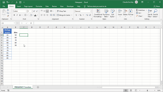
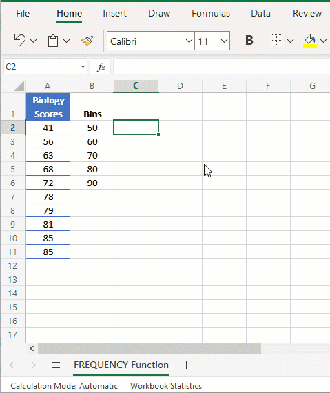
 Now, we’re ready to make a histogram of the Biology test scores below.

Creating the bins is the next important step.
What is a bin in Excel?
Bins are the intervals by which your data will be grouped. The bins must be created in a separate column. We’ll place the list of bins in column B.

Excel will automatically create a bin for values higher than the last specified bin, so we have specified 90 as our last bin.
Now that all the prep work is done, Excel is ready to produce our histogram.
- Click the Data tab on the ribbon and choose the Data Analysis command. This will open up the Data Analysis window.
- Select the Histogram tool and click OK.

- Enter the Input Range as A2:A11, and the Bin Range as B2:B6.
- Under Output Options, select the Output Range radio button and enter the name of the cell where you’d like the histogram output table to be displayed. In our example, we’ve entered cell D2.
- Tick the Chart Output checkbox. This tells Excel to create a chart.

- Click OK.
Excel generates a histogram graph in the existing worksheet with the following features:
- A corresponding frequency distribution table in cells D2 to E8.
- Bins on the x (horizontal) axis.
- The frequency of grouped values on the y (vertical) axis.
- An Excel-created series labeled ‘More’ for values greater than the final bin.

- The histogram chart (that is, the graph) is linked to the distribution table, not to the original source data. Making changes to the original dataset will not automatically update the distribution table nor the chart. This is why it is considered a static chart. However, manually changing the table will update the histogram.
- To change the values displayed on the x (horizontal) axis, adjust the values in column D. For example, you can type >90 in cell D8. The histogram will now show “>90” as the last value on the X-axis.
Method 2 - Using the Insert Chart menu option
Beginning with Excel 2016, you can create a histogram without having to use the Data Analysis Add-in, simply by inserting a histogram as you would any other chart.
The built-in chart method has the advantage of being dynamic, meaning that changes made to the dataset will result in the immediate update of the chart. The basic steps are:
- Select the entire dataset.
- Go to the Insert tab on the ribbon.
- Click the Insert Statistic Chart dropdown (a blue column-looking icon), and select Histogram. Excel creates a histogram chart based on the parameters of Scott’s normal reference rule1.

1Scott's normal reference rule works best with data that is normally distributed. It minimizes the bias of the histogram compared with the dataset.
As you can see, there are a few more steps required before your chart can actually be a useful tool for analyzing data and/or communicating with an audience. This mostly concerns customizing the chart bins.
- Right click the horizontal axis. Click Format Axis. The Format Axis pane will appear on the right of your screen.
- Adjust the properties of the bins within the Format Axis pane, including number of bins, underflow bin, and overflow bin.
- We will change the bin width to 10.
- The Underflow Bin is where all values less than or equal to this number will be collected. We will enter 50 here.
- The Overflow Bin is where all values over a certain number will be collected. We will enter 90 here.


- The first column shows that one student had a score less than or equal to 50. All values less than 50 would be collected and reported in this bin since we designated 50 as our underflow bin.
- For the remaining bins, notice the use of a parenthesis before the first number, but a square bracket after the second number, for example (50, 60]. This means that the values collected in this bin are for scores more than 50 and up to 60.
- Even though we specified an overflow bin for values greater than 90, since there were no scores that fell into that category, no bin was created. If there were scores greater than 90, the bin would have been labeled “>90”.
Method 3 - Using the FREQUENCY function
The final method to create an Excel histogram is by using the FREQUENCY function. This method is also dynamic.
The syntax of the FREQUENCY function is:
=FREQUENCY(data_array, bins_array)
Both arguments are required and are defined as follows:
- Data_array - the dataset to be evaluated.
- Bins_array - an array or range which will be used as groupings for your data frequencies.
The FREQUENCY function returns a list of frequencies based on the count collected into each bin.
FREQUENCY is a special type of function called an array function. For all versions prior to Excel 365, this means you must first highlight the range of cells where the resulting list will be displayed, and type the formula using the syntax referred to above.
Importantly, do not press Enter. Press CTRL+SHIFT+ENTER (this is why array formulas are sometimes called CSE formulas) to let Excel know you are entering an array formula. Excel will insert curly brackets around the formula to remind you in the future that this was entered as an array formula.
If you have a current version of Microsoft 365, then Excel recognizes FREQUENCY as a dynamic array function, and you can just enter the formula in the first cell of the range you would like to be your output range, then press ENTER as normal.
In our example, our data_array will be the range A2 to A11, and our bins_array will be B2 to B6.
Steps to create a histogram using the FREQUENCY function
The first step is to create bins according to the parameters discussed above. Next, follow the three steps below.
Versions prior to Excel 365:
- Select the cells which will become your output range. In our case, this will be C2:C7.
- Enter the frequency formula: =FREQUENCY(A2:B11,B2:B6).
- Press Control + Shift + Enter.
 Excel 365 Version:
- Go to the cell where your output range will begin. In our case, this will be cell C2.
- Enter the frequency formula: =FREQUENCY(A2:B11,B2:B6).
- Press Enter.
 You will notice that the number of elements in the returned array is one more than the number of elements in bins_array.
That extra element in the returned array returns the count of any values above the highest interval. This is similar to the ‘More’ bin created by the Data Analysis method and to the ‘Overflow Bin’ created by the Insert Chart method. You can label the corresponding cell (B7) accordingly.
At this point, you can now use the distribution created by the FREQUENCY function, along with the bins, to create a standard column graph using the regular Insert Chart method:
- Select the bins and frequency list (including the More/Overflow bin).
- Go to the Insert tab on the ribbon.
- Click the Insert Column or Bar Chart dropdown. Select 2-D Column.
Excel creates a column chart based on your selection.
How to customize a histogram chart
So far, we’ve taken you up to the point where Excel has created a graphical representation of the distribution of Miss Windsor’s Biology class test scores. But it will take a minute or two more to make the chart presentable.
Add chart elements
You can add, remove or change a chart title, axis titles, data labels, gridlines, and a legend by clicking on the green plus (+) symbol to the top right when your chart is selected. A menu of checkbox options will appear. Each option can expand into more specific details by clicking on a black arrow to the right of the option.
Another way to add chart elements is to select the chart, then click on the Design tab on the ribbon. The Quick Layouts menu item offers some commonly-used built-in combinations for your chart type.
Resize chart
Click on the chart and drag any of the eight handlebars to resize. The four corner handles will expand the chart proportionally, while the middle, left, and right handles will only make the image wider or narrower without changing the height.
The middle, top, and bottom handles will only make the image taller or shorter without changing the width.
Format Axis
Format any of the axis elements by right-clicking on that axis. A pane will open up on the right of your screen with various options which can be customized as needed.
Remove the space between bins
Select the columns, right-click, and choose Format Data Series. On the Format Data Series pane, set the Gap Width to zero.

Summary
Which of the three methods did you most enjoy using?
The built-in histogram method is probably the one that will take the most time to get used to, especially with the way the bins are labeled. Note that some of the formatting and customization options may be more or less flexible, depending on which method was chosen to create the histogram.
Histograms are useful for reporting on statistical data, especially when large datasets are involved.
Visit our course library to learn more about Excel with GoSkills! Try either our free Excel in an Hour crash course or our comprehensive Excel - Basic and Advanced course. Or both!
Ready to become a certified Excel ninja?
Start learning for free with GoSkills courses
Start free trial
Join the Excel conversation on Slack
Ask a question or join the conversation for all things Excel on our Slack channel.