

Join the Excel conversation on Slack
Ask a question or join the conversation for all things Excel on our Slack channel.
If you’ve tried to create a waterfall chart in Excel 2010 or Excel 2013, it was probably such a hassle that you decided against them in favor of some other chart type.
Great news! Making a waterfall chart in Excel 2016 or later is now so straightforward and user-friendly that you’ll be able to teach someone else how to do it after this tutorial.
What is a waterfall chart?
A waterfall chart is a chart that looks like a cascade diagram. It’s one of the most visually descriptive charts supported in Excel. Sometimes they’re also called bridge charts because of the connector lines which may be included to link each data point.
Basically, waterfall charts show a running total as values are added or subtracted. They’re useful for understanding how an initial value is affected by a series of positive and negative values.
Download your free practice file!
Use this free Excel file to practice along with the tutorial.
When should you use a waterfall chart?
Waterfall charts have been typically used to track important values such as net profit or cash flow over time. However, they can also be applied in other settings such as sales, inventory, and education management to track and understand the effects of negative and positive values on cumulative performance.
In our first example, the source data is a table showing daily sales, so there are only positive values.


The chart above starts with the October 1 value (56 sales). Each subsequent value (with the exception of the final value - Total Sales) only highlights the difference between the previous value and the current.
Typical features of a waterfall chart
Waterfall charts look a bit unusual compared to the more common pie, bar, and line charts. Some distinctive features are discussed below.
Floating columns
The most noticeable feature of waterfall charts is their “floating” columns. If you imagine each floating datapoint as extending all the way down to the X axis, the waterfall chart would simply be a cumulative column chart. By showing only the difference between two data points at a time, waterfall charts highlight the changes between one date and the next.
Cumulative data points
Each data point is shown in comparison to the data point immediately preceding it, with negative values in a different color from positive values.
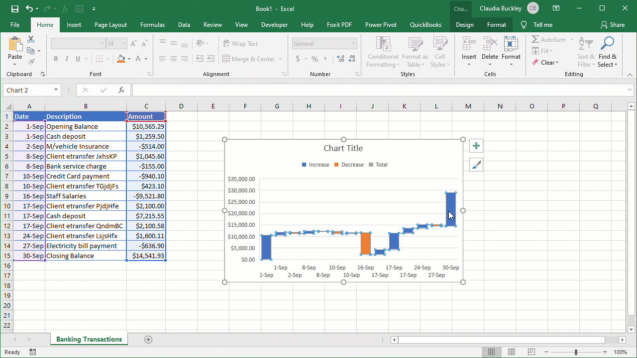
Below is a waterfall chart of banking transactions which includes deposits and withdrawals, so both positive and negative values are shown. Since we already understand how to read bars representing positive values, let’s see how waterfall charts help us to form a mental image when negative values are shown.

Representation of negative values
An increase in values is shown by the blue bars, with the cumulative total being at the top of the blue bar. When there is a decrease in value, the current status of the total is shown at the bottom of the orange bar (see example below).

Total or subtotal displayed as final data point
Perhaps the second most noticeable feature of waterfall charts is that the final column usually represents the total or subtotal of all the previous values and is shown in a special color. This is useful for comparing start and end values.
In the case of our example, the final value (September 30) is shown in the color gray and is the closing balance in the account. This was calculated based on the sum of all the previous transactions.
Connector lines
Connector lines connect the end of each column to the beginning of the next column to show the flow of the data in the chart.
To hide connector lines, single-click any data column. The Format Data Series task pane will appear to the right of the screen. Uncheck the Show connector lines box.

How to create a waterfall chart in Excel
Let’s walk through the steps to create an Excel waterfall chart using the banking transactions above.
- Select the data you want to create the waterfall chart from. In this example, our data is in the ranges A1:A15 and C1:C15. Since these are non-adjacent columns, we use the Ctrl (or Command) key between selections.

- Go to the Insert tab, and from the Charts command group, click the Waterfall chart dropdown. The icon looks like a modified column chart with columns going above and below the horizontal axis. Click Waterfall (the first chart in that group).


- Add or remove data labels.
- Set a data point as a total or subtotal.
- Create or modify the chart title.
- Resize the chart.
- Add or remove axis titles.
Add or remove data labels on a waterfall chart
Since our data in column C is made up of numbers that take up quite a bit of space — making the chart cluttered — they are best removed from this chart. This can easily be done in one of two ways:
- Select the chart. Click the green plus (+) symbol at the upper right corner for the Chart Elements shortcut. Uncheck the Data Labels checkbox.
Or
- Click any of the data labels. They will all be selected. Press the Delete button on your keyboard.
Your chart should now look like this:

How to add subtotal or total columns
You'll notice that the final data point (30-Sep) is formatted and color-coded as an increase which is, of course, incorrect. Going back to our data source, the September 30 data point is the closing balance, being the total of all the previous numbers.
To designate a data point as a total or subtotal, double-click on that data point (in this case, the ending balance). In the Format Data Point pane, check the "Set as total" box.
Now the chart will display that value as a total or subtotal instead of adding it to the other values.
Create or modify chart title
A good chart usually has a title that summarizes what the chart itself depicts. Our chart is missing a title, but we do have the placeholder displayed.
Enter a title simply by clicking on the placeholder once, and in about six words or less, type in an appropriate name that tells the audience what story your chart tells. Using this method replaces whatever text was previously in the chart title placeholder. We’ve chosen the name September Banking Transactions.

Resize the chart
Due to the size of this chart, the values on the X axis are too close together, making it difficult to determine the date each floating column represents. Expanding the chart will resolve this situation.
Click on the chart and drag any of the eight handlebars to resize. The four corner handles will expand the chart proportionally, while the middle left and right handles will stretch or shrink the image without changing the height.

Add or remove axis titles
The data on this chart is fairly self-explanatory, so we may decide against axis titles. But for some charts, it makes sense to explicitly state what is being measured on each axis.
For demonstration purposes, we will add a title to the vertical axis.
To add an axis title, click the green plus (+) symbol at the upper right corner for the Chart Elements shortcut. Check the Axis Titles checkbox to create placeholders for both axes, or click the expand arrow to choose Primary Horizontal or Primary Vertical axis.


The Quick Layout menu option offers a few built-in combinations which save you from having to experiment with adding and removing chart elements one at a time.
The benefits of using a waterfall chart
Now that you’ve seen how waterfall charts work, you can understand why they’re getting more and more popular.
They have a clean, uncomplicated format which makes performance analysis quite easy since the audience is able to observe the cumulative effect of individual changes.
To explore other kinds of charts, try our Excel - Basic and Advanced course today.
Level up your Excel skills
Become a certified Excel ninja with GoSkills bite-sized courses
Start free trial
Join the Excel conversation on Slack
Ask a question or join the conversation for all things Excel on our Slack channel.