Features
Premium video tutorials
Award-winning instructors
Personalized learning
Get certified
Learn at your own pace
Mobile (learn on-the-go)
Unlimited tests and quizzes
Regularly updated content
Overview
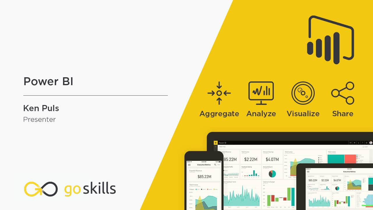
Make your data come to life with beautiful, interactive reports in Power BI. In this online course, you will learn how to use Power BI's analytics tools to transform dull data into dazzling dashboards, reports and visualizations to understand key business insights at a glance.
Designed for beginners, no prior experience is required to start analyzing and visualizing data with Power BI. You will learn step by step how to use your data to build reports in Power BI Desktop, and publish them to the cloud service where you can create and share your personalized dashboards. By the end of the course, you will be equipped with the business intelligence skills to get the meaningful answers you need to make informed decisions for your business.
Your skills can be used across many industries, including Marketing to monitor the effectiveness of campaigns, Finance to oversee financial performance, and Sales to manage quotas against forecasts.
Highlights:
- 39 practical tutorials.
- Understand the difference between dashboards and reports.
- Add data from Excel, a text file or CSV to create reports in Power BI Desktop.
- Publish and update your data in the Power BI cloud service.
- Learn how to share a Power BI dashboard to collaborate with others.
- Understand key concepts for relating data in order to link tables together properly.
- Create a calendar table that dynamically updates with your data.
- Learn how to use Data Analysis Expressions (DAX) to perform calculations.
- Create a range of stunning visuals to display your data, including charts, maps, tree views, and tables.
- Design custom visuals with the Chiclet Slicer.
Once enrolled, our friendly support team and tutors are here to help with any course related inquiries.

- 720p
- 540p
- 360p
- 0.50x
- 0.75x
- 1.00x
- 1.25x
- 1.50x
- 1.75x
- 2.00x
Summary
Instructor
Syllabus
What is Power BI? Free Lesson
1
Introduction to Power BI
2
Overview of PowerBI Components
This lesson explores the main components of Power BI, including Power BI Desktop, Power BI Free, Power BI Pro and Power BI Premium, and discusses how to get access to each component.
3
Power BI Workflow
In this lesson we will explore the steps used in Power BI to get from data to dashboards, as well as all points in between.
Getting Started with Power BI
1
Getting Data From a Text file
We will begin our journey by pulling some sales data into Power BI from a text file, as well as making some minor manipulations to the data.
2
Creating visuals
This lesson covers an introduction to create different visuals and cross filtering in Power BI.
3
Publishing to the Power BI service
This module covers how to publish your data into the Power BI service, explores the feature parity between desktop and cloud, and covers how to update your data in the service.
4
Dashboards vs Reports
5
Sharing Power BI Reports and Dashboards
In this module we will look at the methods of sharing your BI artifacts. We explore sharing without using the cloud, as well as sharing both within and external to your "tenant".
6
Working with Q&A
7
Generating Quick Insights
8
Working with Alerts
Data & Modeling
1
Adding Excel Data to an Existing Power BI Model
In this module we will explore collecting Budget data to link into our dashboards. The only issue is that it comes from a completley different source: an Excel file.
2
Key Concepts for Relating Data
This lesson focuses on the characteristics that are required in order to link tables together properly, as well as a key tip that will prevent getting yourself into trouble later.
3
Solving m:m Joins via Composite Keys
One potential source of m:m (many to many) join issues in Power BI can be solved by combining multiple columns into a "composite key" in order to relate tables together. This module will dig into this issue, as well as how we solve the problem.
4
Solving m:m Joins via Table De-Aggregation
In this module we'll explore how to build dimensional tables that solve the m:m (many to many) linking problem, allowing you to create much more robust models.
5
Table De-Aggregation - Application
This module shows how to apply de-aggregation to our sample model. The end goal here is to avoid m:m (many to many) joins by creating new dimensional tables that can be linked into the model via 1:m (one to many) relationships.
6
Dynamic Calendars – Theory
Every model that will perform any kind of date/calendar intelligence must have a proper calendar table. This lesson gives you the tips that you can apply to any model to build a calendar table that dynamically updates with your data.
7
Dynamic Calendars – Application
It's now time to build a dynamic calendar on the fly for our sample model. After identifying your calendar's start and end dates, it's one line of code, 5 clicks, 4 characters and the Enter key, and you're set.
Working with DAX (Power BI's formula language)
1
Basic Measures – Theory
In this module we'll explore how to use Power BI's formula language to create re-usable "Measures"
2
Basic Measures – Application
It's now time to apply our knowledge of basic formulas, and build measures that add business intelligence value to our sample model.
3
Understanding Measure Calculation
Creating measures is all very well, but you need to understand why they return what they do. In this module we will explain how to identify the filter context applicable to your data point, and how that influences the way measures are calculated.
4
Performing Math with Compound Measures
This lesson explores the syntax and practical application of adding or subtracting measures from each other, and lays the groundwork for creating more complicated mathematical combinations
5
The CALCULATE() Function – Theory
CALCULATE() is the super-charged SUM(anything) function, and mastering it is the secret to truly mastering Power BI's formula language. In this module we will show how it works, as well as how it impacts basic measure calculation.
6
The CALCULATE() Function – Application
In this module we will review several CALCULATE() functions that live in a real model, showing how they work and add value to our business intelligence.
7
The ALL() Function – Theory
How do you ensure that your "All Time Sales $" retains it's "All time" status when someone click on a visual and cross filters your report? This lesson is ALL() about the function that lets you do exactly that.
8
The ALL() Function - Application
In this module we look at practical examples of using the ALL() function to modify and override the filter context, resulting in measures that only change when we want them to.
9
Quick Measures
Quick measures are ready-rolled formula patterns built through a drag and drop user interface, allowing you to write really complicated formulas for you without having to learn all the nuances of Power BI's DAX formula language.
Exploring Visuals Free Lesson
1
Global Visual Concepts
2
Bar & Column Charts
In this module we will take a look at creating bar and column charts to display our data.
3
Line Charts
Line charts are a great way to show trends over time, and we'll explore doing so here.
4
Combination Charts
Combination charts combine line and column charts into a single visual. They are very useful for showing values versus a standard or target.
5
Maps & Filled Maps
Working with maps can be a bit tricky. This module will explain the good, the bad and the ugly of maps, as well as provide recommendations to avoid the ugly.
6
Pie Charts
In this lesson we'll explore Power BI pie charts, donut charts and their characteristics.
7
Treeviews
Also known as "breakdown trees", this visual can show interesting statistics about the makeup of your data sets.
8
Cards
Cards are super useful in order to drive alerts. They also have a close cousin called the multi-row card. In this module we will explore both, as well as their pros and cons.
9
Matrix
The matrix is similar (but not the same as) Excel's PivotTable. In this lesson we will show how to work with this specific visual.
10
Tables
11
KPIs
KPIs are great for showing you most recent period’s performance versus a target value, with a longer term trend as an area chart in the background.
12
Custom Visuals - Chiclet Slicer
When the default visuals are not inspiring, or you just need to use a visual that Microsoft doesn’t supply by default, you can often find another version in the Custom Visual store. In this module we will look at the Chiclet Slicer, a vast improvement over Power BI's native Slicer visual.


