Features
Premium video tutorials
Award-winning instructors
Personalized learning
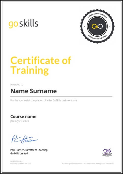
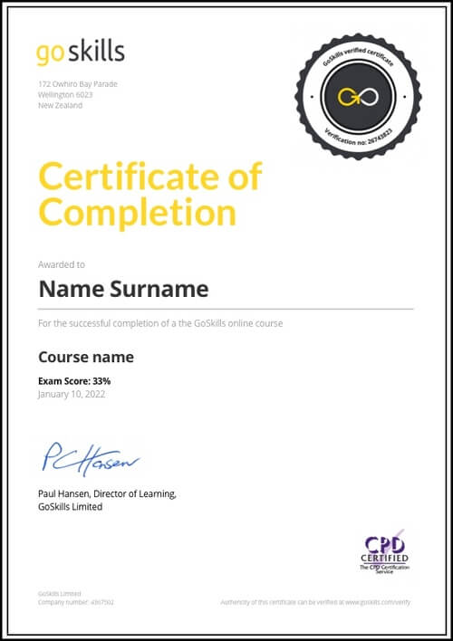
Get certified
Learn at your own pace
Mobile (learn on-the-go)
Unlimited tests and quizzes
Regularly updated content
Overview
This course is part of our Lean Six Sigma Green Belt program, which consists of four courses designed to prepare you for the International Association of Six Sigma Certification (IASSC) Green Belt exam. We recommend you take all four courses in the program to be fully prepared for the exam.
Statistical process control allows you to visually see and understand what is happening with a process in real time. SPC techniques help you manage and control processes with data, and warn you when the process has degraded and action is needed.
In this course you will learn how to create and use control charts, the heart of statistic process control, to improve your business processes.
The training features plenty of opportunities to practice with examples, exercises and quizzes to test your knowledge. By the end of the course, you will have the skills to conduct simple, straightforward analysis to improve processes at your company.
The course is designed from the standpoint of making sound business decisions for improving processes. You won’t need to do any advanced math or derive proofs behind the formulas or statistics. Instead, you’ll learn how to use popular programs like Excel and Minitab to do the calculations for you. While the computer crunches the numbers, you will learn how to read the data and analyze the results of the study.
Highlights:
- 26 practical tutorials with videos, reference guides, exercises and quizzes.
- Designed to prepare you in part for the IASSC Green Belt exam. To prepare in full, you should also take the Lean Six Sigma Principles, Measurement Systems Analysis, and Hypothesis Testing courses part of our four course Lean Six Sigma Green Belt program.
- Understand statistical control principles such as variation and non-normal variation.
- Learn how to create control charts in Excel with the Data Analysis add-in.
- Learn how to use Minitab to calculate descriptive statistics for a data set.
- Identify the difference between special cause variation and common cause variation.
- Understand the principle of process capability and how to calculate it for variable and attribute data.
- Learn the strategy behind using control charts, and their limits.
- Create different kinds of control charts, including X Bar-R, X Bar-S, Variable Data, Attribute Data, and more.
- Aligned to the IASSC Lean Six Sigma Green Belt Body of Knowledge.
- The only method to earn an IASSC certification is to successfully sit for and pass an official IASSC certification™ exam, which can be taken through IASSC. We do not provide access to IASSC Certification exams.
- Earn 4 PDUs or contact hours toward your Project Management education for certification with PMI.
Once enrolled, our friendly support team and tutors are here to help with any course related inquiries.

- 720p
- 540p
- 360p
- 0.50x
- 0.75x
- 1.00x
- 1.25x
- 1.50x
- 1.75x
- 2.00x
Summary
Accreditations and approvals


GoSkills Ltd is an IASSC Accredited Training Organization™.

Syllabus
Statistical Control Principles Free Lesson
1
Variation and Control
2
Normal Variation
3
Non-normal Data
4
Basic Statistics in Excel
5
Basic Statistics in Minitab
Minitab is the most commonly used statistical application within the Lean Six Sigma community. This lesson provides a brief orientation concerning how to navigate through Minitab and shows how to use Minitab to calculate descriptive statistics for a data set. Minitab will be used in future lessons.
Process Capability Free Lesson
1
Common Cause - Special Cause
2
Process Capability
Process Capability consists of comparing the Voice of the Customer to the Voice of the Process. SPC Control Charts provide a quantitative measure of the Voice of the Process. This lesson explains the principle of process capability and the role of SPC in achieving and maintaining it.
3
Process Capability with Variable Data
Process Capability is often correlated with process Sigma. The calculation of process capability is quite different depending upon whether the data is variable or attribute data. This lesson will present the technique and practice using the variable data process capability ratios.
4
Process Capability with Attribute Data
Six Sigma projects strive to achieve a process capability that represents Six Sigma quality. The calculation of process capability is quite different depending upon whether the data is variable or attribute. This lesson will present the technique used for determining process capability with attribute data.
SPC Control
1
Control Chart Design
2
Statistical Control Strategies
In this lesson the strategy for how to use Control Charts is discussed. In addition to monitoring the process, the charts can be used to set performance baselines, validate the impact of improvement, and identify sources of variation.
3
Control Limits
4
Control Charting Process
5
Subgroups and Samples
Some of the most important decisions with respect to control charting are the decisions about subgroups and samples. These decisions will dictate the type of control chart that should be used. They also will determine the number of data points in a subgroup. The decisions should be made based upon the characteristics of the process that is being control charted.
6
SPC Corrective Actions
SPC Control Charts Free Lesson
1
Variable Data Control Charts
2
I-MR Chart
The Individual and Moving Range chart is the simplest of the variable data control chart. This lesson explains how the data is recorded and interpreted on the chart. The lesson describes how to create this control chart in both Microsoft Excel and using Minitab. The lesson will include practice creating the chart.
3
Xbar-R Chart
The X-bar and Range chart is the most commonly used variable data control chart. When discussing SPC, this is always the example. This lesson explains how the data is recorded and interpreted on the chart. The lesson describes how to create this control chart in both Microsoft Excel and using Minitab. The lesson will include practice creating the chart.
4
Xbar-S Chart
The X-bar and Standard Deviation chart is the variable data control chart used when the subgroup is large. This lesson explains how the data is recorded and interpreted on the pair of control charts. The lesson describes how to create this control chart in both Microsoft Excel and using Minitab. The lesson will include practice creating the charts.
5
Attribute Data Control Charts
This lesson discusses the unique considerations associated with monitoring attribute data with control charts. It compares and contrasts the various attribute data control charts and provides some ground rules for subgroups selection.
6
C Chart
The C chart (plots Counts) is the simplest of the attribute data control charts. This lesson explains how the data is recorded and interpreted on the chart. The lesson describes how to create this control chart in both Microsoft Excel and using Minitab. The lesson will include practice creating the chart.
7
U Chart
The U chart relies on counting both defects and units and is appropriate if the process has erratic flow. This lesson explains how the data is recorded and interpreted on the chart. The lesson describes how to create this control chart in both Microsoft Excel and using Minitab. The lesson will include practice creating the chart.
8
NP Chart
The NP Chart tracks defective units rather than actual defects. It provides a more macro perspective for the organization. This lesson explains how the data is recorded and interpreted on the chart. The lesson describes how to create this control chart in both Microsoft Excel and using Minitab. The lesson will include practice creating the chart.
9
P Chart
The P chart is closely related to the NP Chart. It also tracks units but tracks the percentage of defective units. This lesson explains how the data is recorded and interpreted on the chart. The lesson describes how to create this control chart in both Microsoft Excel and using Minitab. The lesson will include practice creating the chart.