Pie charts are a popular way to show how much individual amounts contribute to a total amount. We use them to show proportions of a whole.
Let’s explore when to use a pie chart, when not to use one, how to make a pie chart in Excel - basic and advanced, and how to customize pie charts to suit each situation.
What is a pie chart?
A pie chart is probably the most basic type of chart you can create in Excel. In the unlikely event that you’ve never seen one before, each value looks like the slice of a pie, and all the values together make up the entire pie.
Download your free pie chart practice file!
Use this free Excel pie chart file to practice along with the tutorial.
Why use a pie chart?
A pie chart is very useful for displaying basic statistical data. It usually doesn’t require the audience to have an in-depth knowledge of the subject being reported on, nor any lengthy explanations of what it is meant to describe. It’s easy to create and even easier to read.
When not to use a pie chart
Let’s get this out of the way — pie charts are not ideal for every type of data. Don’t use pie charts if:
- you want to display more than one data series (i.e., each category has multiple data points).
- you want to display a trend over time. Since each variable will have only one value, pie charts are a snapshot of one moment in time.
- you have negative or zero values in your dataset. Negative values will be displayed as positive values, as zeros won’t be displayed at all.
- you have more than seven categories. Pie charts are notoriously bad for displaying lots of data points, simply because the slices will be too small, making them meaningless for making a point visually.
How to read a pie chart
As long as you remember that the data in a pie chart will always add up to 100%, you can appreciate why it’s so easy to read. After all, even if the slices are not labeled with individual values or percentages, and if there is no legend (doesn’t sound like a very good chart, to be honest), the relative size of each slice is a visual indicator of the value of each variable in relation to the other variables, and to the pie as a whole.
Working with pie charts in Excel
Most of the menu options we’ll be referring to below can be found on the Design or Format tabs. These are called contextual tabs, meaning that they only appear when you select a chart. This goes for all Excel charts, by the way, not just pie charts.

How to make a pie chart in Excel
Step 1 - Select your data
From your Excel worksheet, highlight the data you want to appear in your pie. This should include what is being measured, and how much of it there is. Remember, pie charts can only handle one measurement or value per independent variable.
When selecting the cells to be used as your source data, there may be times when your data is non-contiguous. Remember, Excel puts (or tries to put) everything that is highlighted on your chart. So select only what you need by holding down the Control key between non-adjacent selections.
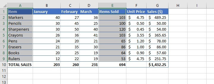
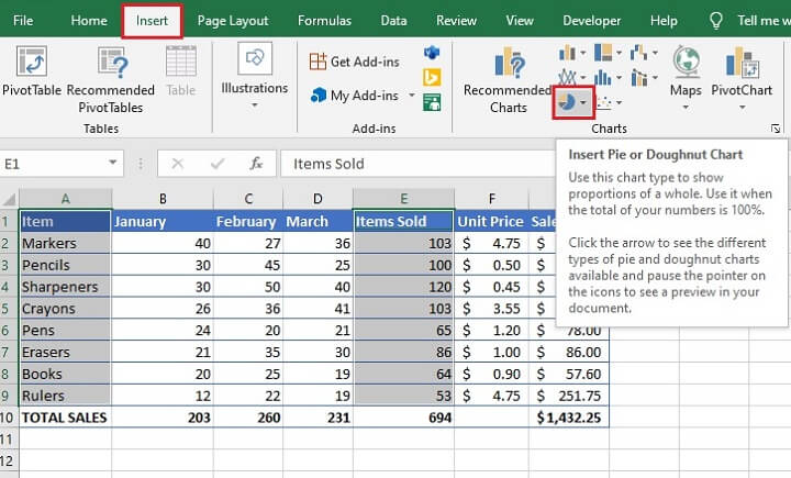
Step 2 - Insert the type of pie chart you want
From the Insert tab, go to the Charts command group and click the Insert Pie or Doughnut Chart icon. This icon looks like a mini pie chart.
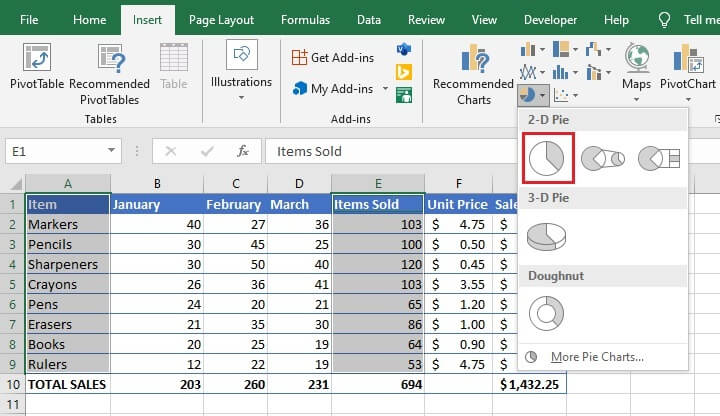
3D pies might look cool, but be careful. Because of the angles used, they are often accused of being misleading since the sections toward the front look bigger. This will, of course, defeat the purpose of simplifying data to your audience.
For your first chart, it’s best to stick with the classic 2D chart since it’s more straightforward.
Step 3 - Quick customization
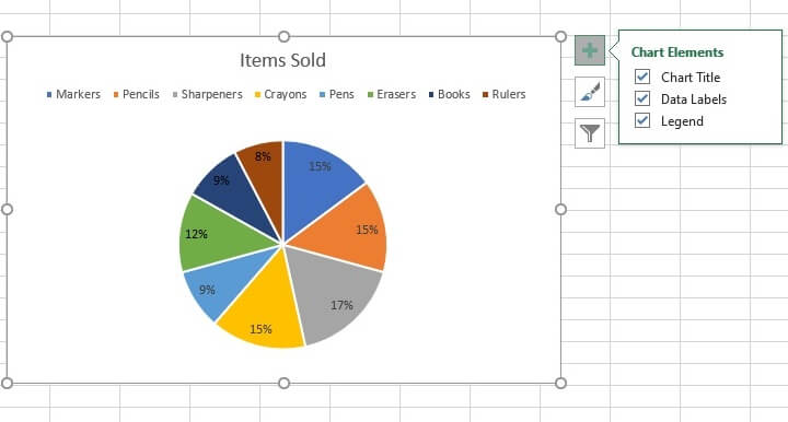
Chart elements
It’s possible to add or remove a chart title, data labels, and/or a legend in two ways. You can either click Add Chart Element from the Chart Layouts command group to the far left of the Design tab or click the green Chart Elements icon next to the chart when its image is selected.
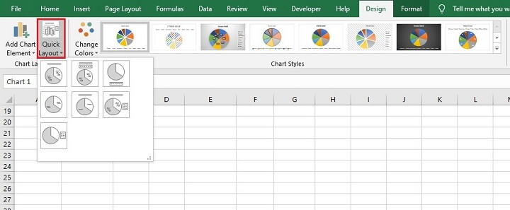
Color and style
You can change the chart’s color or style from the Chart Styles command group. The Change Colors selection allows you to choose from a list of themes, while the sample styles offer variations of designs within the selected theme.
As a shortcut, you can click the chart styles (paintbrush) icon next to the chart when its image is selected to access the same chart style options.
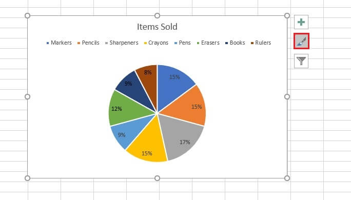
Filter data
The Filters icon next to the selected image allows you to hide or show categories as needed.
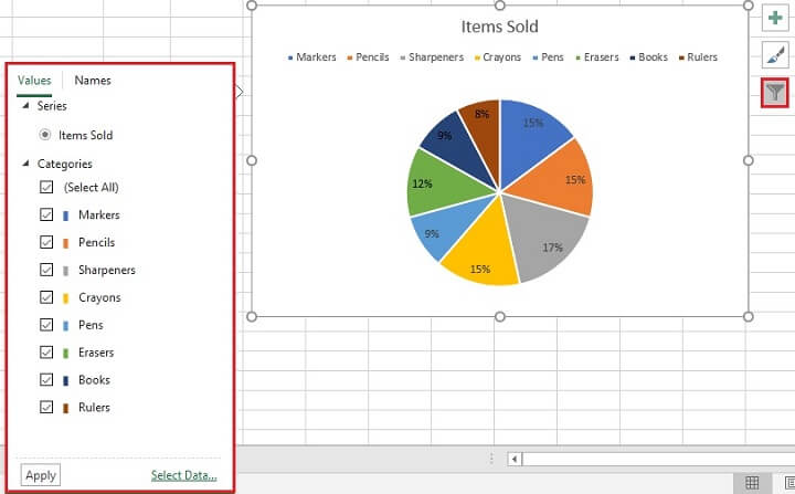
Formatting data for pie charts
The above methods for formatting pie charts are handy if you want to work with Excel’s existing designs and formats. But if you can’t find the design that’s just right for your presentation, you might want to explore formatting your data yourself.
Here are some common tasks you’ll want to learn how to do on your own.
How do I change to another chart type without starting over?
Just click on the chart and choose Change Chart Type from the Design tab. Select the new chart type and you’re good to go.
How do I add labels to a pie chart?
Easy. Either click Add Chart Element from the Chart Layouts command group to the far left of the Design tab or click the green Chart Elements icon next to the chart when its image is selected.
To customize data labels, right-click the pie itself and click Format Data Labels from the menu. A panel will appear on the right, presenting you with advanced checkbox options for your series labels.
How do I change number formats in a pie chart?
You can change number formats on a pie chart without adjusting the source data by right-clicking on the pie itself then selecting the Format Data Labels from the menu. Scroll down and expand the Number option and select a number format (e.g., Currency, Date, Percentage, etc.) from the Category dropdown menu.
How do I emphasize one category in my chart?
You can “explode” a single slice of the pie by clicking on that slice and dragging it outwards to draw attention to a particular category.
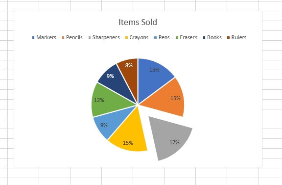
Can I make a change to a single element within my chart?
Yes! Any item can be edited simply by clicking on it. Once you’ve ensured that only that object is selected, make changes to color, text, value, or size from directly within the chart as required.
I don’t like the manual style adjustments I made. Can I go back to the original?
Yes. Click on the Format tab and select “Reset to Match Style” from the Current Selection command group.
Can I make a pie chart in Excel Online?
2D and Doughnut pies can be created and formatted using Excel Online.
3D, Pie of Pie, and Bar of Pie charts can’t be created in Excel Online yet, but if you created them in the desktop app, they can be displayed in Excel Online with limited formatting options.
Advanced pie charts
At some point, you’ll get curious about those odd-looking pie charts - Pie of Pie, Bar of Pie, and Doughnut. It’s time to learn how to use them.
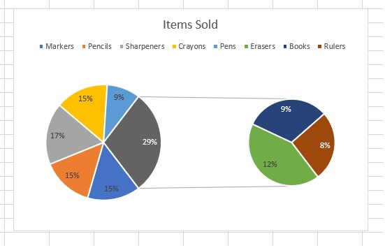
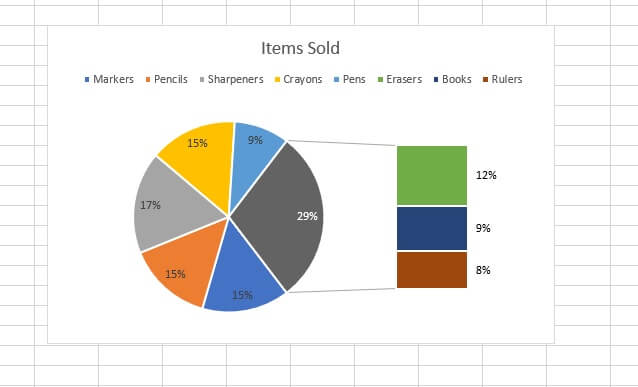
It’s possible that in spite of prevailing advice not to put more than seven categories on a pie chart, you find yourself with exactly that. It happens. The Pie of Pie and Bar of Pie charts make it easier to view smaller values or subsets of the data that make up the category pulled out into a secondary pie or stacked bar chart, which makes them easier to distinguish.
If your classic pie chart has several categories where the slices are so small that it’s impossible to see their individual contributions, simply go change the chart type. Do this by clicking on the chart and choosing Change Chart Type from the Design tab.
Pie of Pie
The first thing to note is that by default, Excel picks up the last three data points to plot in the subset pie chart. If the values on your worksheet are not sorted in descending order, these last three data points may not be the smallest ones.
You can fix this by sorting the source data on your worksheet from largest to smallest. Your Pie of Pie will now summarize the last three data points into one slice on the original pie. And it will expand that slice to a smaller pie where the values are broken down as a subset or percentage of that slice.
Bar of Pie
The Bar of Pie is similar to the Pie of Pie. The only difference is that the expanded slice will be displayed as a bar chart instead of a pie.
Doughnut
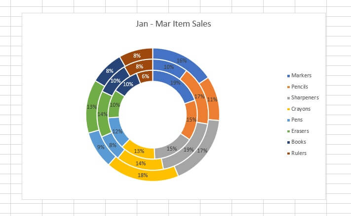
Doughnut charts are a special type of pie that is modified by having a hole in the middle. You may choose to use doughnut charts because they allow representation of more than one series because series are stacked on top of and curled around each other. This is considered by some to be a way to make a pie chart in Excel with two columns of data.
Best practices
- If at all possible, put the category name as a data label rather than just in the legend. There is usually no good reason for the audience to constantly refer to a legend to understand the message being conveyed.
- Placing the value or percentage of each slice is always a good idea to eliminate ambiguity.
- Limit slices in your pie chart to seven or fewer.
- Don’t try to depict a trend by creating multiple pies. There are better charts for that.
- Limit the use of 3D pie charts. They can actually do the opposite of what pie charts are meant to do — convey information simply and clearly.
Learn more
Feel more confident about pie charts now? Then you can level up your other Excel skills with our Basic and Advanced course. If you’re not ready for this comprehensive training, you can start with some basics by trying our free Excel in an Hour Crash course instead.
Free Excel crash course
Learn Excel essentials fast with this FREE course. Get your certificate today!
Start free course


