
What is a Pareto chart?
A Pareto chart is a bar chart, ordered from the most frequent category on the left to the least frequent category on the right.
A cumulative percent line is often included so that you can determine the number of categories needed to reach a certain percentage of the total occurrences.
Pareto charts are especially useful when you want to show that a small number of categories are responsible for almost all of the observations in the data.
For example, you can use a Pareto chart analysis to show the most frequent defects, so that you know where to focus improvement efforts.
Pareto chart example
The following Pareto chart shows frequencies of income classes from tax returns from the United States of America in 1931. As is often the case when Pareto chart analysis is useful, a few of the groups vastly outnumber the others.

Let's review!

Pareto chart Excel example
It’s easy to make Pareto charts in Microsoft Excel. If you begin from a list of individual measurements, then you’ll use the following general steps:
- Create a frequency table from the individual measurements.
- Insert an Excel Pareto chart.
Create a frequency table from individual measurements
It’s easy to give a Pareto chart Excel example. The first step is to arrange your data in a table of frequencies. From a frequency table, you can create a Pareto chart in Excel.
With individual measurements, each row provides information about a single individual.
| Flaws |
|---|
| Other |
| Flaking |
| Fading |
| ⁞ |
The first step with this data is to use a pivot table to get the frequencies for the Pareto chart. The following steps work for both the desktop and web versions of Microsoft Excel 365. You can follow along with this example with the following data set (paint_flaws.xlsx):
Download your free Pareto chart exercise
Follow along with the tutorial with these practice Excel worksheets
- Select a single cell that contains data.
- On the Insert tab, click PivotTable. Microsoft Excel should select all of the contiguous data.
Note: If the data is not selected in the desktop version, click the arrow next to Table/Range to select the data in the worksheet. If the data is not selected in the web version, you can select the data without any other clicks.

- Click OK.
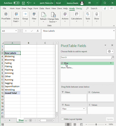
One of the special features of pivot tables in Microsoft Excel is that you can use a column of data in multiple fields. Use the following steps to arrange the pivot table fields:
- Select Flaw.
- Click and drag Flaw to the Values field.
Now that you have a list of the categories and their frequencies, you can create a Pareto chart in Excel.
Insert an Excel Pareto chart
In the first part of the example, we took individual measurements and turned them into a frequency table.
From there, you can create a Pareto chart in Excel with a cumulative percentage line. If you did not do the first part of the example, you can follow along from the following frequency table.
|
Row Labels |
Count of Flaw |
|---|---|
|
Blistering |
137 |
|
Blooming |
510 |
|
Fading |
161 |
|
Flaking |
604 |
|
Flashing |
389 |
|
Grinning |
1275 |
|
Other |
327 |
|
Running |
562 |
|
Sagging |
387 |
|
Saponification |
570 |
|
Wrinkling |
78 |
The steps to create the chart are slightly different for the desktop version and the web version of Microsoft Excel in Office 365.
Microsoft Excel desktop
- If your frequencies are in a pivot table, insert a new sheet and copy the frequency table to the new location (the native Pareto chart in Excel is incompatible with pivot tables).
- Select a single cell from the data.
- On the Insert tab, in the Charts group, click the expansion arrow to show all of the available charts.
- Click the All Charts tab.
- From the list of chart types, choose Histogram.
- In the gallery of histograms, select the Pareto chart. Click OK.

The Pareto chart analysis will match the Pareto chart from the preview.
Microsoft Excel on the web
- If your frequencies are in a pivot table, insert a new sheet and copy the frequency table to the new location (the native Pareto chart in Excel is incompatible with pivot tables).
- Select a single cell from the data.
- On the Insert tab, in the Charts group, click Other Charts, then choose the Pareto chart from the Statistical charts.


Pareto chart example Excel file
Download your free Pareto chart exercise
Follow along with the tutorial with these practice Excel worksheets
Although Pareto chart Excel analysis is easy, you can see your results even faster by updating the data in a file where the chart is already built. In the following file, paste individual measurements into column A and refresh the pivot table to see the chart update (Pareto_chart_example.xlsx):

Learn more
Pareto chart analysis is only one of many analytical tools in the Lean Six Sigma toolkit. Try GoSkills Lean Six Sigma courses today to learn more tools and techniques, and prepare to get certified with IASSC/PeopleCert.
Prepare to get certified in Lean Six Sigma
Start learning today with GoSkills courses
Start free trial