
Ready for this month’s Excel challenge? You’ll be stepping into the shoes of a marketing analyst tasked with building a PPC dashboard in Excel.
Here’s how it works:
- Watch the challenge video for a complete overview of the scenario
- Review the instructions below to understand the tasks and guidelines
- Download the Excel worksheet and share your solution in our Excel Slack community
- Watch our solution to compare
Download the file here
Get the practice exercise to solve this challenge.
The challenge 🧗
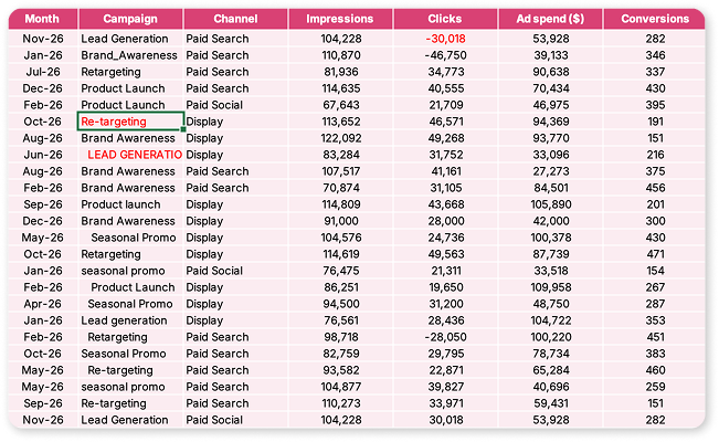
Imagine you’ve just joined the marketing team at a digital agency. Your manager has handed you a raw dataset straight out of their PPC platform (it’s a mess!). Your job is to clean it up and turn it into a polished, dynamic PPC dashboard that any marketing manager would be proud to present.
The dataset covers five campaigns:
- Lead generation
- Brand awareness
- Retargeting
- Product launch
- Seasonal promo
These campaigns run across three channels: paid search, paid social, and display. It spans a full year of data.
Your mission ✅
These three tasks are your mission:
- Clean the raw data
- Complete the summary tables
- Build the dashboard
1. Clean the raw data
Standardize the campaign names and fix the negative click values in the “Raw data” tab. Bonus points if you can do it with a single nested formula!
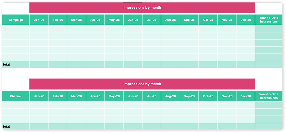
2. Complete the summary tables
You’ll find two tables already set up in the “Summary tables” tab: one breaking down performance by campaign, the other by channel. Populate them with total impressions and clicks by campaign and by month, and do the same by channel. You’ll also need to pull ad spend and conversions for each, and calculate three key metrics: click-through rate (CTR), cost per click (CPC), and cost per conversion. The formulas for these are on the “Instructions” tab.
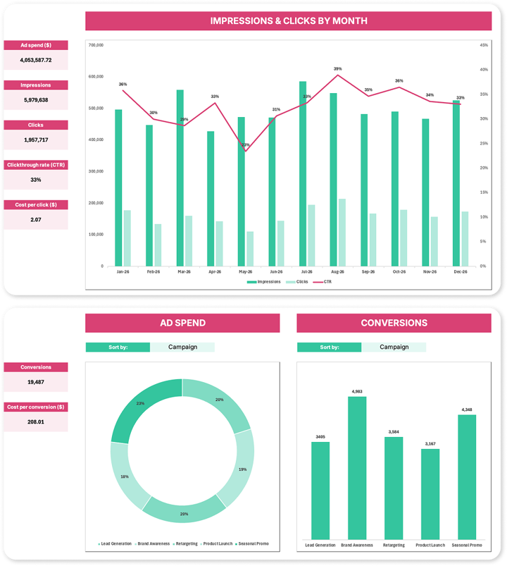
3. Build the dashboard
Head to the “Dashboard” tab and bring your data to life with three charts:
- A combo chart showing impressions, clicks, and CTR by month
- A donut chart for ad spend
- A column chart for conversions.
The fun part? The donut and column charts should be dynamic, updating automatically based on a drop-down that switches between campaign and channel views.
 P.S. Those three tasks are your mission, but consider them a starting point, not a ceiling. There's plenty of data to play with, so if you're feeling ambitious, see what else you can build.
The hints 🕵️
Not sure where to start? Here are a couple of nudges.
- For the summary tables, you’ll need a function that can sum values based on multiple conditions at the same time — like a specific campaign name and a specific month. Check out our guide to SUMIF in Excel to get you started.
- For the dashboard, the charts are yours to design, but if you want inspiration for making them clear and effective, this GoSkills guide to dashboard design best practices is well worth a read before you start.
The solution ✅
Excel is all about creativity and flexibility, and there's always more than one way to solve a problem. Share your solution — or even a new challenge idea — with our community on Slack and connect with fellow enthusiasts.
Need more Excel practice online? 🤩
If you enjoyed this challenge, keep the momentum going by exploring the rest of our Excel challenges or diving into the Resource Hub, packed with tutorials, tips, and tricks to boost your skills. For targeted learning, check out our Excel Charts for Data Visualization course to master the charting techniques used in this challenge, or our Excel Dashboards course to take your dashboard-building skills to the next level.
Keep crunching those numbers... We’ll see you in the next challenge! 👋

Join the Excel conversation on Slack
Ask a question or join the conversation regarding Excel challenges on our Slack channel.
Join Slack channel