Excel Charts for Data Visualization
Excel Charts for Data Visualization
Skills you’ll gain
If you do any kind of research or analytics in your job, Microsoft Excel Charts can transform massive amounts of data into meaningful, actionable insights. Master data visualization and present your findings with charts and graphs that are easy to understand and visually appealing. Follow along as Microsoft MVP Deb Ashby walks you through all you need to chart your course to success and make your data points crystal clear!
In this course, you'll learn:
- Foundational data visualization principles
- How to create and customize charts
- Various chart types and use cases
- Chart shortcuts
- How to create pivot charts and dashboards
Plus, get loads of practice exercises and quizzes to help you remember what you’ve learned. Enroll now and turn numbers into narratives!
Syllabus
Download syllabus-
1
Data Visualization Principles Understand the 3 principles of data visualization to ensure you create charts that are relevant, clear, and well-designed. 2m
-
2
Examples of Good and Bad Chart Design Explore some examples of good and bad chart design. 7m
-
1
Make Sense of Chart Elements and Chart Formats Build your first chart and explore chart elements and chart formatting options. 8m
-
2
More Formatting Options Explore the advanced formatting options available in the Format Pane. 3m
-
3
Brand Charts with Custom Themes Use company colors in charts by creating a custom theme. 5m
-
4
Dynamic Charts with Excel Tables Create a dynamic chart that automatically updates when new data is added using Excel tables. 4m
-
5
Change Chart Type and Add a Secondary Axis Learn how to change the chart type and add a secondary axis to represent two data series. 5m
-
6
Use Custom Number Formatting in Charts Makes numbers more meaningful by using Custom Number formats in Charts. 6m
-
7
Create a Chart Template Save time by creating a reusable chart template. 4m
-
1
The Good All-Rounders: Column and Bar Charts Visualize and analyze datasets using column and bar charts. 5m
-
2
Time-Based Data: Line Charts and Trendlines Visualize time-based data using line charts and trendlines. 9m
-
3
Comparing Data: Pie and Doughnut Charts Create a Pie or a Doughnut Chart to effectively represent comparison data. 8m
-
4
Show the Composition of Data: Area Charts Create an Area Chart to show the composition of data. 7m
-
5
Show the Distribution of Data: Histogram and Pareto Charts Create a Histogram and a Pareto Chart in Excel to show a graphical representation of the distribution of numerical data. 7m
-
6
Scatter Plots Create a scatter plot chart in Excel to display a graphical representation of the relationship between two sets of data. 5m
-
7
Bubble Charts Create a bubble chart in Excel to display three dimensions of data. 7m
-
8
Box and Whisker Charts Create a Box and Whisker (Box plot) chart in Excel to display the distribution of data based on a five-number summary. 4m
-
9
Treemaps and Sunburst Charts Create a treemap and sunburst chart in Excel to visualize hierarchical data in different ways. 5m
-
10
Waterfall Charts Create a Waterfall Chart to visualize how an initial value is affected by a series of intermediate positive or negative values, leading to a final value. 5m
-
11
Stock Charts Create a Stock Chart in Excel, also known as a financial chart, to visualize the price movements of a stock over a certain period. 9m
-
12
Radar Charts Create a Radar Chart in Excel, also known as a spider chart or web chart, to display multivariate data in the form of a two-dimensional chart. 4m
-
13
Funnel Charts Create a funnel chart in Excel to represent stages in a process, showing the flow and drop-off of data at each stage. 6m
-
14
Dumbbell Charts Create a Dumbbell Chart to show the difference between two data points. 8m
-
15
Geographic Data: Map Charts Create a Map Chart in Excel to represent geographic data overlaid on a map. 5m
-
16
Use Images in Charts Create a chart that uses images, icons, or shapes to represent the columns. 4m
-
1
The Quick Analysis Tool Use the Quick Analysis tool in Excel to quickly analyze and visualize data without extensive manual formatting or calculations. 8m
-
2
Charts with Conditional Formatting Use Conditional Formatting along with Charts and formulas to highlight key values. 5m
-
3
Create Dynamic Chart Titles Create chart titles that dynamically update when the chart changes. 7m
-
1
Heat Maps: Color Scales Apply Color scales to a dataset to visually represent the relative values in a range of cells using colors. 3m
-
2
Data Bars Apply Data Bars to values in Excel to visually represent the relative values in a range of cells using horizontal bars within the cells. 3m
-
3
Create Dynamic In-Cell Charts with the REPT Function Use the REPT function to create in-cell charts using symbols that dynamically update when the data changes. 4m
-
4
Sparklines Use Sparklines - small, condensed charts that fit into a single cell - to provide a visual representation of data trends or variations. 5m
-
1
Create a Pivot Chart Create a Pivot Table and Pivot Chart from a dataset. 4m
-
2
Filter Pivot Chart Data with Slicers Use Slicers to filter Pivot Table data. 7m
-
3
Connect Slicers to Multiple Charts Connect slicers to multiple charts. 4m
-
1
Course Close Course Close and instructor goodbye. 2m
Certificate
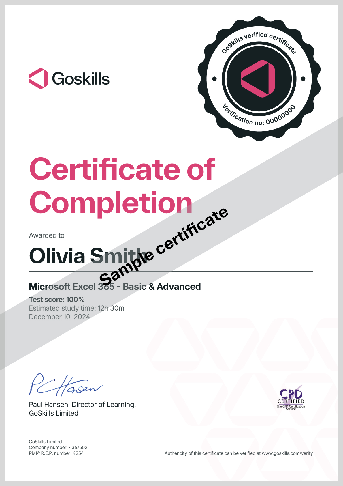
Certificate of Completion
Awarded upon successful completion of the course.

Instructor
Deborah Ashby
Deborah is a Microsoft MVP and TAP Accredited Microsoft Instructor and Content Creator specializing in the design and development of online training courses and video content.
Since the mid-1990s, she has been involved in the IT industry, starting her career on an IT Helpdesk for an airline at the tender age of 16. This sparked a passion for travel, and in 1997, she left the U.K. and moved to Melbourne, Australia, where she furthered her career as an Operations Analyst and programmer.

Deborah Ashby
Microsoft MVP and Trainer
Accreditations
Link to awardsHow GoSkills helped Chris
I got the promotion largely because of the skills I could develop, thanks to the GoSkills courses I took. I set aside at least 30 minutes daily to invest in myself and my professional growth. Seeing how much this has helped me become a more efficient employee is a big motivation.


