Microsoft Excel - Dashboards
Microsoft Excel - Dashboards
Skills you’ll gain
Take your Excel skills to a whole new level by learning how to build dynamic Excel dashboards to show off your data. This online course will teach you the data visualization skills you need to design any dashboard in Excel exactly the way you want.
You should come to this course with a comfort level of building IF functions at a minimum, and knowledge of Pivot Tables is an asset, but not a requirement. At the end of the course, you will have gained the practical skills you need to create beautiful, functional and interactive Excel dashboards.
Highlights:
- 42 practical tutorials.
- Understand the goals of data visualization.
- Learn to use conditional formatting, from data bars to icon sets to add finesse to your dashboard.
- Review the Excel logic functions which are key to adding dynamics to your dashboard.
- Explore the 5 rules of effective charting.
- Start by building bar charts, column charts, pie charts and line charts to display your data.
- Build more complex charts like scatter plots, combination charts and more to really tell your story.
- Add interactivity to your dashboard with the MATCH () and INDEX () functions.
- Leverage pivot tables within your dashboard to add even more interactivity.
- Learn “black magic” dashboarding tricks, like using Emojis and VLOOKUP to further enhance your data.
Video tutorials are recorded in Microsoft Excel 2016 for PC. Learn more about how a GoSkills Excel certification can boost your career.
Want to be a more efficient Excel user? Start learning 200 of the best Excel shortcuts for PC and Mac.
Once enrolled, our friendly support team and tutors are here to help with any course related inquiries.
Syllabus
Download syllabus-
1
Cell Highlighting Dynamically highlighting values that fall in the top or bottom ranges of your data sets. 5m
-
2
Data Bars The easiest way to add easy to read "bling" to your Dashboard. 5m
-
3
Icon Sets Adding stoplights, check marks, flags and other icons to your Dashboard. 5m
-
4
Color Scales Applying dynamic heat maps to your data in order to show outliers and trends. 4m
-
5
Logic Function Review The key to adding dynamics to your dashboard starts with Excel's Logic Functions. 5m
-
6
Formula Based Conditional Formats Leveraging the logic of the IF() function to drive conditional formats based on formulas. 5m
-
7
Understanding Conditional Formatting Rule Precedence Understanding why you can define two different conditional formatting rules, yet end up with a mixture of both. 5m
-
1
5 Rules of Effective Charting: Rules 1-2 Exploring two rules that help ensure your charts convey their intended message. 5m
-
2
5 Rules of Effective Charting: Rules 3-5 Exploring the final three rules that help ensure your charts convey their intended message. 5m
-
3
Bar Charts Bar Charts are useful for comparing values to each other. This lesson examines features that can be tweaked to optimize their consumption. 5m
-
4
Column Charts Column Charts are useful for comparing values to each other. This lesson explores ways to help make them as effective as possible via some of their available options. 4m
-
5
Pie Charts Pie Charts can be useful for comparing values as a % of the whole. This lesson explores way to help make them more effective. 6m
-
6
Line Charts Useful for showing trends over time, this lesson explores line charts and some of their options. 5m
-
7
Scatter Plots This chart type can be useful for identifying clusters and outliers. 6m
-
8
Sunburst Charts and Treemaps (Excel 2016+) Sunburst and Treemap charts are intended to show the breakdown of the source data. 6m
-
1
Combination Charts - Column and Line Combination charts open a whole new world of charting. In this lesson we combine column and line charts together to make a compelling chart. 4m
-
2
Combination Charts - Area and Line This lesson shows a trick to include an extra data series in your chart that fades in and out of view as it's needed. 6m
-
3
Plotting Data Using the Secondary Axis When you need to show values of a different scale, there is no better way than to add an additional axis. 4m
-
4
Bullet Charts This complex looking chart conveys a TON of information comparing a single target value against multiple different markers. 4m
-
5
Waterfall Charts Waterfall charts help break "net change" into increases and decreases, giving more information about the business cycle. 6m
-
6
Sparklines In this lesson, we will look at sparklines: what they are and how to create and modify them. 6m
-
7
Forecast Sheets (Excel 2016) Generating forecast charts in Excel is only a few clicks away, resulting in a chart that you can customize and update later. 5m
-
8
Micro Charting Leveraging Micro Charts to build a very quick visual summary of your key metrics. 5m
-
1
Understanding the MATCH() Function The MATCH() function may not look like much, but it can pull back the position of a data element: something that is key for dynamic dashboarding 6m
-
2
Pinpoint Data with INDEX(MATCH()) Using a combination of the INDEX() and MATCH() functions to dynamically restate the dashboard source information 6m
-
3
Benefits of NA Values Many users fear #N/A values appearing in their spreadsheets. This module explores how to create this result with the NA() function, and why it's fantastic for charts 6m
-
4
Data Validation Drop down lists avoid the risk of "Garbage Out" by preventing your users from putting "Garbage In" 5m
-
5
Working with Form Controls A variety of different objects that add some visual style to your dashboards, as well as provide mechanisms to force valid data entry 6m
-
1
Intro to Pivot Tables A brief introduction/reminder about the power of Pivot Tables 5m
-
2
Applying Conditional Formats to Pivot Tables Understanding the tips and tricks to get conditional formats working properly on Pivot Tables 5m
-
3
Filtering and Linking Dashboards Using Slicers Highly visible and engaging, these devices can provide your users with a method to easily select valid object or filter in to just their slice of the pie 5m
-
4
Extracting Data Points with GETPIVOTDATA() Leveraging the GETPIVOTDATA() function in order to extract specific data points from a Pivot Table 5m
-
5
Using Pivot Charts The ins, outs and shortcomings of Pivot Charts 5m
-
1
Understanding Custom Number Formats Excel has an entire language for displaying values just the way you need them. Don't see your format in the list? Let's look at how to roll your own! 6m
-
2
Displaying Variances with Custom Number Formats A classic cost-accounting trick to display variance in a easy to read way (and avoid watching your audience do math in their heads at each review) 5m
-
3
Conditional Formatting of Chart Axes Leveraging Custom Number Formats in order to provide conditional formatting for chart axes 5m
-
4
In-Cell Charts Using the REPT() Function Leveraging the REPT() function and a special font in order to build charts in cells via formulas 5m
-
5
Display Emojis in Your Dashboards Did you know that Excel can display Emojis in the worksheet? Why not leverage that ability to help convey your message? 3m
-
6
Displaying Indicators on Charts Sometimes showing the chart just isn't enough and you want to display a text message with an indicator on the chart canvas. This lesson explores how to make that happen 4m
-
7
VLOOKUP() for Pictures A cool trick that shows how we can dynamically look up pictures and return them to our worksheet 6m
Certificate
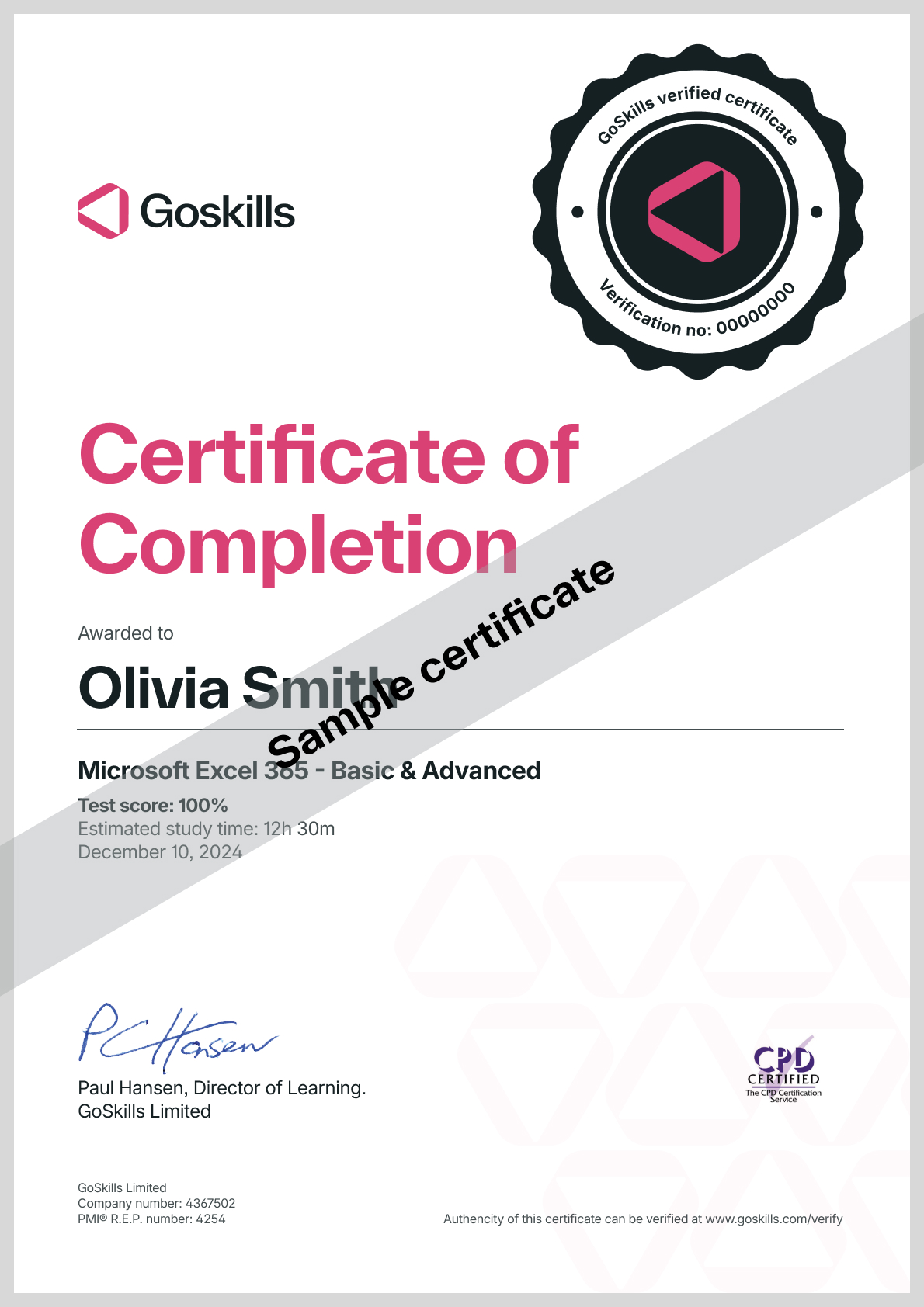
Certificate of Completion
Awarded upon successful completion of the course.

Instructor
Ken Puls
Ken Puls is a globally recognized authority in Microsoft Excel, Power Query, and Power BI, with over two decades of hands-on experience in accounting, IT, and business intelligence systems. His career began in public practice accounting and industry, where he served as both Controller and IT Director, leading numerous system implementations and designing custom business intelligence solutions from the ground up.
Ken’s deep technical expertise is matched by a passion for teaching and community engagement. He has authored several acclaimed books, including RibbonX – Customizing the Office 2007 Ribbon, Power Query Recipes, and Master Your Data with Power Query in Excel and Power BI. His writing reflects a clear, practical approach to solving real-world data challenges.

Ken Puls
Excel MVP
Accreditations
Link to awardsHow GoSkills helped Chris
I got the promotion largely because of the skills I could develop, thanks to the GoSkills courses I took. I set aside at least 30 minutes daily to invest in myself and my professional growth. Seeing how much this has helped me become a more efficient employee is a big motivation.


