
Despite the existence of newer business intelligence tools, Excel still earns its place as the analyst's most important instrument. With a handful of built-in functions and a bit of structure, you can turn raw numbers into forecasts and trend analysis that are both faster to produce and easier to defend in a meeting. This guide walks through the essential Excel forecasting tips and Excel trend analysis techniques every financial analyst should have on hand, with practical examples you can apply to your own models.
Top 6 Excel forecasting and analysis tools & techniques
- FORECAST.LINEAR function
- TREND function
- Exponential smoothing (Data Analysis Toolpak)
- Moving average
- Regression analysis (LINEST)
- Dynamic trend charts
Essential Forecasting Techniques
1. FORECAST.LINEAR: The go-to Excel forecasting function
If you're looking for the best Excel function for financial forecasting, the FORECAST.LINEAR function is usually the first stop. It uses linear regression to predict a future value based on existing historical data — ideal for projecting revenue, sales growth, or expense trends when the relationship between time and value is roughly a straight line.
Syntax:
=FORECAST.LINEAR(x, known_y's, known_x's)
- x is the future point you want to predict (e.g., next month)
- known_y's is the range of your historical values (e.g., past revenue)
- known_x's is the range of the corresponding time periods
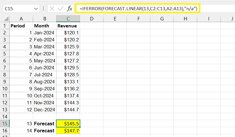
Use case: Say you have 12 months of revenue figures and want to project month 13. FORECAST.LINEAR fits a trend line through your historical data and extends it forward, giving you a single, defensible number for next month's revenue.
Pro tip: Wrap the formula in IFERROR to handle gaps or missing data gracefully:
=IFERROR(FORECAST.LINEAR(13, B2:B13, A2:A13), "N/A")
This keeps your model from breaking when a data point is missing, which is especially useful in shared workbooks where inputs change often.
2. TREND: Fitting a line through historical data
The TREND function in Excel serves a similar purpose to FORECAST.LINEAR but offers more flexibility — it can return multiple forecasted values at once and lets you toggle whether the regression line is forced through zero.
Syntax:
=TREND(known_y's, known_x's, new_x's, [const])
Real-world example: Estimating next quarter's operating expenses based on the last eight quarters. Enter your historical expense data as known_y's, the corresponding quarters as known_x's, and the upcoming quarters as new_x's to get several forecasted values in one array formula.
Tip: Run TREND and FORECAST.LINEAR side by side on the same dataset. If both land on similar numbers, that's a good sign your linear model is a reasonable fit. Large discrepancies are usually a signal to look more closely at your data before trusting either output.
3. Exponential smoothing with the Data Analysis Toolpak
Not all financial data behaves in a straight line. When you're dealing with noisy, fluctuating figures — think monthly expenses that jump around seasonally — exponential smoothing gives you a clearer picture of the underlying trend by weighting recent data points more heavily. You can use Excel's Data Analysis Toolpak to make this task easier.
Steps:
- Enable the Data Analysis Toolpak: File > Options > Add-ins > Excel Add-ins > Go > check "Analysis ToolPak."
- Go to Data > Data Analysis > Exponential Smoothing.
- Set your input range, damping factor, and output range, then interpret the smoothed output and chart it alongside your raw data.
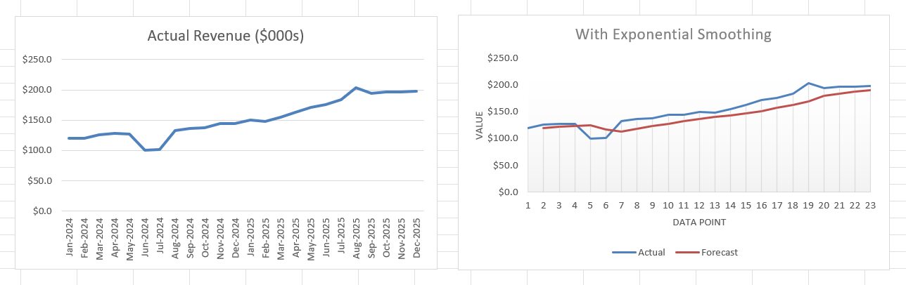
Example: Smoothing quarterly financial performance data to filter out short-term noise before presenting a trend to stakeholders. The smoothed line makes it much easier to see whether performance is genuinely improving or just bouncing around a flat baseline.
Trend Analysis Techniques
1. Moving Averages with AVERAGE and OFFSET
Moving averages are one of the simplest and most reliable Excel trend analysis techniques for cutting through short-term noise and revealing the underlying direction of your data.
Syntax:
=AVERAGE(OFFSET(range, start, 0, end))
Example: Building a rolling 3-month average for sales data lets you see whether sales are trending up or down without getting distracted by a single unusually strong or weak month. As new data comes in, the moving average window shifts automatically, keeping your trend line current without manual updates.
Related: Use these guides to learn more about the AVERAGE and OFFSET functions.
2. Regression Analysis with LINEST
For a deeper look at the relationship between variables — for example, how marketing spend correlates with revenue — the LINEST function and the Data Analysis Toolpak's regression tool give you statistical detail beyond a simple trend line.
Syntax:
=LINEST(known_y's, known_x's, [const], [stats])
Setting stats to TRUE returns additional regression statistics, including R-squared, which tells you how well your model explains the variance in the data — critical for knowing how much confidence to place in a forecast.
Visualization: Pair your regression output with a scatter plot and trendline (right-click a data series > Add Trendline) so stakeholders can see the relationship visually, not just as a formula result.
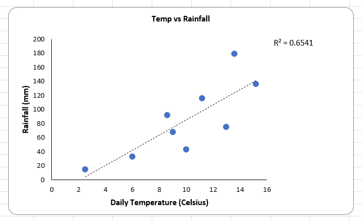
The trendline in the above example shows that warmer days tend to bring more rainfall, but the R-squared value of 0.65 shows that our confidence should be moderate, indicating that other factors may be at play.
3. Dynamic Trend Charts
Static charts go stale the moment new data arrives. Dynamic trend charts update automatically, which matters when you're maintaining recurring monthly or quarterly reports.
Techniques:
- Use named ranges built with INDEX or OFFSET so your chart's data range expands as new rows are added.
- Combine dynamic ranges with sparklines (Insert > Sparklines) for a compact, at-a-glance trend summary next to each row of data.
Best practice: Set up your dynamic named range once, then base your chart and any related formulas on that name rather than a hardcoded cell range. It's a small setup cost that saves significant maintenance time later.
Real-world scenario: Forecasting monthly revenue growth
Here's how these techniques come together in practice, using historical sales data to forecast monthly revenue growth. Download the file below to get some hands-on experience using an Excel dataset.
Download the practice workbook
We'll send the downloadable file to your inbox.
- Smooth the data. Calculate a 3-month moving average to reduce the noise in your historical sales figures.
- Forecast forward. Apply FORECAST.LINEAR to the smoothed data to project the next three to six months.
- Visualize the result. Build a dynamic chart with a trendline overlaying both historical and forecasted values, so the transition from actuals to projections is clear at a glance.
Outcome: A forecast that's grounded in smoothed historical data, projected with a statistically sound method, and presented in a way that's easy for non-technical stakeholders to interpret and trust.
Tips and best practices
- Automate updates. Build your models around dynamic named ranges so they refresh automatically as new data comes in, rather than requiring manual range edits every reporting period.
- Handle errors gracefully. Combine AGGREGATE or IFERROR with your forecasting formulas to manage blank cells, text values, or other inconsistencies without your model breaking.
- Visualize trends clearly. Sparklines and conditional formatting are quick, low-effort ways to highlight the story in your data before anyone even reads the numbers.
Ready to become a certified Excel ninja?
Start learning for free with GoSkills courses
Explore Excel coursesConclusion
Financial analysts live in spreadsheets. Between quarterly close, budget reviews, and ad hoc requests from leadership, you're constantly asked to turn a wall of historical numbers into a confident answer about what happens next. The problem is that historical data doesn't interpret itself — spotting a real trend versus a random blip, or building a forecast that holds up under scrutiny, takes the right tools and the discipline to use them consistently.
Accurate forecasting and clear trend analysis are what separate a report that gets questioned from one that gets acted on. Functions like FORECAST.LINEAR and TREND, paired with moving averages, regression analysis, and dynamic charts, give financial analysts a toolkit that covers everything from a quick monthly projection to a full statistical breakdown of what's driving the numbers.
The best way to make these techniques second nature is to practice them on your own datasets — try applying a moving average or a FORECAST.LINEAR projection to a real report you're already working on.
Ready to go deeper? Build on these skills with GoSkills' Financial Modeling Techniques course, where you'll learn to construct full financial models step by step in Excel, taught by award-winning instructor Liam Bastick.