

Join the Excel conversation on Slack
Ask a question or join the conversation for all things Excel on our Slack channel.
Picture this: Your boss just sent over a massive Excel file. It has hundreds—or maybe even thousands—of rows of data. And, to make things worse, within all of those digits he would like you to find a very specific trend or piece of information.
Is your head spinning? Are your eyes glazing over? You aren’t alone. Staring at all of those rows, columns, and numbers is overwhelming.
Fortunately, Excel is incredibly powerful and literally exists to take the elbow grease out of the very data analysis that’s being requested of you.
In this Pivot Table tutorial, we’re going to show you how to use this awesome feature, in five easy steps.
Practice makes perfect!
Download your free excel spreadsheets to practice
What is a pivot table?
Don’t run for the hills just yet. You’ve likely heard of pivot tables before. And, if you’re like most people, you immediately wrote them off as yet another Excel tool that was too complicated for you to master.
But, they can actually be surprisingly simple to utilize—and, they’re sure to remove a lot of headaches from your data management duties.
Put simply, a pivot table summarizes your data. It empowers you to extract significant trends or findings from what is otherwise a totally overwhelming spreadsheet.
Curious? Check out this video to see all of the different capabilities of an Excel pivot table:
But basically, all you need to know is that something that would typically take a long time can be done quickly and painlessly when you build a pivot table. And don't worry, this pivot table tutorial will guide you!
How to build a pivot table: A case study
You get it—pivot tables are awesome. However, that doesn’t change the fact that you have no clue how to build one.
Well, have no fear! We’ll walk you through it step by step. And, since there’s nothing like an example to add some clarity, let’s look at a specific scenario when a pivot table could be helpful.
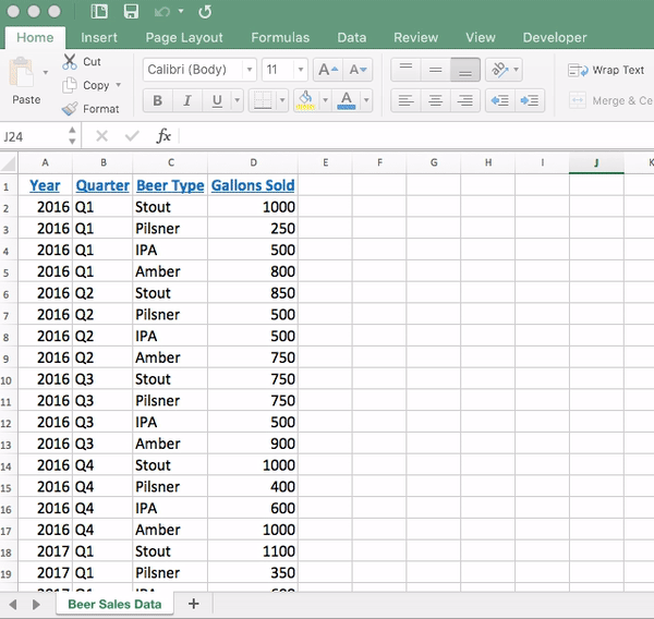
Meet Jason. Jason brews and sells craft beer in a quaint brewery in his hometown. In order to better manage his inventory and brewing schedule, he wants to see if there are any trends in terms of the type of beer that sells most each quarter.
For example, do people drink more dark beer in the wintertime? Getting a better grasp on any seasonality would help him a lot, but to start he only has a spreadsheet that breaks down his sales of each type of beer (stout, pilsner, IPA, and an amber) per quarter in 2016 and 2017.
So, to make this easier, Jason has decided he’s going to build a pivot table to see which beer he sold the most of during each quarter.
Let’s walk through the steps along with Jason.
1. Clean your data
Before you start building anything in Excel, it’s smart to take a quick look at your data to ensure that everything looks correct.
Spelling is something that you’ll want to pay especially close attention to when building a pivot table. For example, if Jason had a typo that said “Sout” instead of “Stout” somewhere in his spreadsheet, the pivot table would pull both of those into the data summary.
Want a quick way to check if there are any spelling errors? Highlight only the first row of your data, click on the “Data” tab of your ribbon, click “Filter,” and then click the arrow that appears on the column header to see all of the different items that are listed within that column. Obviously, this tip works best for more manageable data sets.
Finally, while we’re talking about column headers, it’s important to note that Excel will not create a pivot table unless each of your columns has a heading. So, make sure those are in place before you get started! Try using PowerPivot to clean large data sets quickly and easily.
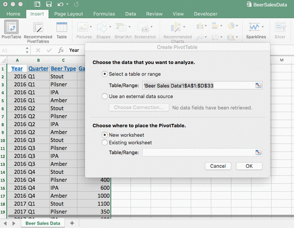
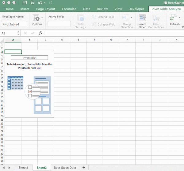
2. Insert pivot table
Believe it or not, we’re already to the point in the process when you can insert a pivot table into your workbook.
To do so, highlight your entire data set (including the column headers), click “Insert” on the ribbon, and then click the “Pivot Table” button.
3. Choose where to place your pivot table
After clicking that “Pivot Table” button, you’ll be met with a popup that asks where you’d like to place your pivot table. You have two options:
- New Worksheet: Meaning it’ll appear on a separate tab from where your raw data lives
- Existing Worksheet: Meaning it’ll be placed right within that same tab with your raw data
Ultimately, this comes down to personal preference. So, Jason is going to go ahead and choose to put his pivot table in a new worksheet. He selects that option, clicks “OK,” and then his pivot table and another popup will appear.
4. Select what your pivot table should include
This is the part that gets the most confusing for people. In this step, you need to select the data that you want to pull into your pivot table.
So, in Jason’s case, he wants to see the different quarters, the types of beer, and the gallons sold of each during those quarters.
To pull them into the pivot table, Jason will simply drag them into the appropriate spots for rows, columns, and values.
There are obviously exceptions to this rule, but when you’re just getting started, this is a good way to think about each of these things:
- Rows: Will be your time increments, whether that’s quarters (like Jason), months, years, etc.
- Columns: Will be your identifiers—the different ways that you could ID the data. In Jason’s case, that’s the types of beers.
- Values: Will be the metric that you’re measuring. Again, in Jason’s case, it’s gallons of beer sold.
After you’ve dragged those into the appropriate spots, close out of that pop-up and you’ll see your pivot table.
5. Do your analysis
Now, your pivot table will be populated. Before rolling up your sleeves and diving into the analysis, this is a good opportunity to double-check things. Are you seeing all of the elements that you selected? Does anything look off to you?
If not, you’re good to go—you’re ready to use your pivot table to identify trends!
For example, Jason can see that he sells far more stouts (which is a darker, heavier beer) in the first and fourth quarters—which makes sense, as those are the colder months. In contrast, he sells way more pilsners (a lighter, crisper beer) in the second and third quarters—which are the warmer months.

Now, he can leverage the information he discovered through his pivot table to better map out his brewing schedule and manage his inventory of craft beer.
Is your thirst not quenched with our beer example? Here's another real-world case study from Microsoft on how to manage household expenses with pivot tables.
Ready to get started?
We’ve only started with the basics with this example. There’s so much more you can do to slice your data in different ways and really zone in on different pieces. Check out our advanced pivot table techniques article to find out more!
Eager to learn more? Sign up to our Pivot Tables Course to discover even more tips and tricks that you can use to leverage this powerful tool to your advantage. We promise—once you master them, you’ll be hooked!
Level up your Excel skills
Take the Pivot Tables course today!
Start free trial
Join the Excel conversation on Slack
Ask a question or join the conversation for all things Excel on our Slack channel.