Power BI 2017
Power BI 2017
Skills you’ll gain
Make your data come to life with beautiful, interactive reports in Power BI. In this online course, you will learn how to use Power BI's analytics tools to transform dull data into dazzling dashboards, reports and visualizations to understand key business insights at a glance.
Designed for beginners, no prior experience is required to start analyzing and visualizing data with Power BI. You will learn step by step how to use your data to build reports in Power BI Desktop, and publish them to the cloud service where you can create and share your personalized dashboards. By the end of the course, you will be equipped with the business intelligence skills to get the meaningful answers you need to make informed decisions for your business.
Your skills can be used across many industries, including Marketing to monitor the effectiveness of campaigns, Finance to oversee financial performance, and Sales to manage quotas against forecasts.
Highlights:
- 39 practical tutorials.
- Understand the difference between dashboards and reports.
- Add data from Excel, a text file or CSV to create reports in Power BI Desktop.
- Publish and update your data in the Power BI cloud service.
- Learn how to share a Power BI dashboard to collaborate with others.
- Understand key concepts for relating data in order to link tables together properly.
- Create a calendar table that dynamically updates with your data.
- Learn how to use Data Analysis Expressions (DAX) to perform calculations.
- Create a range of stunning visuals to display your data, including charts, maps, tree views, and tables.
- Design custom visuals with the Chiclet Slicer.
Once enrolled, our friendly support team and tutors are here to help with any course related inquiries.
Syllabus
Download syllabus-
1
Getting Data From a Text file We will begin our journey by pulling some sales data into Power BI from a text file, as well as making some minor manipulations to the data. 7m
-
2
Creating visuals This lesson covers an introduction to create different visuals and cross filtering in Power BI. 6m
-
3
Publishing to the Power BI service This module covers how to publish your data into the Power BI service, explores the feature parity between desktop and cloud, and covers how to update your data in the service. 3m
-
4
Dashboards vs Reports Dashboard is a loaded term to Excel users, and Power BI calls those reports. So what is a "Dashboard", and how do we create one? 6m
-
5
Sharing Power BI Reports and Dashboards In this module we will look at the methods of sharing your BI artifacts. We explore sharing without using the cloud, as well as sharing both within and external to your "tenant". 7m
-
6
Working with Q&A What is Q&A? Great question! Check out this module not only to get an Answer, but to learn how to tailor those answers as well. 6m
-
7
Generating Quick Insights If you've ever had a challenge creating good business intelligence visuals, why not let the system help? This module is all about making the system do the hard work so that you don't have to. 4m
-
8
Working with Alerts Dashboards are all about exposing problems. So why not let the system notify you when something goes offside? 6m
-
1
Adding Excel Data to an Existing Power BI Model In this module we will explore collecting Budget data to link into our dashboards. The only issue is that it comes from a completley different source: an Excel file. 5m
-
2
Key Concepts for Relating Data This lesson focuses on the characteristics that are required in order to link tables together properly, as well as a key tip that will prevent getting yourself into trouble later. 6m
-
3
Solving m:m Joins via Composite Keys One potential source of m:m (many to many) join issues in Power BI can be solved by combining multiple columns into a "composite key" in order to relate tables together. This module will dig into this issue, as well as how we solve the problem. 6m
-
4
Solving m:m Joins via Table De-Aggregation In this module we'll explore how to build dimensional tables that solve the m:m (many to many) linking problem, allowing you to create much more robust models. 4m
-
5
Table De-Aggregation - Application This module shows how to apply de-aggregation to our sample model. The end goal here is to avoid m:m (many to many) joins by creating new dimensional tables that can be linked into the model via 1:m (one to many) relationships. 7m
-
6
Dynamic Calendars – Theory Every model that will perform any kind of date/calendar intelligence must have a proper calendar table. This lesson gives you the tips that you can apply to any model to build a calendar table that dynamically updates with your data. 3m
-
7
Dynamic Calendars – Application It's now time to build a dynamic calendar on the fly for our sample model. After identifying your calendar's start and end dates, it's one line of code, 5 clicks, 4 characters and the Enter key, and you're set. 7m
-
1
Basic Measures – Theory In this module we'll explore how to use Power BI's formula language to create re-usable "Measures" 5m
-
2
Basic Measures – Application It's now time to apply our knowledge of basic formulas, and build measures that add business intelligence value to our sample model. 7m
-
3
Understanding Measure Calculation Creating measures is all very well, but you need to understand why they return what they do. In this module we will explain how to identify the filter context applicable to your data point, and how that influences the way measures are calculated. 5m
-
4
Performing Math with Compound Measures This lesson explores the syntax and practical application of adding or subtracting measures from each other, and lays the groundwork for creating more complicated mathematical combinations 6m
-
5
The CALCULATE() Function – Theory CALCULATE() is the super-charged SUM(anything) function, and mastering it is the secret to truly mastering Power BI's formula language. In this module we will show how it works, as well as how it impacts basic measure calculation. 5m
-
6
The CALCULATE() Function – Application In this module we will review several CALCULATE() functions that live in a real model, showing how they work and add value to our business intelligence. 6m
-
7
The ALL() Function – Theory How do you ensure that your "All Time Sales $" retains it's "All time" status when someone click on a visual and cross filters your report? This lesson is ALL() about the function that lets you do exactly that. 3m
-
8
The ALL() Function - Application In this module we look at practical examples of using the ALL() function to modify and override the filter context, resulting in measures that only change when we want them to. 5m
-
9
Quick Measures Quick measures are ready-rolled formula patterns built through a drag and drop user interface, allowing you to write really complicated formulas for you without having to learn all the nuances of Power BI's DAX formula language. 5m
-
1
Global Visual Concepts In this module we will look at some of the global features that are applicable to many visuals including formatting options, drill down, tooltips and more. 7m
-
2
Bar & Column Charts In this module we will take a look at creating bar and column charts to display our data. 4m
-
3
Line Charts Line charts are a great way to show trends over time, and we'll explore doing so here. 4m
-
4
Combination Charts Combination charts combine line and column charts into a single visual. They are very useful for showing values versus a standard or target. 4m
-
5
Maps & Filled Maps Working with maps can be a bit tricky. This module will explain the good, the bad and the ugly of maps, as well as provide recommendations to avoid the ugly. 6m
-
6
Pie Charts In this lesson we'll explore Power BI pie charts, donut charts and their characteristics. 4m
-
7
Treeviews Also known as "breakdown trees", this visual can show interesting statistics about the makeup of your data sets. 5m
-
8
Cards Cards are super useful in order to drive alerts. They also have a close cousin called the multi-row card. In this module we will explore both, as well as their pros and cons. 5m
-
9
Matrix The matrix is similar (but not the same as) Excel's PivotTable. In this lesson we will show how to work with this specific visual. 6m
-
10
Tables Summary tables are a great way to convey key indicators and underlying data points. 4m
-
11
KPIs KPIs are great for showing you most recent period’s performance versus a target value, with a longer term trend as an area chart in the background. 5m
-
12
Custom Visuals - Chiclet Slicer When the default visuals are not inspiring, or you just need to use a visual that Microsoft doesn’t supply by default, you can often find another version in the Custom Visual store. In this module we will look at the Chiclet Slicer, a vast improvement over Power BI's native Slicer visual. 6m
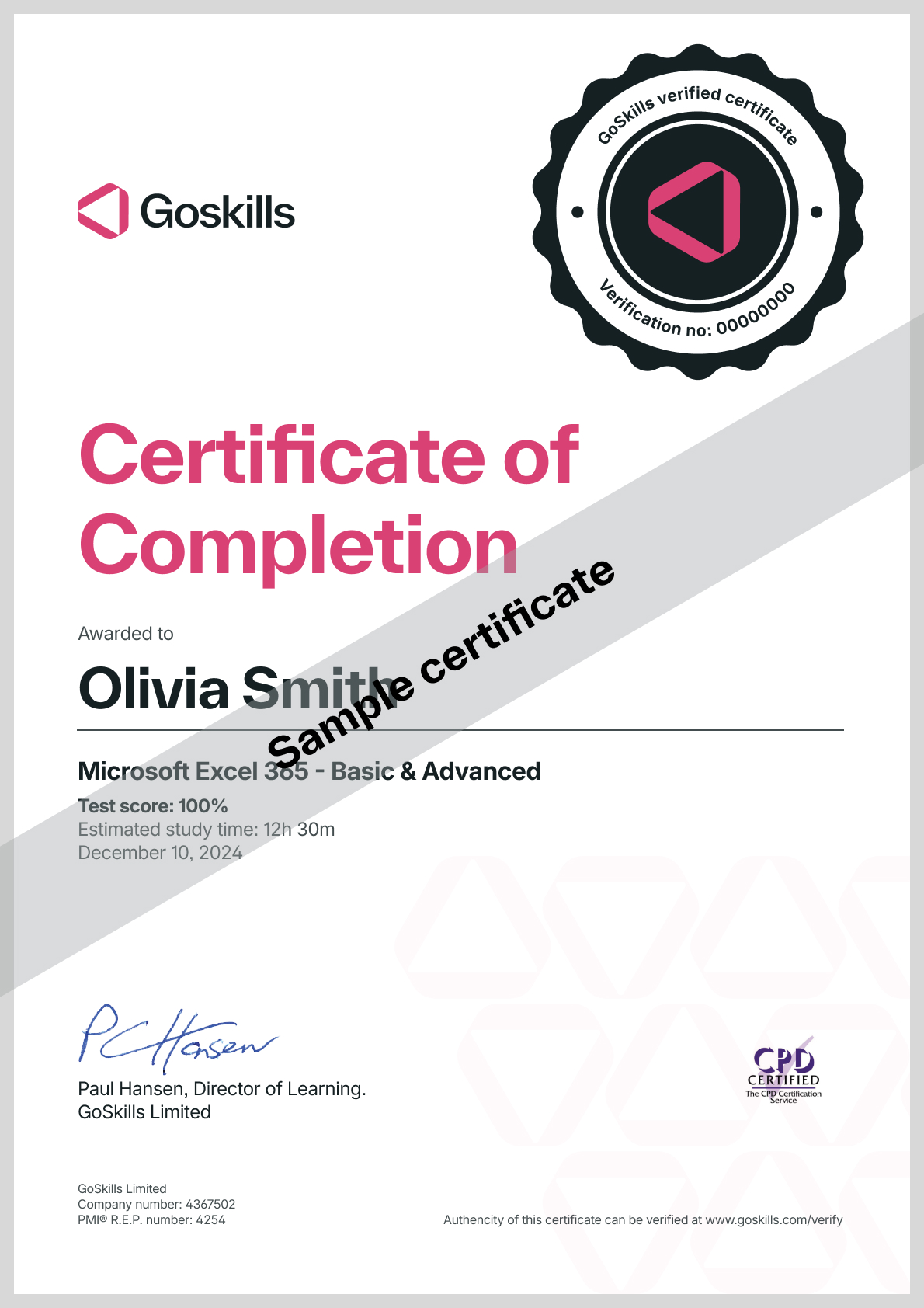
Certificate
Certificate of Completion
Awarded upon successful completion of the course.

Instructor
Ken Puls
Ken Puls is a globally recognized authority in Microsoft Excel, Power Query, and Power BI, with over two decades of hands-on experience in accounting, IT, and business intelligence systems. His career began in public practice accounting and industry, where he served as both Controller and IT Director, leading numerous system implementations and designing custom business intelligence solutions from the ground up.
Ken’s deep technical expertise is matched by a passion for teaching and community engagement. He has authored several acclaimed books, including RibbonX – Customizing the Office 2007 Ribbon, Power Query Recipes, and Master Your Data with Power Query in Excel and Power BI. His writing reflects a clear, practical approach to solving real-world data challenges.

Ken Puls
Excel MVP
Accreditations
Link to awardsHow GoSkills helped Chris
I got the promotion largely because of the skills I could develop, thanks to the GoSkills courses I took. I set aside at least 30 minutes daily to invest in myself and my professional growth. Seeing how much this has helped me become a more efficient employee is a big motivation.


