Photoshop - Advanced
Photoshop - Advanced
Skills you’ll gain
Have some experience with Photoshop and want to improve your skills, or taken our Photoshop Beginners course? This online course will help you learn intermediate and advanced Photoshop techniques.
In 55 engaging lessons you will learn how to use advanced techniques including creating animations, basic video editing, tool recording, a variety of text effects and more.
Whether you use Photoshop for work, study, or leisure, these tutorials will help you on your journey to becoming a Photoshop pro!
Videos tutorials are recorded in Adobe Photoshop CS5 and CS6.
If you haven’t used Photoshop before, try our Beginners course. And if you'd like to know everything - from beginner to advanced lessons, why not take both?
Once enrolled, our friendly support team and tutors are here to help with any course related inquiries.
Syllabus
Download syllabus-
1
Basic Video Editing in CS6 and Above Extend your Photoshop skills into the time dimension. Add effects and layer styles with ease. Turn a ho-hum phone video into expressionist art. 4m
-
2
Clouds Animation Create a time-lapse style effect with some simple video effects in Photoshop. 4m
-
3
Animated Loading Circle This tutorial will show you how to make an animation that pulses a great light effect with layer styles and animation. 6m
-
4
Animated GIF on Mars When reality is just not interesting enough you can always rely on Photoshop to spice it up. This unit is a good introduction to GIF creation. 12m
-
5
Glowing Button Combine layered styles and animation to create this great effect. 13m
-
6
Animating a Power Button: Frame Animation Turn a static design into a glowing button by using the Frame style of animation in Photoshop. 4m
-
7
Load Files into Stacks and Converting to a GIF Bring in a number of files simultaneously and get Photoshop to organise and align them in layers. 3m
-
1
3D Text Intro Turning your text into a 3D object opens up lot of interesting possibilities. Control textures, deform shapes, and add lights and shadows to your text in realistic ways. 2m
-
2
Chrome Text Explore Photoshop’s (CS6 and above) 3D text generator. 7m
-
3
Bubbly Text Create inflatable text with the 3D properties in Photoshop. 10m
-
4
Long Shadow Effect The long shadow is a clean design look that can be created a few different ways in Photoshop; here we achieve the look by using 3D objects. 5m
-
5
Importing 3D Models Importing a 3D model into a 2D background can be tricky, but with a few simple steps you will be able to blend lots of design elements like lighting, position, color tone, and texture. 5m
-
6
Image Based Lights Improve the realistic look to your 3D images with Image Based Lights. 2m
-
7
Create a 3D Pool Ball Create and add 3D objects to an existing photograph with this tutorial. Create a new texture, add lights and composite it in an existing photo. 6m
-
8
TRON Legacy Text Effect This tutorial will teach you how to create 3D text, edit many useful features and then add 2D elements as well. 6m
-
1
Missing Filters The more up to date versions of Photoshop have tucked away some of the rarer filter effects. Find out how to drill down into the filter gallery. 1m
-
2
Adaptive Wide Angle Straighten out those distorted images with this very clever Photoshop Feature. 2m
-
3
Working with Kuler The Kuler extension for Photoshop makes finding great color combinations a breeze. 2m
-
4
Color Coding Layers Organise your complex Photoshop projects with this simple tool. Particularly useful for template projects that you will be coming back to again. 3m
-
5
10 Just Do It (JDI) Tips 10 little Photoshop productivity tips. 3m
-
6
Hiding Menu Items Clean up your menu interface. 1m
-
7
Interface and Performance Improvements Improve your familiarity of Photoshop with this list of interface tips and tricks. 4m
-
1
Fireworks Text Effect Transform text into a path and apply a brush present to a path. 5m
-
2
Hairy Text Effect Give text a furry feel within a few easy steps. 6m
-
3
Beer Text Effect Add a frothy amber liquid appeal to your text. 12m
-
4
Wood Engraved Text Effect Add text or a logo and create a great wood texture effect. 8m
-
5
Graffiti Text Effect In this tutorial Howard will introduce you to Displacement Mapping, which is a fancy way of saying ‘making text bumpy’. 9m
-
6
Battlefield 3 Text Effect The video game is such a classic that of course you need to make text look like it. 5m
-
1
Refine Edge Tool Refine the edge of a selection so that fine strands of hair can be included with the person or animal in the photo. 10m
-
2
Copy CSS Let Photoshop do your geek work for you with this simple but powerful method for converting Photoshop designs to flexible web formats. 3m
-
3
Tool Recording within Actions Record repetitive edits so that you can save time. 2m
-
4
Clone Source Panel A few more tips for using the clone source tools on Photoshop. 1m
-
5
The Swatch Panel Advanced Grab a color scheme from a web pages CSS data. 1m
-
6
Transforming Selections Transforming the size and shape of a selection masks from within the mask mode. 3m
-
7
Conditional Actions Delve into Photoshop’s one button solution to repetitive editing tasks. 2m
-
8
Generator This is an advanced technique for those who want to design their web pages primarily in Photoshop. 5m
-
1
iOS Icon Design Design an app icon for IOS or Android. 7m
-
2
Create a 3D Switch Icon With the principles of this design you can create all sorts of switches, toggles and doorways. This is a good tutorial for learning how to stack and transform layers. 5m
-
3
Create a Space Scene Make stars and planets to design your own Solar System in the Cosmos. 9m
-
4
Create the Minecraft Icon Get that pixelated look into your image editing, or use the basics of this lesson to apply 2D images to a cube shape. 7m
-
5
Minecraft Skin This technique is good for adjusting images at the pixel level. 4m
-
1
Lightroom Smart Previews Work with files in an offline mode. 4m
-
2
Lightroom Upright This is a onestep solution in Lightroom for straightening up photos, and saving the need to take it into Photoshop for a simple edit. 1m
-
3
Lightroom Radial Filter Use the radial filter to add quick vignettes and style touches directly in Lightroom. 1m
-
4
Lightroom Healing Brush Lightroom has a few ways to repair spots and blemishes in photos, explore them here. 1m
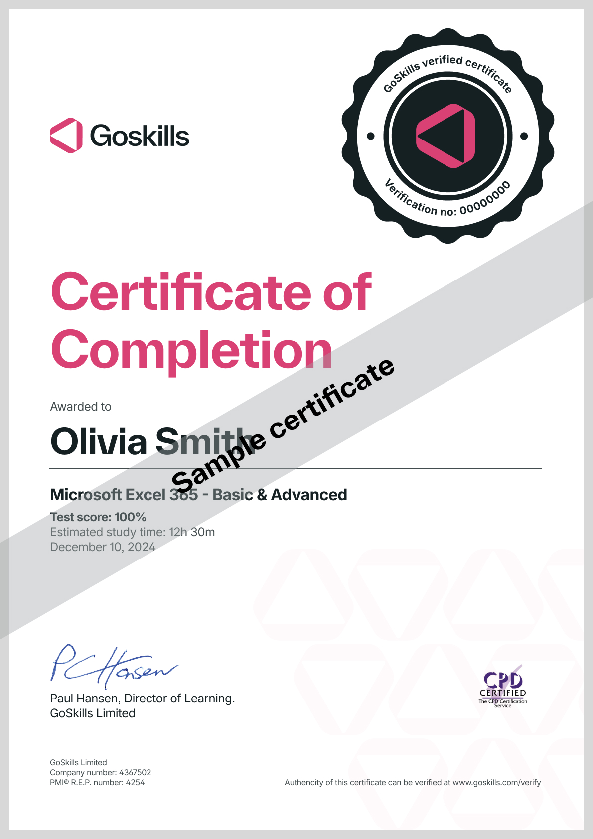
Certificate
Certificate of Completion
Awarded upon successful completion of the course.

Instructor
Howard Pinsky
Howard is an Adobe Community Professional and online educator providing content for Adobe Photoshop and Lightroom. His Photoshop tutorials have been recognized by schools around the United States, numerous design blogs around the Internet, and by Adobe itself. Howard's work can also be seen on YouTube and through Adobe's education portals.
Howard has been using Photoshop for the past 11 years and has primarily focused on design education over the last 7 years, to provide accessible and engaging online video tutorials. Today, Howard is a marketing manager at Fullscreen in Los Angeles and still provides handy Photoshop tips on his dedicated YouTube channel.

Howard Pinsky
Adobe Community Professional
Accreditations
Link to awardsHow GoSkills helped Chris
I got the promotion largely because of the skills I could develop, thanks to the GoSkills courses I took. I set aside at least 30 minutes daily to invest in myself and my professional growth. Seeing how much this has helped me become a more efficient employee is a big motivation.


