Microsoft PowerPoint 2019
Microsoft PowerPoint 2019
Skills you’ll gain
Microsoft PowerPoint is an industry standard when it comes to creating effective presentations. If you are new to PowerPoint, or have some experience and want to sharpen your skills, then this online course is for you. It includes training on beginner, intermediate, and advanced Microsoft PowerPoint techniques.
In more than 30 engaging lessons you will learn to use themes and layouts, add audio visual components to your presentations, and much more. You will also progress through intermediate and advanced techniques such as adding animations, and printing, reusing, and copying slides, among others.
Whether you use PowerPoint for your studies or at work, these bitesize tutorials will get your journey to becoming a PowerPoint pro rolling!
The course is PowerPoint 2010, 2013, 2016, and Microsoft 365 compliant (previously known as Office 365). Video tutorials are recorded in Microsoft PowerPoint 2010, 2013, and 2016 for PC, so you can learn the techniques across these versions.
For the latest version of PowerPoint, visit our new Microsoft PowerPoint course now.
Syllabus
Download syllabus-
1
The Content Placeholder and Bullet Levels Use placeholders to quickly add content to your slides including text, diagrams, and charts – so that you can later change the location and proportions of these objects, often with a single mouse click. 4m
-
2
Formatting Text Format text in your presentation so that it is legible and perhaps even pleasant to look at! 4m
-
3
Adding and Manipulating Shapes Add and work with shapes, which are one of the most important building blocks on a slide, including rectangles, ovals, and triangles. 3m
-
4
Duplicate and Add Multiple Shapes Reuse existing, formatted shapes to save time inserting shape content on your slides. 3m
-
5
Align and Distribute Shapes Align and distribute shapes (and other content) so that they are correctly positioned to quickly balance the content on your slides and prevent the same objects on different slides jumping to different locations during a slideshow. 3m
-
6
Group and Ungroup Shapes Group various shapes together into a single slide object to help you position the group of shapes in a specific location, while still gaining access to the size and formatting options available within PowerPoint for those individual shapes. 2m
-
1
Working with Pictures Since a picture is really worth 1000 words, add pictures, change their appearance and do so much more with these fundamental slide objects. 4m
-
2
Remove Picture Backgrounds Make the selected part of a picture transparent to either cleverly crop parts of the picture, or make parts of the picture transparent to overlay in front of other pictures without obscuring them. 3m
-
3
Photo Album Quickly add multiple pictures to a presentation even in the format of two or four pictures per slide. 3m
-
1
Introducing SmartArt Insert, add text to, and format SmartArt graphics to quickly add diagrams to your presentation which will assist you to tell your story. 5m
-
2
Adding and Editing Charts Select the right chart for your data, add it to a slide, know the basics of editing charts and quickly format charts. 6m
-
3
Advanced Chart Options Understand and work with the tricky parts of charts such as axes and legends. 5m
-
4
Structure Your Tables Add tabular data to your presentation in the form of a table and change the table’s appearance. 6m
-
5
Adding Audio Insert sound on your slides so that your presentation can play music, narration or other sound effects. 5m
-
6
Adding Video Insert video into your presentation and use various formatting options such as soft edges, or 3-D bevels to make your video really stand out. 9m
-
1
Less is More Have the confidence to know exactly what to animate without driving your audience crazy. 5m
-
2
Basic Animation Types Just like an actor, make objects enter the stage, exit, move around the stage and maybe even gain the attention of your audience in the correct way. 4m
-
3
Events and Speed Make your animated objects speed up or slow down, or play with or without your intervention, depending on which you desire. 7m
-
4
Motion Path Animations Make an object move along a defined or custom path to enhance the engagement of your audience or explain in animated form very complex topics. 6m
-
5
Transitions Add smooth or exciting transitions between slides to increase the smoothness and continuity of your slideshow into an almost movie-like format. 7m
-
1
Duplicating and Reordering Slides Reuse existing slides in your current presentation to save development time, as well as changing the order in which your slides play within a slideshow. 4m
-
2
Reusing and Copying Slides Reuse existing slides from another presentation, and retain the theme of that presentation if you wish. 4m
-
3
Working with Slide Sections Group your slides into common concepts or thoughts to help build your storyline, as well is quickly move all of the slides within that group to a new area of your presentation. 2m
-
4
Reset – the Magic Button When you work extensively on a chart, picture or slide and it doesn’t turn out exactly how you wish, quickly reset it back to what it was originally. 4m
-
1
Printing Slides Quickly print your slides professionally to give to your audience, or create PDFs to distribute either before or after the slideshow. 3m
-
2
Rehearsing Slides “Practice makes perfect” – so rehearse your slides and practice the delivery of your presentation. 4m
-
3
Exploring Slide Show Options Before you present your slideshow, set your show up to present in a variety of ways with the confidence that little will go wrong. 3m
-
4
Using Presenter View Use a special PowerPoint view so that even though your audience can only see the slide show, you can view slide timings, slide notes and even a preview of the next, upcoming slide. 3m
-
1
Morph Transitions Use the Morph transition to move objects when presenting a slide show. 3m
-
2
Insert Icons Inserting icons from the internet on your computer. 4m
-
3
3D Animations Inserting 3D models from the internet or your computer. 4m
-
4
Pre-Animated 3D Models Inserting animated 3D models from the internet on your computer. 2m
-
5
Insert Zoom Slides Creating a summary slide to navigate to specific presentation sections during a slideshow. 3m
Certificate
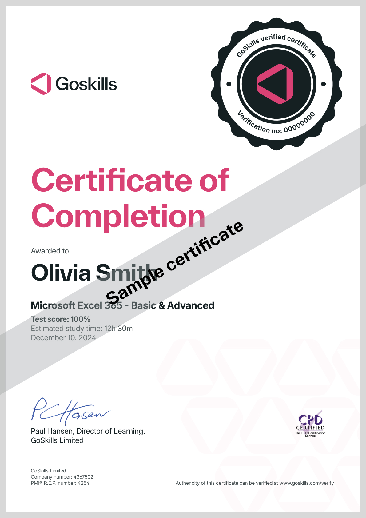
Certificate of Completion
Awarded upon successful completion of the course.

Instructor
Glen Millar
Glen is qualified in science and often uses PowerPoint to communicate complex topics to a wide range of audiences. He became frustrated with bad presentations, particularly in 2001 at a conference where he saw a very good topic presented badly. Determined to fix his own presentations (and then the world’s) he commenced working with presentation professionals to understand the presentation profession, PowerPoint as a tool, and the good and bad of presentations he encountered.

Glen Millar
PowerPoint MVP
Accreditations
Link to awardsHow GoSkills helped Chris
I got the promotion largely because of the skills I could develop, thanks to the GoSkills courses I took. I set aside at least 30 minutes daily to invest in myself and my professional growth. Seeing how much this has helped me become a more efficient employee is a big motivation.


