
It's time for our 15th Microsoft Excel challenge!
Download your challenge data!
Start working on the Excel challenge with this data workbook.
Today we’ll be testing some skills covered in our Microsoft Excel - Basic & Advanced course. Here’s how to participate in the challenge:
- Watch the challenge video
- Read the instructions below the video
- Download the Excel worksheet you will use to complete the challenge tasks
- Put yourself to the test!
If you want to chat about the challenge with other Excel-lovers, join our Slack channel to share your questions and solutions with like-minded learners. Don't be shy - we’re a fun bunch! 🥳😉
The challenge
Today we’re tackling monthly expenses.
Download your challenge data!
Start working on the Excel challenge with this data workbook.
Each expense is listed within a category table, with a "Last Month" vs. "This Month" comparison. So first, we want to find out whether we spent more or less money this month compared with last month and place that in the Difference column.
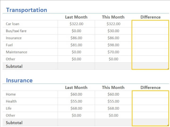
Since these are expenses, the less we spend, the better.
Tasks
1. Let’s use conditional formatting to visually represent the above. For expenses where we spent less this month, we want the font color in the difference column to be green. If we spent more, let’s make the font color red. And let’s also add traffic light icon sets.
2. Then to finish everything off, we want a chart on the Summary worksheet that summarizes the Last Month and This Month subtotals for each category and generate a bar graph or column chart to visualize the changes between last month and this month.
3. Can you create the graph so that adding a category on the Summary page shows up on the graph?
So to recap:
- Conditional formatting
- Summary page
- Graph
We’ve made these lessons from two of our popular Excel courses available so you can review working with Excel Tables and Conditional formatting.
If you're a more advanced user, you might be able to solve this fairly quickly. But maybe your challenge could be to tell us how many different ways you can think of to make the graph dynamic.
I’m ready if you are. Let’s go! We hope you'll enjoy taking part in this challenge!
Download your challenge data!
Start working on the Excel challenge with this data workbook.
The solution
If you enjoyed this challenge, try our Excel Data Visualization course to help you get the most out of Excel charts and visualization options. For all-round Excel skills, try the popular Excel Basic and Advanced course.
Stay tuned to the GoSkills Excel Resource hub for more Excel challenges, and check out our range of expert-led Excel courses for all skill levels to further sharpen your skills.

Join the Excel conversation on Slack
Ask a question or join the conversation regarding Excel challenges on our Slack channel.
Join Slack channel