
If you’re on your way to an interview for any role like front end developer or web content editor, you can be pretty confident that they’ll quiz you on CSS. If you’re still new to the styling standard of the web, this can be pretty daunting. There’s a lot of history and things are changing all the time.
However, there’s hope! These CSS interview questions and answers will help you show that you know the basics, some of the newer tricks, and that you know how to stay up to date - which will go a long way towards improving your chances of securing that coveted second interview.
Looking for more intervew prep? Check out our guides on HTML interview questions and Python interview questions.
- Explain the three main ways to apply CSS styles to a web page.
- Could you describe the different kinds of selectors?
- Explain the three main ways to target elements.
- How do you target something inside or around another element?
- What are pseudo elements and what are they used for?
- What are pseudo classes and what are they used for?
- What are attributes and how are they used?
- Can you describe the rules around specificity?
- Should you use !important?
- How do margin, border and padding fit together in the box model?
- What’s your preferred way of sizing fonts?
- What are web safe fonts and fallback fonts?
- How would you use media queries in a mobile-first approach?
- How do you handle browser differences in your user base?
- Do you use any tools for browser support?
- Have you used Flexbox & CSS Grid before? What are the differences between them?
- Do you use any CSS preprocessors, and which do you prefer?
- What is file splitting and why should you use it?
- What are variables used for?
- What are functions/mixins?
Interested in web development?
Learn all about it in our comprehensive (and free) ebook!
General questions
I’d be surprised if anyone would ask you this, but it can’t hurt to remind yourself what CSS stands for: Cascading Style Sheets. What makes it “cascading” is that styles defined lower down the document or with higher specificity (which we’ll cover further down) override those that came before. This means you can have generic styles, followed by rules that style more specific elements on the page.
1. Explain the three main ways to apply CSS styles to a web page.
You will, of course, need to know how to add CSS to a page, and there are three main ways:
Using the inline style attribute on an element
<div>
    <p style="color: maroon;"></p>
</div>
Using a <style> block in the <head> section of your HTML
<head>
    <title>CSS Refresher</title>
    <style>
        body {
            font-family: sans-serif;
            font-size: 1.2em;
        }
    </style>
</head>
Loading an external CSS file using the <link> tag
<head>
    <title>CSS Refresher</title>
    <link rel="stylesheet" href="/css/styles.css" />
</head>
The first two are useful but you’ll almost always be loading external CSS files. It’s more maintainable to keep your styles in separate files, not to mention it’s a nice separation of concerns.
2. Could you describe the different kinds of selectors?
A selector in CSS is the bit before the curly bracket, for example, body or .nav-item, that selects the content you want to style. The different kinds of selectors include tags, classes & IDs:
- A tag references an HTML tag
- A class references the
classattribute on an HTML tag - Likewise, an ID references the
idattribute on an HTML tag
<!-- tag -->
<section>
    <!-- class -->
    <div class="button-cta">
        <!-- id -->
        <a href="cta-click">Click me!</a>
    </div>
</section>
3. Explain the three main ways to target elements.
Now, in order to style certain elements on the page, you need to know how to specify those elements. There are three main ways to target something:
- By tag, e.g. you can target the
bodyorporspan - By the class you’ve specified in your HTML. For example, if you have three list items with the class
nav-itemyou can target them with.nav-item - By the ID you’ve specified in your HTML. For example, if you have a link with the ID
home-buttonyou can target it with#home-button
/* tag */
body { ... }
/* class */
.nav-item { ... }
/* id */
#home-button { ... }
Keep in mind that IDs should be unique, meaning that there should never be more than one item with a particular ID on a page. It’s also generally better to target tags for very generic, site-wide styles, and classes for more specific styles. You can use a unique class or modifier class instead of an ID if you really need to target a single item.
If you want to target something with two or more classes or IDs, simply concatenate them all together:
.button.nav { ... }4. How do you target something inside or around another element?
Sometimes you need to target something that’s next to something else or target something only if it’s inside a particular container. Luckily, that’s easy!
If you’re wanting to style occurrences of a certain class inside another class, you can write the following:
.nav .nav-item { ... }The above targets any .nav-item inside .nav. If you only want those that are immediately inside the .nav as opposed to any level deep, you can add the > character, like so:
.nav > .nav-item { ... }Want to target a button only if it’s next to another button? The + character has got you covered:
.button + .button { ... }5. What are pseudo elements and what are they used for?
Pseudo elements are used to style particular parts of an element, rather than the whole thing. For example, you can use it to style the first line or first letter of a paragraph, text you’ve selected, or you can use it to insert text or shapes before or after an element.
They always start with a double colon - although a single colon is still allowed for backwards compatibility - and they look like this:
p::first-line { ... }
span::first-letter { ... }
::selection { ... }
.header::after { ... }
.tooltip::before { ... }
6. What are pseudo classes and what are they used for?
Pseudo classes are similar to pseudo elements, but instead of styling a part of an element, they apply styles when an element is in a certain state. For example, you could style a button differently based on whether the user has their mouse pointer over it, or when they click the button.
Another common use case is to style only certain occurrences of elements in a row. For example, styling the first tab in a series of tabs, or every second tab.
They all start with a single colon and look like this:
.link:hover { ... }
.link:active { ... }
.tab:first-child { ... }
.tab:last-child { ... }
.avatar:nth-child(2n) { ... }
7. What are attributes and how are they used?
You already know about classes, which means you already know about attributes, seeing as a class is just one of the many attributes that HTML tags can have. There are a few that apply to all tags, like class and id, but a lot of tags have their own ones. For example, input tags can have a type (text, number, radio, etc) and a tags can have href.
You can target elements with particular attributes by using square brackets: [attribute="value"]. For example, you can target all input fields that are of type radio like so:
input[type="radio"] {
    background-color: #eee;
}
Specificity
8. Can you describe the rules around specificity?
If you’ve spent any time wrangling CSS, you’ve likely come across the tricky rules around specificity. What that means is which rules override others simply by being more specific.
The following list displays the order of specificity, from low to high:
- Type selectors (e.g.
h1) and pseudo-elements (e.g.::before) - Class selectors (e.g.
.nav-item), attributes selectors (e.g.[type="radio"]) and pseudo-classes (e.g.:hover) - ID selectors (e.g.
#example)
This is the reason it’s unwise to use IDs to target specific elements, as they are of a higher specificity. Using it in too many places can backfire later on, where you end up trying to override those styles, which can be hard to do.
Also, the more selectors you use, the higher it ranks in terms of specificity, e.g. button.primary[target="_blank"] is more specific than simply button.
/* low specificity */
button { ... }

/* higher specificity */
button.primary[target="_blank"] { ... }
9. Should you use !important?
Ahh, no way of escaping this one. When you’re wrestling with specificity, trying to override that one style, you may be tempted to add !important to your style. Think very carefully before you do so! It may seem harmless, but if you do this all over the place, you will soon find yourself in a big mess that you cannot get out of.
What !important does, is make that particular style have the highest specificity possible. Nothing else can override it, apart from another !important. You might be able to see where this is going, but once you start using them, you’ll almost certainly get into a position where you need to override a rule marked as !important, which forces you to use another one. And so the cycle continues.
/* high specificity */
.large .navigation.navigation-large {
    font-size: 2em;
}

/* will override the above, but it's dangerous! */
.navigation {
    font-size: 3em !important;
}
The CSS Box Model
10. How do margin, border and padding fit together in the box model?
While the border is pretty self-explanatory, it can be somewhat confusing to see the difference between margin and padding. Surely both simply add space around the element you’re styling?
The easiest way to understand is to look at a visual representation of it. Looking at the below image, the very centre rectangle is the size of your element. Immediately surrounding that is padding. Then comes the border, and only then comes the margin.
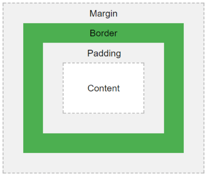
Padding adds bulk to your element, in between the border and the element. This means that if your element has a background color, that color will also fill the padding.
Margin adds empty space around your element. That means that the aforementioned background color will not fill the margin.
Interested in web development?
Learn all about it in our comprehensive (and free) ebook!
Fonts
11. What’s your preferred way of sizing fonts?
Something that has almost always come up for me is the way you size your text, mainly focused on the units you use. You can of course use pixels (px), but there’s also em, rem, %, vs and vh, along with a few others. Some people still don’t like using pixels, but browsers have improved and they’re generally handled pretty well.
Defining your font sizes in em allows you to change the size of your text based on the size defined at a higher level. For example, if a container has specified a font-size of 2em, and you specify a font-size of 2em on an element inside that container, that element has an effective font-size of 4em! However, this can be a little confusing as you might not always see the size you expect!
.container {
    font-size: 2em;
}

.container > p {
    font-size: 2em; /* this is 2em x 2em = 4em! */
}
The rem unit was created to remedy that confusion. It scales well in the browser, just like em and px, but it uses a base size. From that, all further rem values are calculated. For example, if your base rem value is equal to 16px, then 1rem will always be equal to 16px, 2rem will always be equal to 32px, and so on.
Note: While I’ve explained these units using font-sizes, the same rules apply to any dimensions where you use px, em or rem.
12. What are web safe fonts and fallback fonts?
Not all operating systems and browsers have the same fonts installed. Web safe fonts are fonts that are commonly pre-installed on many computer systems, such as Arial and Times New Roman. In case the browser or operating system doesn’t recognize the first font you set (e.g. Ubuntu), you should choose a web safe fallback font to display (e.g. Arial), followed by a generic font family (e.g. sans-serif). If your fallback font doesn’t display either, the browser can pick a generic font in the sans-serif family.
Media queries
13. How would you use media queries in a mobile-first approach?
There’s no way to avoid these nowadays, everyone expects their website to work on mobile devices, even if they don’t specifically ask for it.
The most common approach is the mobile-first one. All styles outside of media queries are targeted at mobile devices. Then, through progressively larger media queries, you can style larger screens one step at a time.
/* mobile styles */
body {
    font-size: 1em;
}

/* desktop styles */
@media only screen and (min-width: 768px) {
    body {
        font-size: 1.5em;
    }
}
Browsers
14. How do you handle browser differences in your user base?
In the past few years, browsers have come a long way. Modern browsers update automatically and provide pretty good feature coverage. There are still differences between browsers, and while some support certain features (like certain CSS styles), others don’t or display them differently.
Your biggest concern is legacy browsers. You may have seen jokes about Internet Explorer, and while the newer versions aren’t as bad, there are still a lot of people using older versions. These days it’s not uncommon to still support IE9, sometimes even IE8.
This can severely limit the kind of styles you can use, though most can be approximated using fallback styles. The @supports query in CSS can be very useful to scan if the user’s current browser has a certain feature. If they do, you can apply those styles without worry. If not, you can have some fallback styles as a backup.
For more information, have a look at the Mozilla documentation about @supports.
15. Do you use any tools for browser support?
One of my favourite online tools is caniuse.com. It’s a website that tells you exactly which browsers support which features, including CSS and JavaScript, which can be extremely helpful in finding out what you can and can’t use!
16. Have you used Flexbox & CSS Grid before? What are the differences between them?
Recently we’ve seen the rise of Flexbox and even more recently, CSS Grid. While these aren’t well supported in older browsers, support for them in newer browsers is continuously growing and now is the time to look into them and see if you can start using them. Make sure you check browser support!
Flexbox is a very useful layout tool, especially for smaller areas within the site. Its main features are to align items in horizontal or vertical axes, space them out automatically, invert the order in which they’re displayed, along with a few other layout options.
CSS Grid is more of a layout tool for the entire page. While Flexbox excels in laying out items along a single axis, Grid is better for layouts with both horizontal and vertical axes, i.e. grids!
CSS preprocessors
17. Do you use any CSS preprocessors, and which do you prefer?
If you’re working on a medium to large project, it’d be a good idea to use a CSS preprocessor. They allow you to write more concise CSS, split it up into multiple files and use a large number of very useful functions and mixins (you can even create your own!), along with variables.
The main players are Sass (also referred to as SCSS), LESS and Stylus, although arguably Sass is the biggest. I’ll be using Sass in the following examples.
18. What is file splitting and why should you use it?
File splitting helps organize your CSS into multiple files, decreasing page load time and making things easier to manage. If you’re working with any of the preprocessors above, you can start splitting up your files.
How you decide to split them up is up to you, but it can be useful to separate files by component. For example, you can have all your button styles in a file called _buttons.scss or all your header-specific styles in a file called _header.scss. Then, in your main file, say _app.scss, you can import those files by writing @import 'buttons';
This way you can also create separate stylesheets for separate areas of your website, where you might not need all styles. For example, if you have a web app, you probably don’t need to load all styles when people land on your homepage, when they haven’t even logged into your app yet. Simply create another file and import only those styles you need.
19. What are variables used for?
Variables are super useful for things like colors, fonts, font sizes, and certain dimensions, as you can be sure you’re always using the same ones, not 4 different versions of roughly the same color.
$primary-font-stack: 'Helvetica', sans-serif;
$primary-color: #fccd48;

body {
    color: $primary-color;
    font-family: $primary-font-stack;
}
20. What are functions/mixins?
Mixins are a very handy way of adding a number of styles, based on a particular input parameter. For example, you might always want to add fallback styles when adding border-radius, but you don’t necessarily know what value you might want.
@mixin border-radius($radius) {
    -webkit-border-radius: $radius;
       -moz-border-radius: $radius;
        -ms-border-radius: $radius;
            border-radius: $radius;
}

.box {
    @include border-radius(10px);
}
Ready to ace your next interview?
I hope this refresher was useful to you. I’ve only really scratched the surface of CSS here, but it should be enough to re-familiarize yourself with the big concepts for your next job interview. If you want to refresh your knowledge of the basics we’ve covered here, check out our Introduction to CSS course. And if you have an interview lined up at a start-up, you might like our expert roundup of the top eight startup interview questions to give yourself a competitive edge.
Good luck!