
You've familiarized yourself with the basics of using pivot tables to summarize your data, and now you feel like you're ready to tackle some advanced pivot table techniques. Look at you go!
Rest assured, there’s plenty more that you can do with pivot tables that we weren’t able to touch on when we were covering just the nuts and bolts. So, now that you’ve laid the foundation let’s break down some other tools and features you can use to make the most of the pivot tables you create.
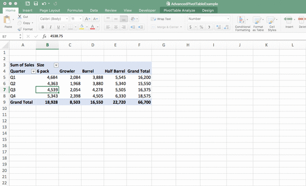
For clarity’s sake, let’s stick with the same example scenario that we used in our pivot table basics article: Jason, who brews and sells craft beer in his own hometown brewery and uses pivot tables to keep a close eye on his beer sales.
Ready to roll up your sleeves and dive in with some more advanced techniques for pivot tables? Let’s get to it.
Step up your Excel game
Download our print-ready shortcut cheatsheet for Excel.
1. Use slicers
While a slicer might sound synonymous with a rare form of torture, it’s actually an incredibly useful tool—and definitely something you’ll want to be familiar with when you’re analyzing a lot of data.
What exactly is a slicer? Put simply, it’s a way to link multiple pivot tables together so that you can filter your data for all of your pivot tables at once—rather than needing to change the filter on each of your individual pivot tables.
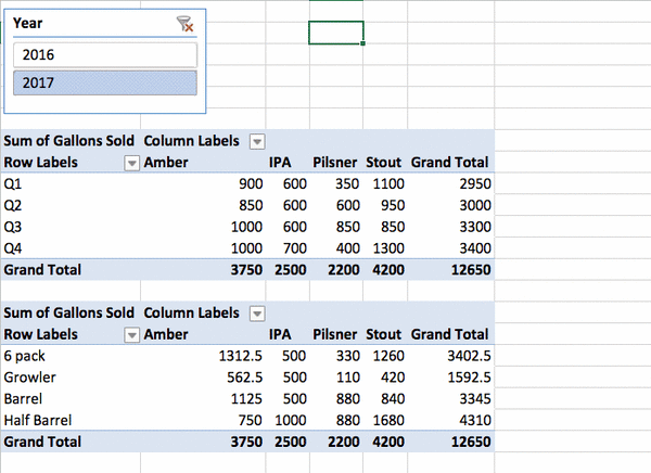
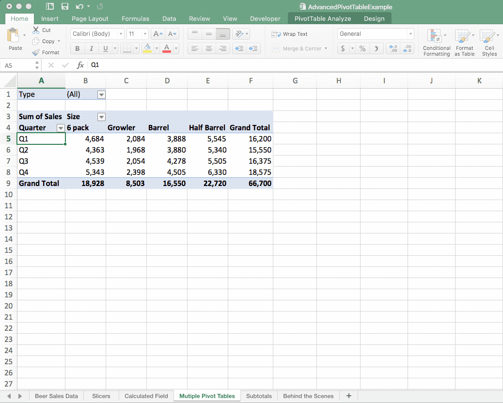
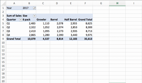
Let’s say that Jason is looking at two different pivot tables: One that displays beer sales by quarter and one that displays beer sales by size. Right now, he’s looking at his data for both 2016 and 2017.
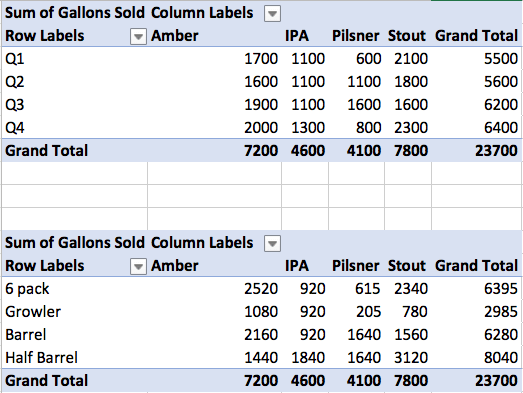
He really wants to drill down and view beer sales by quarter and by size for only 2016. Instead of needing to change the year filter on both of those pivot tables, he could create a slicer for the year. Here’s how to do that:
1. Click inside of the pivot table.
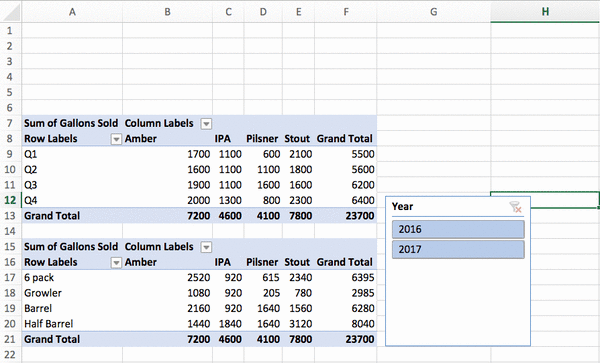
2. Head to “Insert’ and then click the “Slicer” button. Select the variable you want to sort your data by (in this case, it’s the year) and click “OK.”
3. Resize and move your slicer to where you want it to appear. I recommend positioning it on top of your pivot tables, so that you can look at everything in one glance.
 4. Now, Jason needs to link his existing pivot tables to that slicer so that all the data is associated with that particular slicer. To do so, right-click on the slicer, select “Report Connections,” and then choose the pivot tables that should be connected to that slicer.
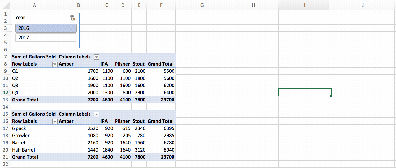 With that slicer setup, Jason can simply hit the button for 2016 to only see his data for that year in his pivot tables. While getting the slicer established involves a little bit of work, it can save you tons of elbow grease down the road—particularly if you’re using a lot of different pivot tables.
2. Create a calculated field
You know by now that Excel is a powerhouse when it comes to making calculations, and the ability to create a calculated field is something you’ll definitely want to have in your toolbox when working with pivot tables.
A calculated field allows you to keep a calculation running throughout a pivot table—similar to how you’d have a formula plugged in a standard spreadsheet.
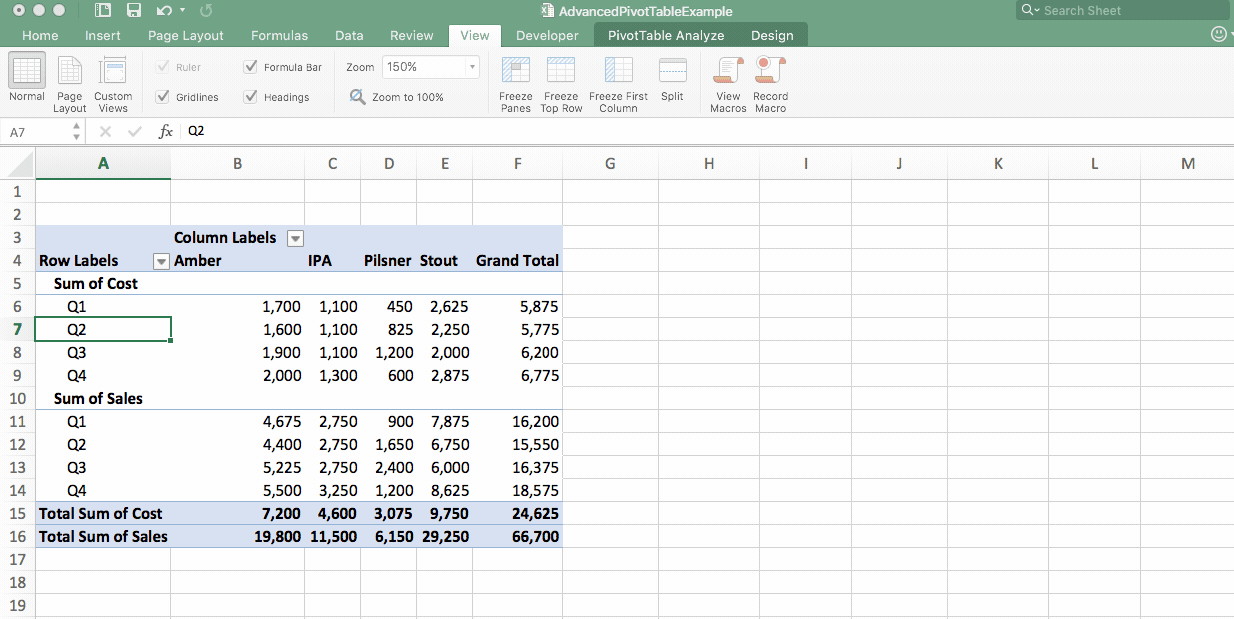
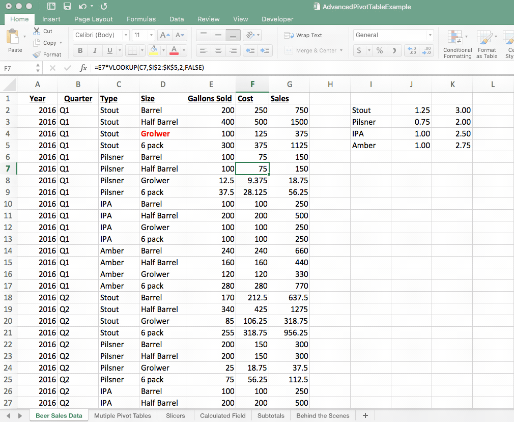
Jason wants to figure out his profit for each type of beer he sells: Pilsner, Stout, Amber, and IPA. Doing the profit calculation himself outside of the pivot table is rather cumbersome because he needs to subtract the Q1 cost from the Q1 sales, do the same for Q2, and so on and so forth.
He can set up a calculated field that will automatically crunch the numbers and tell him his profit for each type of beer. Here’s how it’s done:
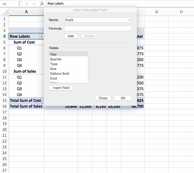
1. While clicked inside a cell of the pivot table, visit the “Pivot Table Analyze” tab of the ribbon, select the button for “Fields, Items, and Sets,” and then click on “Calculated Field.”
 2. In the popup, enter the name of the new calculated field (in this case, Jason would name it “profit” or something similar).
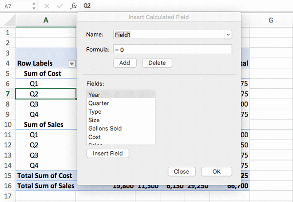 3. Now, Jason needs to enter the formula that he’s trying to calculate. To figure out profit, he knows he needs to subtract his cost from his sales. So, he would click on “sales” and hit “Insert Field,” type in the minus sign, and then click on “Cost” and hit “Insert Field.”
With that calculated field in place, Jason can easily see his profit for each type of beer—as well as his grand total profit—in the bottom row of his pivot table.
3. Create multiple pivot tables from one
When you want to break down your data even further, knowing how to split one pivot table into multiple tables is a handy trick.
Here’s an example: Jason has a pivot table displaying his beer sales by quarter. He wants to dig in deeper and see his beer sales for each quarter for each type of beer (Amber, Pilsner, IPA, or Stout).
To do so, he’s going to create a pivot table for each type of beer: one for Amber, one for Pilsner, and so on. Fortunately, he can do that with just a few clicks using his original pivot table as his starting point. Here’s how he’ll do it:
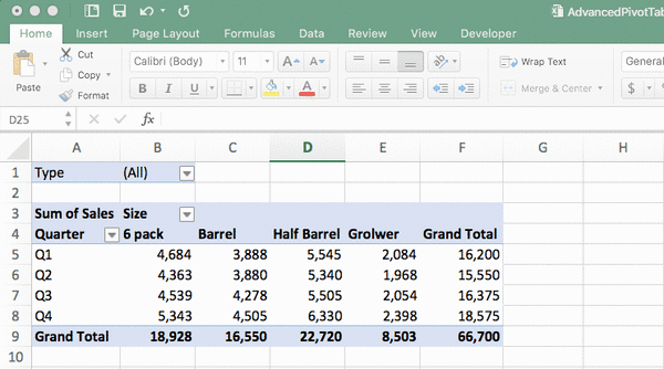
1. Whatever you want to filter your pivot tables by (in Jason’s situation, it’s a type of beer), you’ll need to apply that as a filter. Click within your pivot table, head to the “Pivot Table Analyze” tab within the ribbon, click “Field List,” and then drag “Type” to the filters list.
 2. With that filter applied, Jason, would click inside the pivot table, go back to the “Pivot Table Analyze” tab in the ribbon, click “Options,” and then select “Show Report Filter Pages.” After Jason highlights “Type” as what he wants to break the data down by, Excel will create a new worksheet with a pivot table for each type of beer.
4. Hide or unhide subtotals
We’ve already mentioned how Excel can save you some serious number crunching. But this doesn’t just apply to the total sum of digits. You can also display subtotals in your pivot table if you’d like.
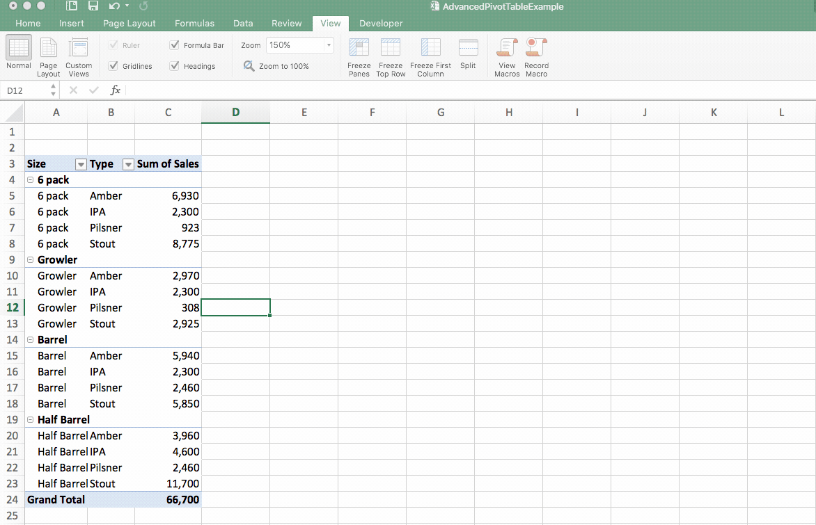
Let’s say that Jason is reviewing data on his beer sales by both size and type. With the way his defaults are set, Excel isn’t displaying the subtotals for each section—only his grand total of all beer sales.
Jason would like to take a look at that more broken-down data as well, and it’s plenty easy for him to do so:
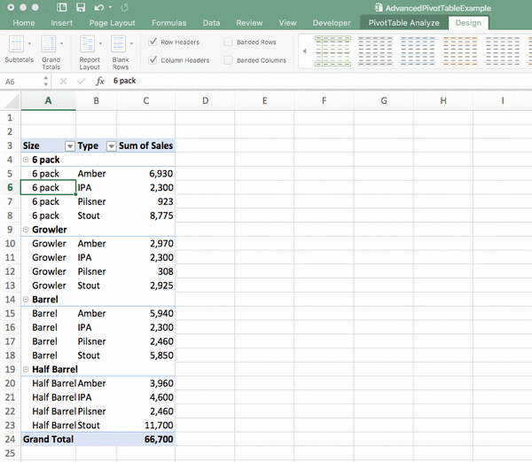
1. Click inside the pivot table and click the “Design” tab in the ribbon.
 2. Click “Subtotals” and then select whether to show the subtotals at the bottom or the top of your group (either way is fine—it’s all up to personal preference!).
 After doing so, Jason sees subtotals for each size of his beer offerings. If he wants to remove the subtotals, he can easily do so by following those same steps and selecting the “Don’t Show Subtotals” option.
5. Look behind the scenes of your pivot table
Here’s another pivot table technique that’s incredibly easy yet will save you tons of time and digging around through your data: You can take a detailed look at any number that appears inside your pivot table simply by double-clicking on it.
For example, Jason is looking at a pivot table that displays his beer sales by size and quarter in 2017, and he wants to see detailed information about his half-barrel sales in Q1. He needs to double-click on that number in the cell, and Excel will open up detailed information in a new worksheet.
6. Refresh your data
Here’s a worst-case scenario worthy of a horror film soundtrack: You’ve been working with your data for hours, and you’ve built tons of different pivot tables from your source data, just like we did with Jason here.
You take another look at some of your pivot tables, and you realize that you made a mistake—you have a typo in your data set. Jason accidentally spelled “growler” as “grolwer,” for example, and now it appears that way everywhere.
Does he have to go through his workbook with a fine toothcomb to correct that error everywhere it appears in his data and his pivot tables? Absolutely not. All he needs to do is:
1. Return to the raw data set where the pivot tables are pulling from and do a “find and replace.” He’d hit Ctrl + F and then enter what he wants to identify and what should be swapped out in its place.
2. Doing so corrected all appearances of “grolwer” in his data set but not in any of the pivot tables that are linked to that data.
 3. To make that update everywhere, go to the “Data” tab in the ribbon and then click the “Refresh All” button. That will make that same correction across the entire workbook.
Bonus tutorial: Pivot table styles
If you want to make your pivot tables even more visually pleasing, check out this video tutorial on pivot table styles:
Ready to make the most of pivot tables?
There you have it - six advanced pivot table techniques that you should definitely know. Put them to work, and you’ll make summarizing and analyzing your data a total breeze.
Eager to know even more about how to leverage the power of pivot tables to your advantage? Check out our course all about pivot tables and learn how to use powerpivot and you’ll transform yourself into a bonafide pivot table pro before you know it!