
Do you want to organise your data in a clear way so that you can analyse it easily and communicate the key insights?
In this article, we will show you how to do that with a step-by-step guide on how to make a variety of different column charts in Microsoft Excel.
Download the Excel worksheet to follow along:
Download your worksheet
Follow along with the steps in the article by downloading this worksheet
Why are column charts so useful
Here are five reasons why column charts are so great:
- Column charts are simple to create. You can create a column chart in just a few clicks.
- Users are more familiar with column charts than some of the other chart types. This makes them a sensible option as you want others to understand what you are presenting.
- There are a huge number of formatting options available with column charts.
- Column charts provide advanced options that are not available with some other chart types such as trendlines and adding a secondary axis.
- They are extremely versatile and can be used to compare data, to see progress toward a goal, percentage contribution, the distribution of data and actuals against target scenarios.
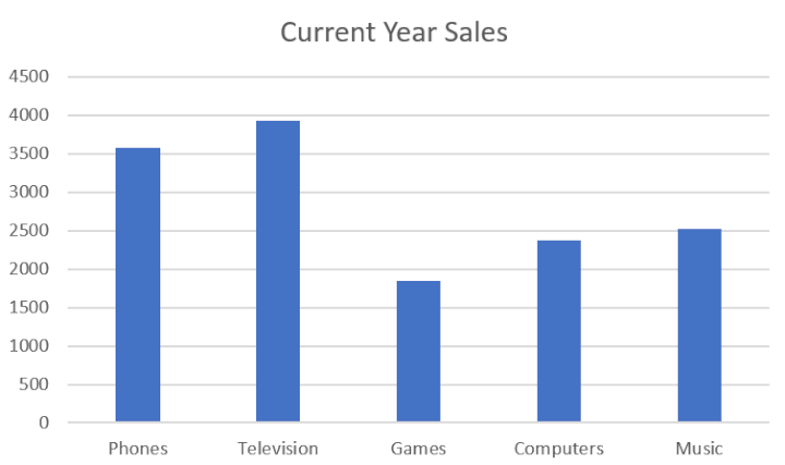
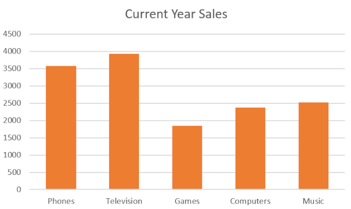
Below is a classic column chart. This chart is comparing the current year's sales of different products.
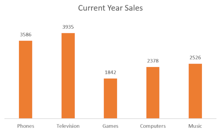
It is easy to interpret the data and see that phones and televisions have the most sales, and the games products with the least.
Bonus: Check out the free lesson on how to make a column chart in Excel
How to make a column chart in Excel
The data shown below was used to create the column chart above.
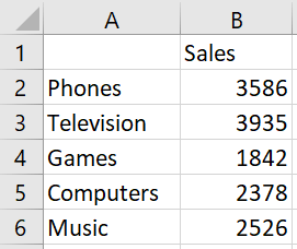
The data is arranged with the labels in the first column and the values in the second column. Nice and simple. The chart will have no problem interpreting this layout.
Select the range of cells A2:B6.
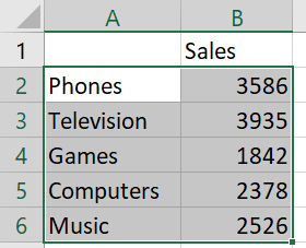
We have excluded row 1 in our selection. If we selected A1:B6 then the label in cell B2 would be used as a chart title. But we will insert our own title as we are not happy with the text "Sales".
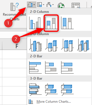
Click Insert > Insert Column or Bar Chart > Clustered Column
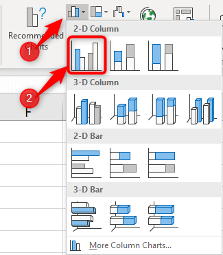
In just a few clicks, we have made the column chart below.

We can now look at making some improvements to this chart.
Formatting a column chart
When a chart is created, the default colours and layout are used. These are rarely sufficient.
Let's start by changing the colours of the columns.
The easiest way to do this would be to use the Change Colors button on the Design tab.
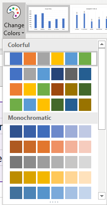
From here we can easily select a built-in colour scheme.
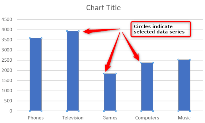
Alternatively, you can click on a column in the chart to select all of the columns (the data series).
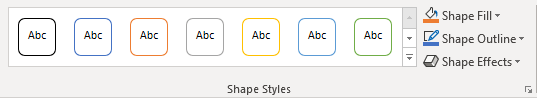
And then click the Format tab.
There are a selection of shape styles to choose from. These will apply a fill and outline colour to your columns with the click of a button.
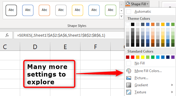
However, you can also use the Shape Fill and Shape Outline buttons to get complete control over the column colours and many other settings.
For this example, I will select an orange colour from the Shape Fill button.
We will now edit the chart title.
Click on the chart title and start typing the text you would like to use. The text will appear in the formula bar as you type.
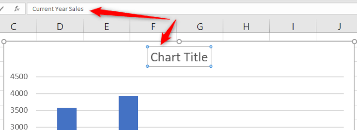
Press Enter when complete and the text will appear as the chart title.
A column chart is made up of many different elements.
Our simple column chart consists of two axes, gridlines, one data series (consisting of 5 data points), a chart title, chart area and a plot area.
Column charts are not limited to just these elements, and we will talk about how to add more or remove some of these shortly.
All of these elements can be formatted and there are many options to do so.
The place to find all of the options is in the formatting pane for the chart element.
Click the Format tab, select the chart element from the list and then click Format Selection.
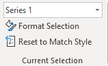
Because cell B2 was not selected when the chart was created, the data series does not have a name and is referred to as "Series 1".
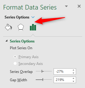
Below is the formatting pane for the data series. At the top are three category icons to access other options.
If you click another chart element or select one from the list on the Format tab, the formatting pane will show you options relating to that chart element.
So in short, there are many elements for column charts and there are numerous formatting options.
As an example, let's change the Gap Width for the data series from 219% to 110%.
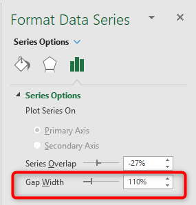
By reducing the gap width the columns will become wider.
Add and remove column chart elements
One of the strengths of a column chart is that despite its simplicity, it does have many options in its arsenal.
These include the number of elements that you can add and remove from a column chart.
Let's begin by looking at removing the gridlines and the primary vertical axis (value axis) from the chart.
One way of doing this would be to select the element in the chart and press the Delete key on the keyboard.
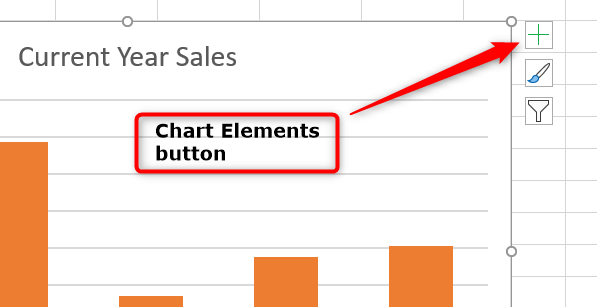
However, I prefer to click the Chart Elements button to the right of the chart.
A list of chart elements is displayed. Uncheck the Gridlines box. Then position the mouse over the Axes option and click the arrow that appears to the right.
Uncheck the box for the Primary Vertical Axis.
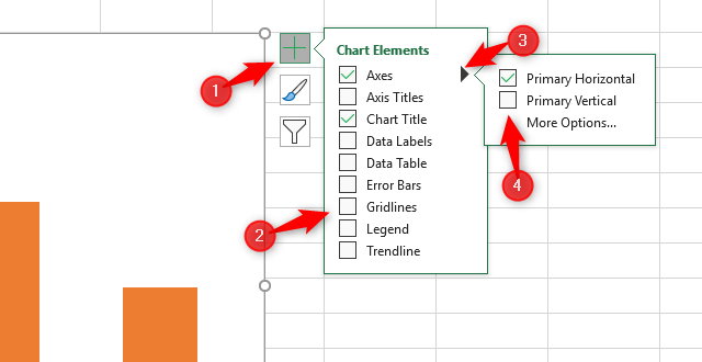
Instead of the axis, we will add some data labels to the chart. This is quite a simple column chart with just 5 columns, so it should present nicely.
Position the mouse over the Data Labels option and click the arrow to the right. Then check the box for Outside End.
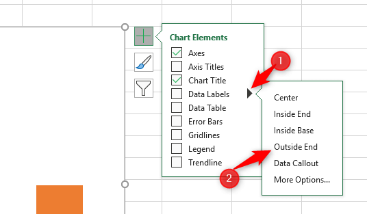
Click on the Chart Elements button to hide the list when finished.
The data labels are added above the columns.
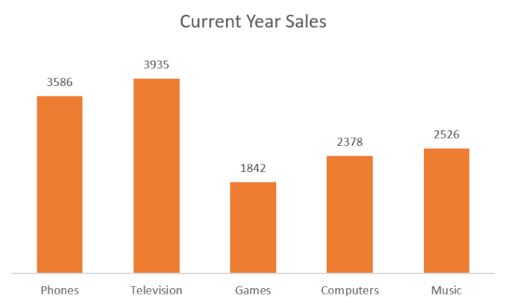
This looks good for this chart. If we had more columns then the labels could get messy and the axis would probably be a better alternative.
Create a column chart with multiple data series
The previous chart had a single data series. Let's look at a column chart with multiple data series.
For this example, we will be using the data shown below.
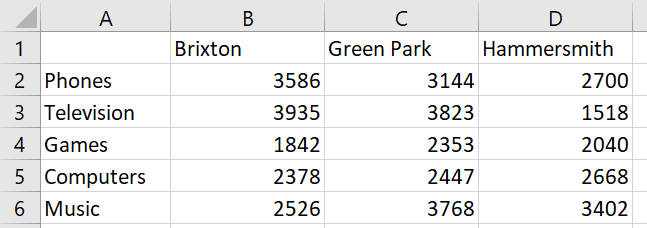
This data shows sales for 5 different departments across 3 different store locations.
Select the cell range A1:D6.
And just like with the previous chart - click Insert > Insert Column or Bar Chart > Clustered Column.

The column chart is inserted.
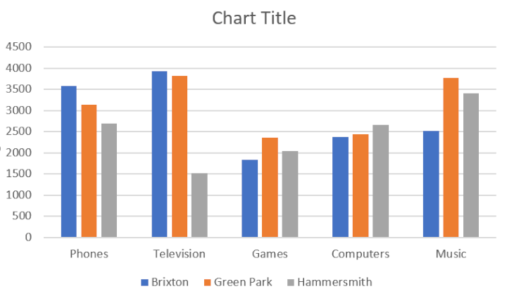
This chart is a lot busier than the previous one. It has 15 columns but it is still easy to interpret the information.
For example, television sales in Hammersmith are noticeably worse than the other two stores. And sales of games and computers are consistent across all three stores.
We can now start to make improvements to the chart like before. Especially to the chart title as the current one is useless.
This has already been spoken about in this article though, so we will leave that and look at making another type of column chart instead.
How to make a stacked column chart
Stacked column charts are great. They perform a slightly different role to the clustered column charts.
The clustered column charts made it simple to compare the sales from different stores.
The stacked column chart will enable us to compare the total sales of each department and the contribution of each store to that total.
Using the same range of cells as the previous example, click Insert > Insert Column or Bar Chart and then Stacked Column.
The stacked column chart makes it easy to see that sales of games and computers were the lowest.
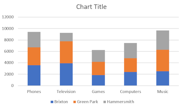
This stacked column has a column for each department with the store's sales stacked on top of each other.
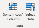
This can be reversed by clicking the Switch Row/Column button on the Design tab.
The chart now shows a column for each store, with the department's sales stacked.
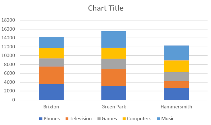
In this chart, we can see that sales from the Green Park store were highest.
100% stacked column chart
The stacked column chart was great at comparing total sales. It also displayed the contribution to those sales by each department, or store.
The contributions were more difficult to interpret, however, especially if they were similar values.
Excel offers a 100% stacked column chart. In this chart, each column is the same height making it easier to see the contributions.
Using the same range of cells, click Insert > Insert Column or Bar Chart and then 100% Stacked Column.
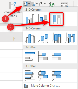
The inserted chart is shown below.
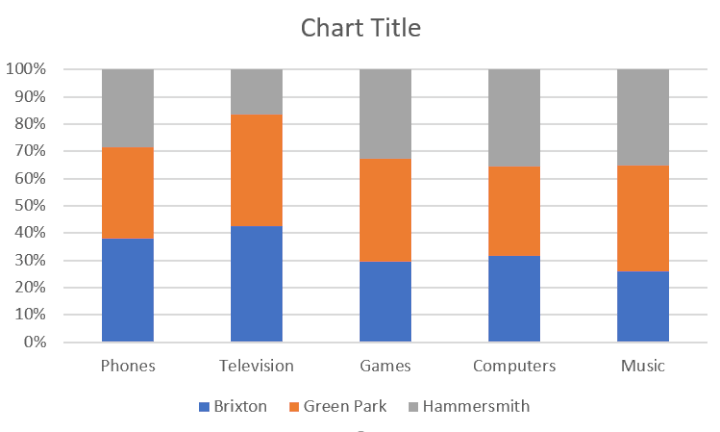
A 100% stacked column chart is like having multiple pie charts in a single chart.
Conclusion
In this article, we saw how to make a column chart in Excel and perform some typical formatting changes. And then explored some of the other column chart types available in Excel, and why they are useful.
Column charts are simple, yet very effective. Clean, concise and easy to understand is important when presenting data with charts.
Want to master Microsoft Excel?
Take our comprehensive online Excel course delivered by Excel MVP Ken Puls. If you're not ready for a deep dive just yet, you can start with our free Excel in an Hour Couse right now.