

Join the Excel conversation on Slack
Ask a question or join the conversation for all things Excel on our Slack channel.
You never thought you’d see the day, but you’ve slowly become obsessed with Excel charts. From your personal budget to your work projects, you look at almost everything and think, “Hey, I bet that’d make an awesome Excel chart!”
Alright, so maybe your enthusiasm for Excel charts hasn’t quite reached that level.
But, here’s the point: You’ve been playing around with the basics of Excel charts for a while (if not, stop here and read this post instead!) and now you’re ready to take things up a notch.
You’re in luck. In this post, we’re talking all about advanced Excel charts and some of the things you can do to take your simple charts to the next level.
Step up your Excel game
Download our print-ready shortcut cheatsheet for Excel.
What exactly is an advanced Excel chart?
Take a look in Excel, and you’ll quickly notice that there’s no shortage of charts available.
From the basics (like column charts, bar charts, line charts, and pie charts) to options you may have less familiarity with (like radar charts, stock charts, and surface charts), there are seemingly endless charts you can make within Excel.
 We consider an advanced chart to be any chart that goes beyond the basics to display even more complex data.
That could be one of the more in-depth charts we just mentioned, like a surface chart, or it could be a combination chart—where you take two different chart types (like a bar chart and a line chart, for example) to visualize a more involved data set.
Creating an advanced Excel chart: A case study
With so many different chart types and the option to combine them, there’s no possible way to outline every single chart you could make in Excel.
So, for the sake of rolling up your sleeves and getting started, we’re going to pick one slightly more advanced chart and work on creating that.
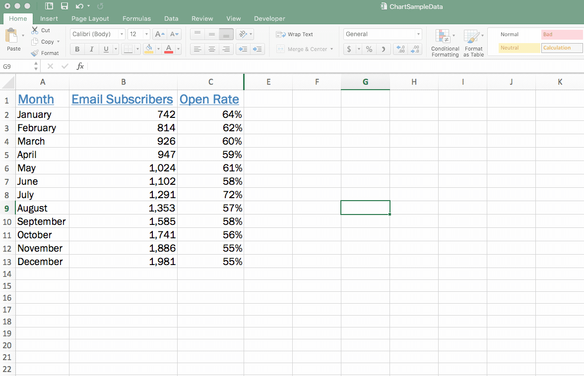
In our basic Excel charts article, we analyzed the growth of an email subscriber list. Now, we have some more data added to that: the average email open rate for each month. We want to analyze the relationship between open rate and subscriber count—basically, does open rate increase or decrease the larger our subscriber list gets?
We’re going to create a combination chart to understand this relationship. We’ll use a column chart to represent the number of subscribers and a line chart to represent the open rate.
Let’s get started!
1. Double-check and highlight your data
As always, it’s smart to take a quick look to check if there are any issues or blatant errors in your data set.
Remember, your chart is tied directly to your data set—meaning any mistakes that appear there will also show up in your chart. So, now’s a good time to make sure you don’t have any spelling errors, digits that look off, or any other problems that you could have to go back and fix later.
After that, to get started with your chart, you’re going to highlight all of your data (including column headers) to get ready to insert your chart.
2. Insert a chart
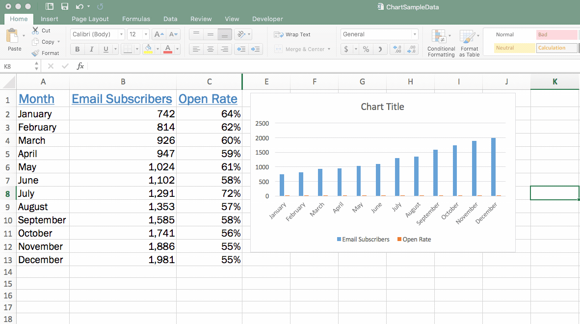
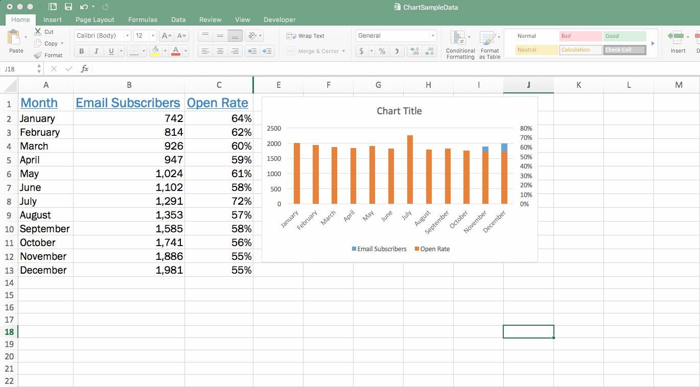
With your data set highlighted, head up to the “Insert” menu and then select the chart type you’d like to use to represent your first set of data. In this case, we’re going to start with a column chart to represent our total email subscribers.
 You’ll see that the chart you just created pulls in both sets of your data—your email subscribers and the short little column that shows your open rate (it’s so short it’s barely visible). Do you see those tiny little orange bars representing open rate?

Don’t worry; we’re going to fix that in the following steps by inserting another chart type.
3. Select your second chart axis
Since we’re going to use the blue columns to represent our total number of email subscribers, we need to change the orange columns that represent open rate to a line.
To do so, you need to click on one of the orange bars to select that entire data series.
Fair warning: Because they’re so tiny on our current chart, they can be tough to click. To save you a ton of frustrated clicking around, here’s a helpful and straightforward trick to auto-select that orange data series:
- Click on the blue columns to start, since they’re bigger and much easier to click on
- Head to “Format,” select the “Series” drop-down in the upper left corner, and then change it to “Open Rate” (or whatever other variables you’re trying to select and adjust)
- That will auto-select all of the orange columns for us
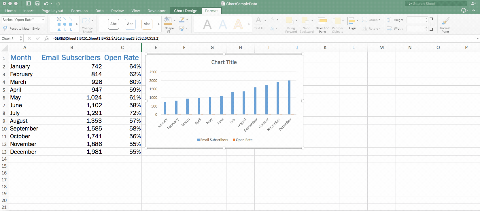
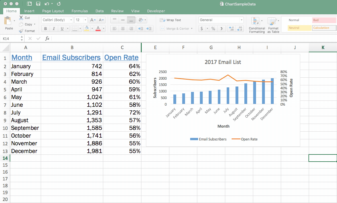
 With those orange columns selected, we’re ready to make the change and display that information as a line.
Right-click with those orange columns selected, navigate to “Format Data Series,” and then in the right sidebar that appears select “Secondary Axis.”
4. Change your second chart type
At this point, you might panic a little—it looks like the orange bars just wholly overtook your beautiful chart, and you’re beginning to think you screwed everything up.
First of all, take a deep breath. This is supposed to happen, and getting things to look right again is a quick and simple step.
Right click on those newly created orange columns, head up to the “Chart Design” tab in the ribbon, click the “Change Chart Type” button, and then select your line chart.
 That’s it—now your total number of email subscribers are displayed as columns, and your line chart shows the open rate.
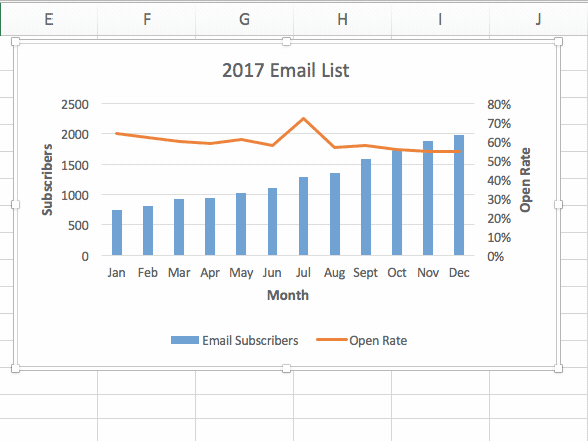
5. Fine-tune your chart
With the bones of your chart in place, now you can do things like add a chart title, adjust your colors, and even add axis labels (all of which we went over in the basic chart article).
Now is also an excellent time to ensure that nothing looks off in your chart and that you didn’t let any mistakes or errors slip through.
After doing so, we end up with a chart that looks like this:

Three more advanced charting tips
You’ve mastered that combination chart, and now you want to know if there are any other more advanced tricks and hacks you can use with your charts.
Well, of course, there are! We’ve touched on just a few of them below.
1. Insert a table in a chart
While the chart we’ve created is great for looking for any trends, it doesn’t show a tremendous amount of detail. For example, it’s hard to tell precisely what the open rate or subscriber count was during any given month—you can only get an estimate by looking at the columns and line.
Inserting a data table within your chart is handy if you also need to show detailed values and not just an overall trend.
To insert that table, click anywhere within your chart, go to the “Chart Design” tab in the ribbon, click the “Insert Chart Element” button, select “Data Table,” and then decide to display your table with or without a legend. In this case, we’re going to skip the legend.
 You’ll see that a table is now inserted directly within your chart.
It looks a little crowded to start, but you can make some edits to change that. Keep in mind that you’ll need to edit the text within your existing dataset (rather than within the table).
After doing so, here’s a look at our chart including the table:

2. Add data labels
Maybe you don’t want to clutter up your chart with a table, but you still want to display more detailed digits. Adding data labels puts a number at a point above your line or column to give a better indication of values.
Adding those data labels is simple. Just right-click on your line or your columns and select “Add Data Labels.” That’s it!
3. Add another variable
Remember, there’s only so much information you can display on a single chart—because you’re limited by three axes.
However, if you have another variable that has the same metric or unit of measure as one of your existing variables, you can add that to your chart.
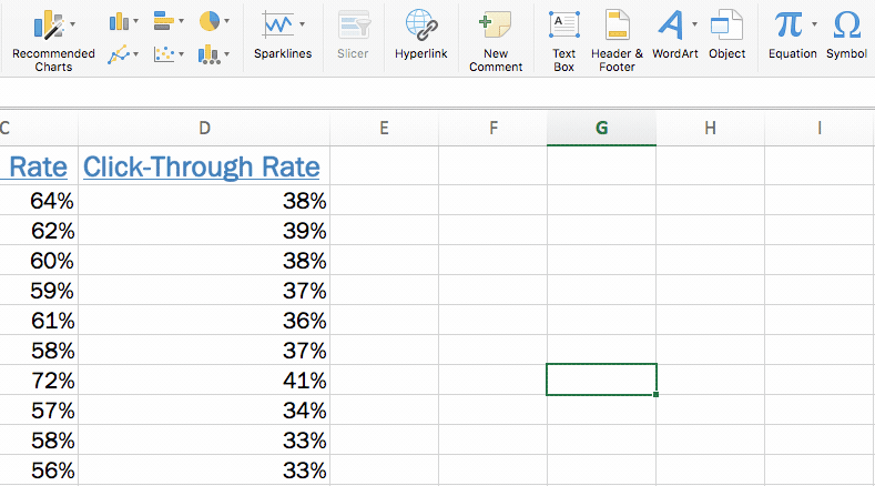
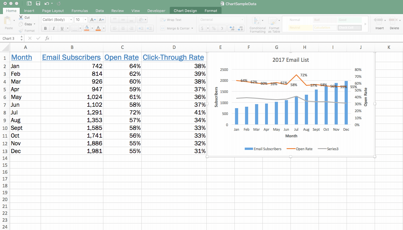
For example, if we also wanted to add click-through rate to our chart, we could do so because it’s a percentage just like the open rate. But, if you wanted to incorporate the time of day an email was sent, you’d need a separate chart—because there’s currently no axis available to display the measure of time.
Make sense? Alright, so let’s say we did want to add click-through rate to our chart. To do so, you need to make sure that data appears in your data set.

You’ll see that an additional line representing click-through rate has been added to your chart.
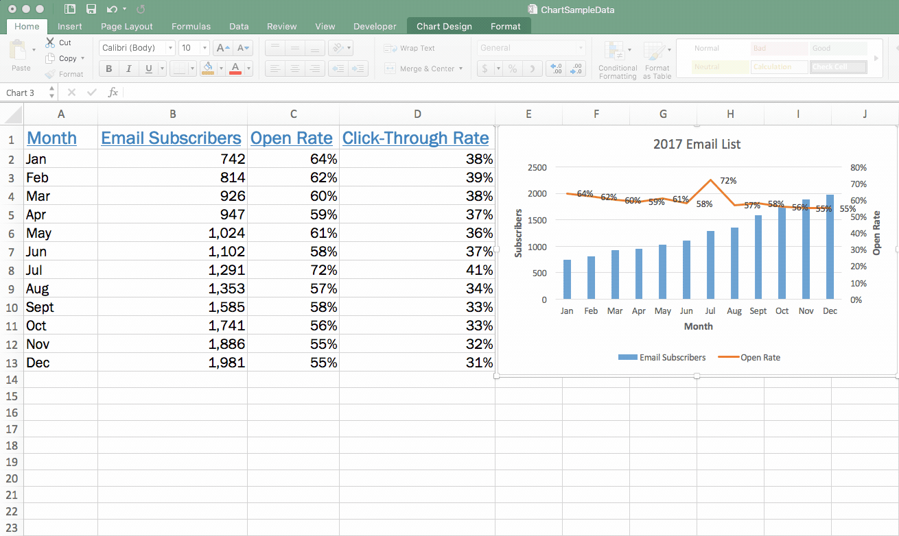 If you want to make click-through rate appear in your chart legend so that viewers know what that line is representing (right now it just says “Series 3” in your legend), right-click within your chart again and go to “Select Data.”
Click on your new series (which isn’t yet named and is just called “Series 3”), click in the “Name” field, click the little box that allows you to select from your data set, and then click the appropriate column header. Hit “Enter” and then click OK.
 That’s it! You’ve added a line for click-through rate and also added it to your legend:

Want to learn even more about Excel charts?
Are you feeling like an Excel charts pro? We’ve covered a lot here that will help give your Excel charts game a boost.
But, if you’re looking to dig in even deeper, check out our advanced Excel course to sink your teeth into even more tips, tricks, and tutorials that will transform you into a total Excel whiz.
Ready to become a certified Excel ninja?
Start learning for free with GoSkills courses
Start free trial
Join the Excel conversation on Slack
Ask a question or join the conversation for all things Excel on our Slack channel.