
In this guide, we'll cover:
- Why do we use charts in Excel?
- Chart-specific terminology
- Types and use cases of Excel charts
- How can I create a chart in Excel?
- Change chart type or location
- Customizing Excel charts
- Types of charts
- Best practices
- Learn more about charts
Why do we use charts in Excel?
Simply put, charts are an easy way to visually tell a story. They summarize information in a way that makes numbers easier to understand and interpret.
Excel is well-known for its ability to organize and calculate numbers, but it's also great for helping to analyze that data with a variety of charts. Excel data visualization allows us to filter out the extra “noise” from the story we are trying to tell at the moment and zero in on the important pieces of data.
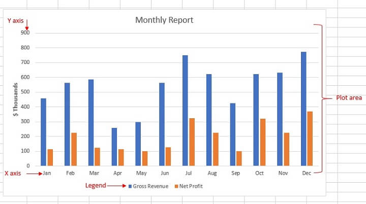
Chart-specific terminology
First, let’s get the lingo out of the way:
- Chart vs Graph: Technically, there’s a difference. A chart is basically any visual representation of two or more variables. Graphs are a type of chart.
- X Axis: On a two or three-dimensional graph, the X axis is the horizontal axis and usually shows independent variables, such as time periods or the categories being measured.
- Y Axis: The Y axis is the vertical axis which usually shows the quantity or dependent variable and shows the data you are tracking.
- Legend: This gives information about the tracked data. It helps viewers to read and understand the graph. A legend (sometimes called a key) is most useful when a graph has more than one line.
- Plot Area: The plot is the space on which the data is plotted.
Types and use cases of Excel charts
Chart types have different advantages and limitations. One chart type can be used to highlight a specific aspect or relationship in a data set but would be ineffective when used for another. Knowing the best chart types for specific use cases will help you maximize the impact of your Excel chart templates.
Common chart classifications
| Chart Type | Description | Example | |
|---|---|---|---|
| 1 | Area chart |
combines elements of line and bar charts to show trends over time and total values |
 |
| 2 | Bar chart |
similar to column charts but with horizontal bars. Useful for comparing individual items or measuring a single variable |
 |
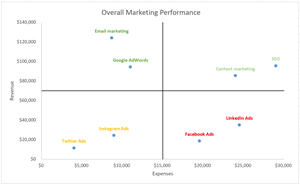
| 3 | Bubble chart | a type of scatter plot that uses bubbles to represent data points. The size of each bubble corresponds to a third variable, allowing for a three-dimensional visualization of data in a single chart | 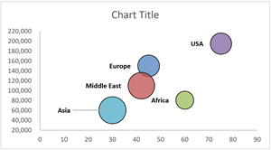 |
| 4 | Bullet chart |
combines elements of a line chart, bar chart, and data markers to compare a metric against a target value |
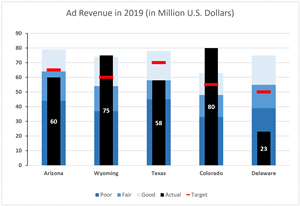 |
| 5 | Column chart |
displays data using vertical bars. Categories are on the horizontal axis, and values are on the vertical axis. Ideal for comparing different categories |
 |
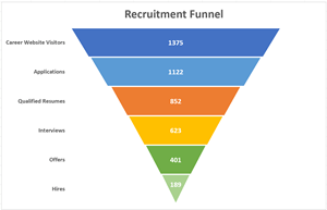
| 6 | Funnel chart |
uses a variety of shapes and elements to display how a variable changes as it moves across a multiple-stage process |
 |
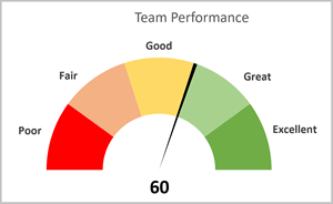
| 7 | Gauge chart |
resembles a speedometer or dial, used to visualize a single metric within a defined range. Often used to visualize performance indicators |
 |
| 8 | Line chart |
shows trends over time with data points connected by lines. Categories are evenly spaced on the horizontal axis |
 |
| 9 | Pie chart |
represents data as slices of a pie, showing proportions or percentages of a whole |
 |
| 10 | Polar chart |
a type of circular graph that displays data points in terms of radiuses and angles |
 |
| 11 | Radar chart |
a type of circular graph that compares multiple data points using axes radiating from a central point |
 |
| 12 | Scatter (plot) chart |
plots data points for two variables on a two-dimensional plane, showing relationships between them. |
 |
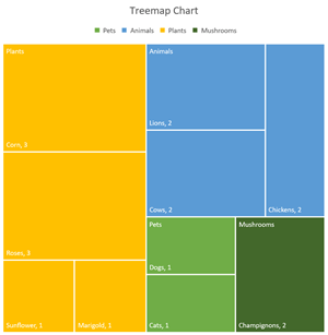
| 13 | Treemap chart |
displays hierarchical data in nested shapes, useful for comparing different category levels |
 |
| 14 | Waterfall chart | shows the impact of additions and subtractions on a data variable over time, often rendered as columns. | 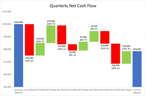 |
Now let’s take a look at how to create a basic chart in Excel, step by step.
How can I create a chart in Excel?
There are slight differences if you’re making one of the more advanced Excel charts, but you’ll be able to create a simple chart by doing these three basic steps.
Download your free practice file!
Use this free Excel file to practice along with the tutorial.
Step 1 - Enter data into Excel
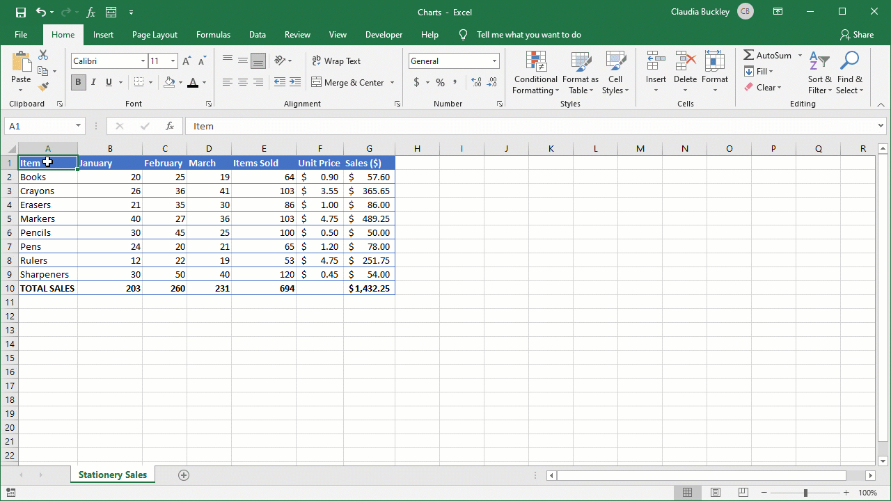
Chances are, you’re not creating a chart just for the sake of creating a chart. Your data is probably already entered in a tabular format on an Excel worksheet, and you want to highlight some aspect of that data.
The most important task at this stage is to check the validity and accuracy of your data. This includes data headings, as they will be used to automatically generate labels for your chart.
Step 2 - Decide what story you want to tell
This may seem like a given, but doing this step will directly affect the type of chart you choose. Your story might be about changes over time. Or perhaps you’re comparing variables. Another important factor is whether or not your audience is familiar with the subject. How well will they be able to read and understand the message you are trying to convey with your chart without relying on your words?
Don’t make the mistake of trying to impress people with your Excel knowledge but fail to add value. Your chart should enhance, not detract from, your message. A good chart requires little explanation.
Step 3 - Highlight your data and 'Insert' your desired chart
Whenever you’re selecting cells to be used as source data, there may be instances where your data is non-contiguous. Remember, Excel puts (or tries to put) everything that’s highlighted on your chart. So select only what you need by holding down the Control key between selections.
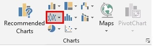
 Pick a chart from the Insert tab. With its Recommended Charts option, Excel takes the guesswork out of choosing a graph. Excel determines this by looking at your data selection and offering a preview of what your data will look like with each recommended option. This is a good starting point if you don’t know what type of chart options work best with your data.
Step 3b - Customize chart elements (optional)
To edit any chart element within Excel, you must select the chart. Two contextual menu sets will appear next to the other ribbon tabs - Design and Format.
From the Design tab, you can add or remove specific elements (e.g., a legend, axis titles, data labels) by using the Add Chart Element menu item. Each element has an arrow that expands into more specific options, like choosing where and how you want the data values to be displayed.
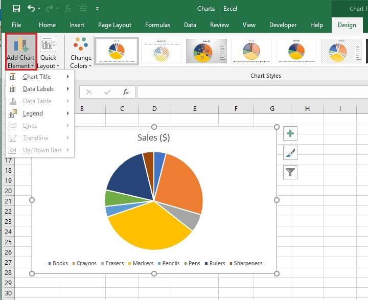 Alternatively, click on the green plus sign to add chart elements individually.
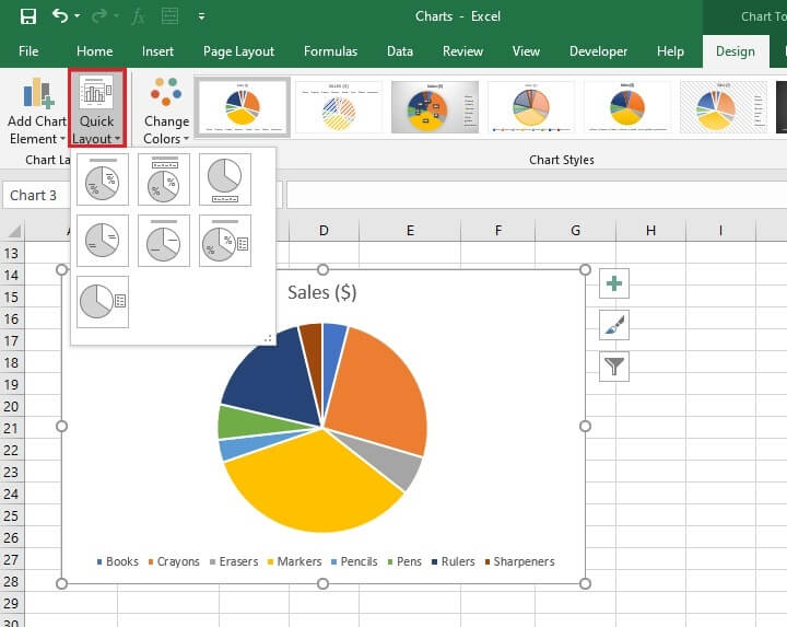
 You may find it more convenient to use the Quick Layout menu item instead of Add Chart Element. It offers layouts with common chart element combinations, which might save you from having to add them one by one.
Change chart type or location
If, after creating your chart, you find that you’d prefer to use a different type of chart you don’t need to restart from Step 1. Simply select the chart image. Then click the Change Chart Type icon from the Design tab. Then you can select your new chart type.
You can also place the chart on an existing or new worksheet within the current workbook by clicking the Move Chart icon.
Customizing Excel charts
Once you’ve mastered the above, you should practice doing the following to make your chart look exactly the way you want.
Title your graph
The quickest way to enter (or change) a title for your graph is to right-click on the Chart Title placeholder and choose Edit Text from the menu. Type the title you want and Enter. If there is no placeholder, add one by clicking on the green Chart Elements plus (+) symbol to the top right of the chart and checking the Chart Title checkbox.
Reorder your data
If you want your categories to appear in a particular order, go to the Design tab > Data command group > Select Data. From the Select Data Source window, look below Legend Entries (Series), and click the data series that you want to change the order of. Click the Move Up or Move Down arrows to move the data series to the position that you want.
Adjust color and style
If you want to change your chart’s color scheme, go to the Design contextual tab and choose from a large selection of pre-designed themes and styles from the Chart Styles command group. If you hover over each one, you will be given a preview of what the chart will look like if you select that option.
If you use the Format contextual tab instead, you’ll be able to make advanced manual changes to the style and color of your chart without following an Excel-designed theme.
Alternatively, right-clicking any element within your chart will give you formatting options that allow you to do the same thing.
To restore your chart to its original theme, go to:
- Format contextual tab
- Current Selection command group
- Reset to Match Style menu option
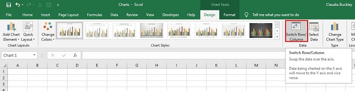
Switch the data on each axis
Most graphs in Excel have an X (horizontal) and a Y (vertical) axis. Of course, this doesn’t apply to pie charts. By default, Excel compares the number of rows and columns in the source data and plots the larger number on the X axis. Quantitative values (for example, money or sales volume) for these categories are plotted on the Y axis.
This doesn’t always turn out to be the best setup for your graph though. Take a look at this chart.
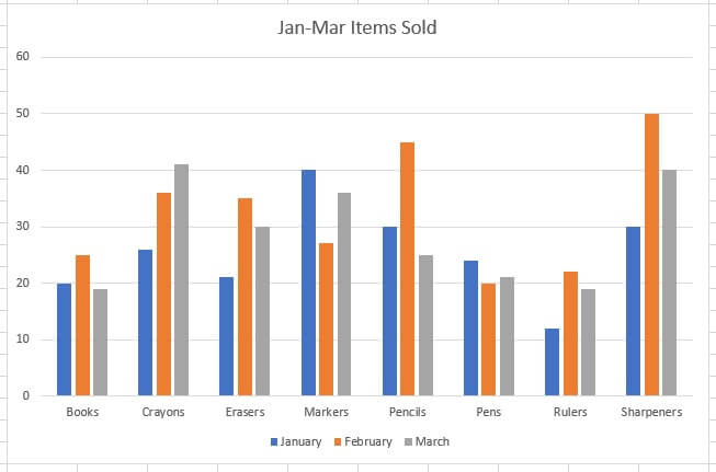 It shows the progression of sales of each item for the three months but isn’t very useful if we want to compare which item was the highest seller each month. The solution for this is to switch the data being reported on each axis.
Simply click on the chart, click the Design tab, and choose ‘Switch Row/Column’ from the Data command group.
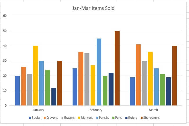
 Data will now be grouped by month, and it’s easy to see how each item performed in comparison to the others. Again, it’s a matter of the story we want to tell.
Change the size of your chart's legend and axis labels
To change the size of any chart element (e.g., a legend, axis, or title) right-click the element and then click Font. When the Font box appears, increase the font to the desired size and click OK. If the element is now too large to fit within the chart, drag a corner of the chart element to expand the box until all text is visible.
Change the Y axis measurement options
You may find that because of the values on your Y axis, there is a lot of wasted space on your chart.
In our example, since none of our sales values are less than 12, we may choose to start our Y axis at 10 instead of 0. Or we might want our values to have intervals of 5 instead of 10 to show greater detail. To do this, we would adjust the Y axis measurement options as follows:
- Click on the Format contextual tab.
- Go to the Current Selection command group and click the dropdown menu.
- Choose Vertical (Value) Axis.
- On the Format Axis panel to the right, click the Axis Options icon.
- Expand the Axis Options menu and adjust Bounds and/or units as desired.
‘Minimum’ means where the Y axis begins, and ‘Maximum’ means where it ends.
Which chart should I use?
Excel has lots of chart options in the Charts command group, but some charts are more appropriate than others in representing certain types of information.
Each chart option in the Charts command group is represented by an icon that depicts the outcome of your chart. If you hover over each icon for a second or two, you’ll get the name of the chart and a recommendation on when to use it.
The type of chart you choose will depend on:
- The type of data you’re presenting.
- The type of story you’re trying to tell.
- The audience you’re presenting to.
Examples of basic chart application
Bar graphs and column charts
 Bar charts and column charts present categories of data in rectangular bars, proportional to their values. Bar and column charts are essentially the same thing, except that bar charts are plotted horizontally, while column charts are plotted vertically.
We use both bar and column charts to visually compare values across categories. Below is an example of a column chart.
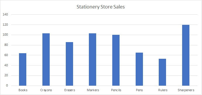 This chart is good for comparing the total sales volume of each item. This makes it easy to see which product had the highest and lowest sales volume. It’s also useful for estimating the average number of each item sold for the period.
Bar charts allow data with longer text labels to have the independent variable shown on the Y axis because of the additional space allowance. The numbers (dependent variables) are shown on the X axis.
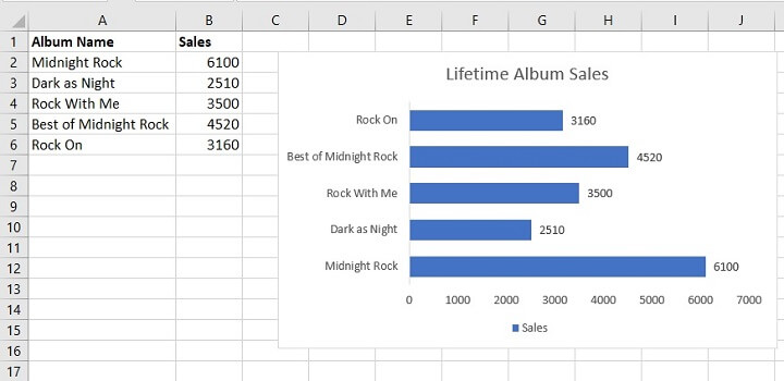 Due to the amount of text space required for the album names, bar graphs are a better choice than column charts to visually present the data in an uncluttered way.
 |
Learn more about bar graphs here - How to Make a Bar Graph in Excel. | |
| Learn more about column charts here - How to Make a Column Chart in Excel. |
Line graphs and area charts
 When we have data that show trends or changes over days, months, or any period of time, line graphs are usually a great choice. The sales data below shows the number of items sold in January, February, and March.
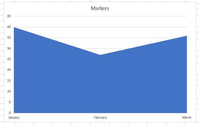
 We can select a single item and use a line graph to show its sales performance for each month, as shown below.
 This line graph illustrates the trend in marker sales over the reporting period, eliminating the need for the audience to do too much interpretation on their own. Note that only the data in rows A1 to D1 and A5 to D5 were used to create this chart.
Area charts are a type of line graph, where the area below the line is shaded to highlight the volume of change over time.
 We could have also compared item sales over the 3-month period using a line chart, but this is best limited to two or three items to preserve the usefulness of the chart.
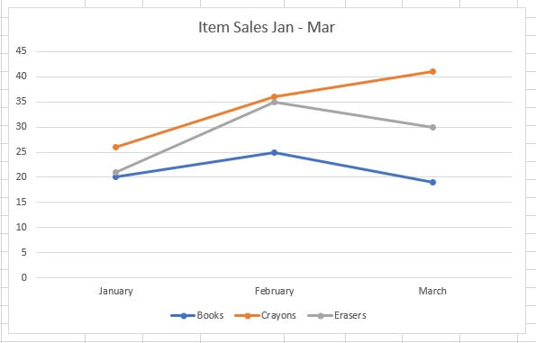 This graph does a great job of showing the trend of three items over the 3-month period. However, adding more lines to this graph is likely to make it too crowded, making comparisons difficult, thereby reducing the effectiveness of the chart.
A column chart would probably be the best choice to show all item sales for each of the three months.
|
Learn more about line graphs here - How to Make a Line Graph in Excel. |
Pie charts
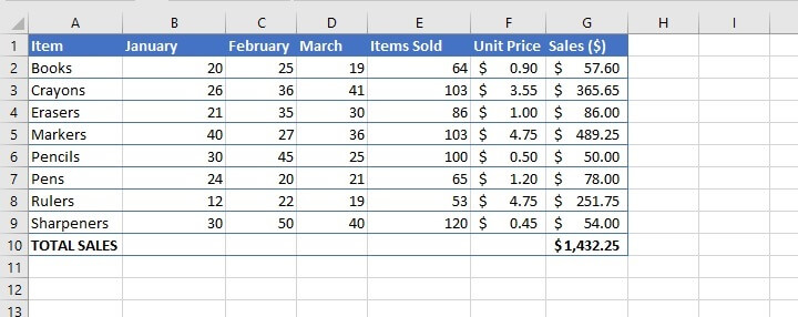
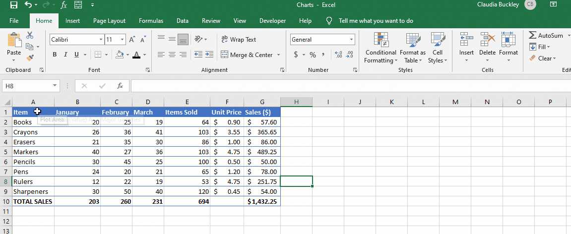
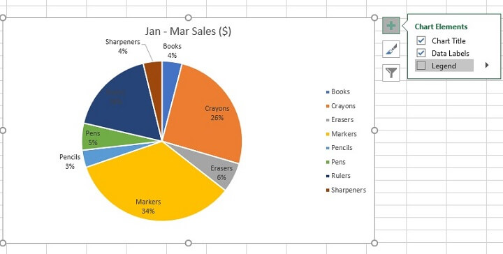
Pie charts are another popular choice. We use pie charts to show proportions of a whole. For example, we can see that total sales for the period amounted to $1,432.25 (cell G10). However, we may want to know the percentage that each item contributed to that figure.
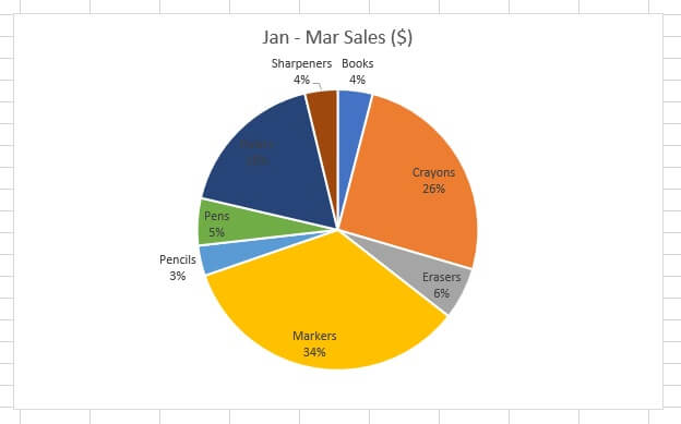 Using data in columns A and G, Excel calculates and displays each item’s contribution as a percentage of the total.
Pie charts are excellent for showing one point in time but poor for showing a trend or changes over time. The chart above is a snapshot of what happened for the January to March months as a whole but doesn’t tell which month was best for sales. A bar, column, or line graph would do a better job of telling that story.
The chart above is called a 2-D pie chart, and there are variations of this classic pie chart, including 3-D and doughnut charts.
|
Learn more about pie charts here - How to Make a Pie Chart in Excel. |
Other charts
The three chart types above are the most commonly-used ones in Excel. But they’re not the only ones. Not by a long shot! Some of the others are:
- Scatter graphs - to observe relationships between variables.
- Waterfall charts - to show the effect of positive or negative values on an initial value.
- Histograms - to show the distribution of data grouped into bins.
You can also use Excel to custom-build advanced charts for special situations or to display complex data, like:
- Stock charts
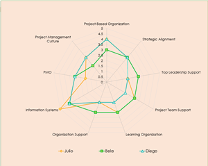
- Radar charts
- Gantt charts for project management
Once you’re comfortable making basic charts, you’ll want to experiment with those specialty charts so that you’re prepared for any situation.
Chart best practices
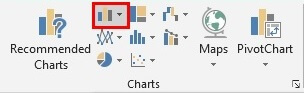
- Choose the right chart for your data type. Your audience shouldn’t have to work to understand your story. That’s your chart’s job. When you highlight the source data, choose the Recommended Charts from the Insert menu and Excel plots graphs that would be appropriate for your dataset. That should be a good jumping-off point.
- Don’t go too crazy with chart styles and designs. Excel pre-designed color themes are usually subtle and muted because your presentation shouldn’t really be about the chart. It’s about what the chart communicates. If the most memorable thing was your chart, then chances are you’re doing it wrong.
- Usually, it’s a good idea to sort bar or column graphs according to their values from low-to-high or high-to-low. This makes the graph easier to read because our brains like it when lists are already sorted in some kind of order. Of course, if your chart is already sorted in some logical order, like by date, that works too.
|
If you think you’re ready to test what you’ve learned about charts in a real-world scenario, try this challenge - Excel Challenge # 10 (Charts). |
Learn more
If you liked what you just learned, you’ll love our course on Excel Charts for Data Visualization, taught by Microsoft MVP, Deb Ashby.