
Bar graphs are an effective way to visually compare frequency, amounts, or units. They make it easy to spot patterns or anomalies, especially when time frames are involved. Making a bar graph in Excel is possibly simpler than doing one manually once you bear a few points in mind.
We’ll explore how to make a bar graph in Excel, but first, let’s find out what a bar graph is.
What is a bar graph?
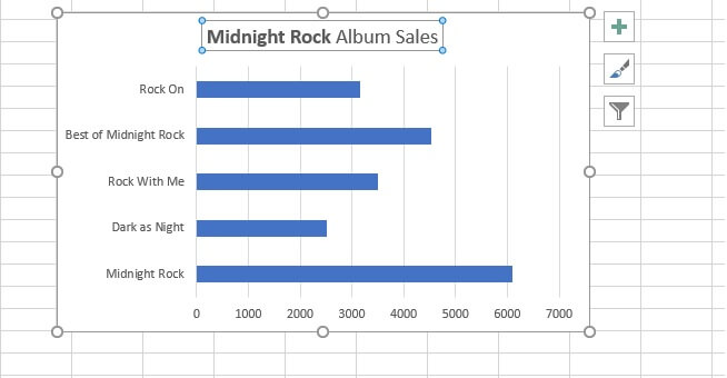
A bar graph (also known as a bar chart) is the horizontal version of a column chart. If you have large text labels, bar graphs work better than column charts. This is because the independent variables are displayed on the Y (vertical) axis where there is more room to show the entire text of the label, as opposed to significantly less space on the X (horizontal) axis.
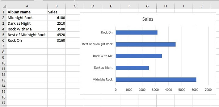 The above graph would not display well in vertical format because the text labels are too long to be formatted well on the X axis.
Excel has a few variations of the classic bar graph format, including:
- The clustered bar graph (classic bar graph)
- The stacked bar graph
- The 100% stacked bar graph
- 3-D versions of the above
Download your free bar graph practice file!
Use this free Excel bar graph file to practice along with the tutorial.
How to make a bar graph in Excel step by step
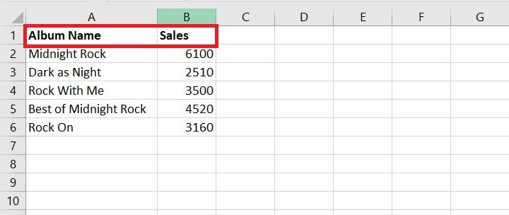
To create a bar chart, you’ll need at least two variables — the independent variable (in our example, the name of each album), and the dependent variable (the number sold). Follow along with these easy steps to create a bar graph in Excel.
- Locate your data in Excel. “Good” data includes headings, which identify what each variable is. In the image below, cells A1 and B1 are the data headings.
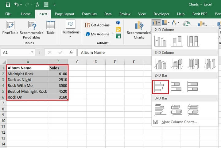
- Select all the data that you want to be displayed in the bar graph, including headings. If you are using Excel data where some of the columns or rows in your data are non-contiguous (i.e., not adjacent to each other), select only the data you need by holding down the Control (Ctrl) key between selections.
- Go to the Insert tab and choose a bar chart from the Insert Column or Bar Chart dropdown menu. We will work with the 2-D Bar for starters.
- The chart will appear in the same worksheet as your source data.
- For data with a single value to each variable, Excel usually uses the name of the dependent variable as the chart title.
 You can change your chart title at any time by clicking on the title and typing in the name you want. Your text will be typed in the Formula Bar and will replace the existing title when you press Enter.
- The bar graph can remain in its current location, or you can change the location by clicking Move Chart from the Design tab. Note that the Design and Format tabs are contextual — they only appear when a chart is selected. It can be placed on a new sheet all on its own, or it can be an object in any sheet within your workbook.
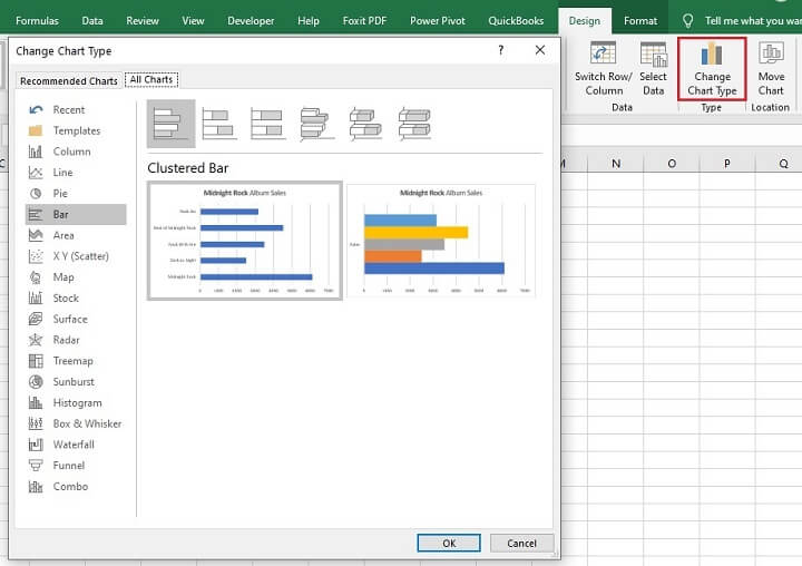
- If you want to choose one of the other chart types instead, there is no need to start over from Step 1. Simply click the chart, then select Change Chart Type from the Design tab.
Types of bar graphs
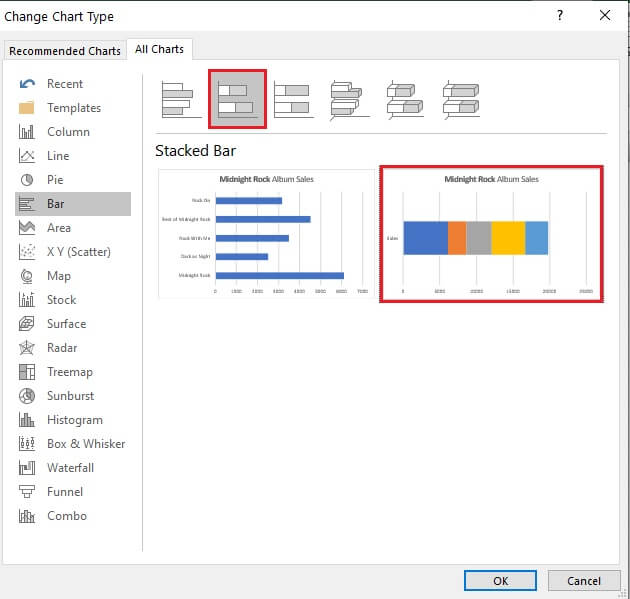
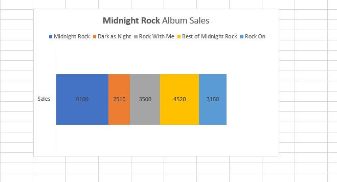
Stacked bar graph
Stacked bar graphs show the dependent variables stacked on top of each other. They show each variable as parts of a whole. In this sense, they are quite similar in concept to pie charts.
To turn our existing clustered bar graph into a stacked bar graph, we can change the chart type as we learned before, and select Stacked Bar from the bar graph options.
For single-series bar graphs, it may be necessary to click the option that shows all the categories as a single bar, then click OK.
 If you already selected Stacked Bar, but the graph still looks like a cluster, try switching the row and column series so that the Sales series will switch from the X axis to the Y axis. To do this, go to the Design tab and select Switch Row/Column.
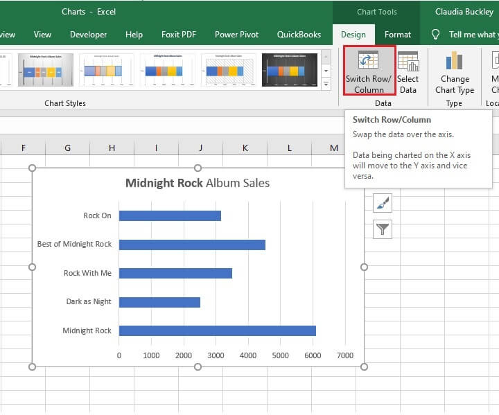 Clicking Switch Row/Column above will result in the stacked bar shown below.
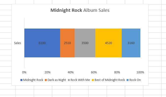
100% stacked bar
Stacked bar graphs can also have the values on the X axis displayed as percentages to further highlight how each value contributes to the whole.
How to create a bar chart in Excel with multiple bars
Bar charts with multiple bars are also known as multi-series charts, meaning that each independent variable has multiple data points or values. For example, maybe all our previous examples represented album sales over the lifetime of the band. But what if we wanted to track sales for each album, in each decade? Then each album would have several values, as shown below.
The steps to show this on a clustered bar graph are the same as above. Note that column G (Total Sales) is not included in the source data range, since we do not want total sales to appear on the chart this time.
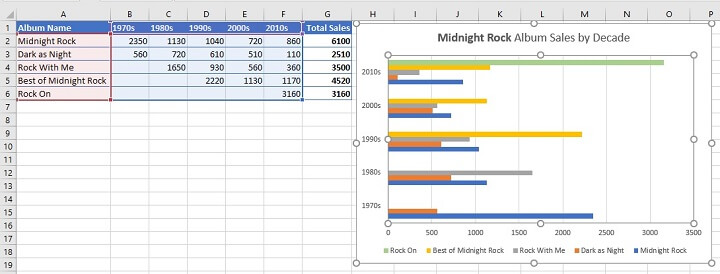 With the above visual, each cluster represents a decade, and each bar within the cluster represents an album.
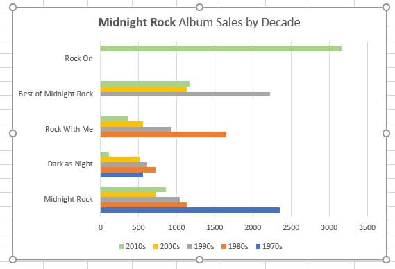
What if we wanted to know how each album trended over the five decades? We could switch the view so that each cluster represents an album, and each bar within the cluster is the decade (see below). To do this, we simply go to the Design tab and select Switch Row/Column.
Formatting bar graphs
Here are some useful tips for adding, removing, and customizing elements within your bar graph. These pointers apply to virtually all Excel charts.
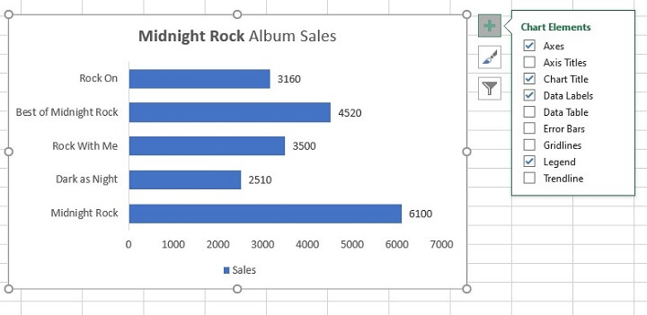
Below is the quickest way to add or remove individual elements such as:
- Chart title
- Axis title
- Data label
- Legend
- Trendline
Do this by selecting your chart and clicking the “Chart Elements” — shown as a green “+” — symbol to the right of the chart.
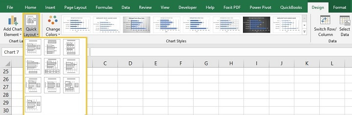
 Another way to add or remove Chart Elements is to use the Quick Layout dropdown menu on the Design tab.
Quick Layout has a few commonly-used combinations that you can choose from instead of manually adding each element one by one. Hovering over each layout option will give you a preview of what your bar graph will look like if you select that option.
Other chart formatting options
One thing that makes working with Excel charts really easy is the ease of customizing chart colors and style. For example, we could choose another theme by going to the Change Colors dropdown menu on the Design tab.
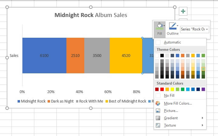
Or, since there are two shades of blue in the chart below, we could just right-click the one we’d like to change and select another fill color.
 You can even filter out some data by clicking on the funnel icon to the right of the chart when it’s selected.
Other ways to visually represent data
Curious about how to make other types of charts in Excel? Try our Excel - Basic and Advanced course. Or start today with the basics of chart making by trying our free Excel in an Hour course.