
You’ve probably heard that Excel is a great tool for storing and analyzing a bunch of data. But, let’s face it—rows and rows of digits can be plain hard to look at. This is where our Excel chart tutorial comes in.
While spreadsheets themselves aren’t that interpretive and can be challenging to wade through, charts enable you to display that data and any trends or results in a visual way. In doing so, that seemingly complex data is far easier to digest, comprehend, and ultimately take action on.
Here's the amazing thing: Excel charts look awesome, but they really aren’t that complicated to create. And, the even better news? We’re here to walk you through the process step-by-step with an Excel chart tutorial.
Step up your Excel game
Download our print-ready shortcut cheatsheet for Excel.
Growth in email subscribers: An Excel charts case study
Meet Lucy. She works on the marketing team at her company and is primarily responsible for all of the email marketing campaigns.
She has to deliver a presentation to her organization’s leadership team, where she’ll highlight the growth of email subscribers over the past 12 months. She really wants to knock the presentation out of the park—because, when you boil it down, this information proves that she’s doing her job well.
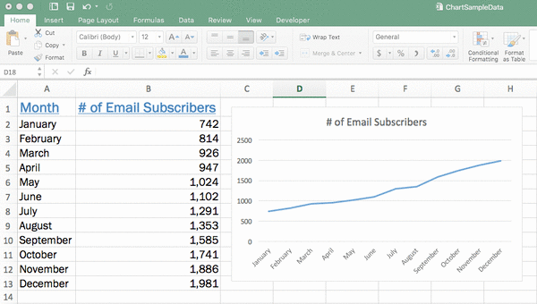
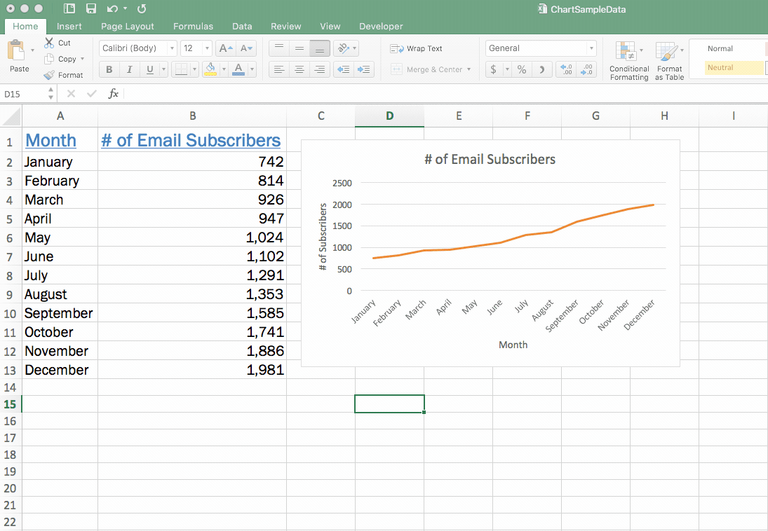
Currently, she has the total number of email subscribers for each month of 2017 in a simple Excel spreadsheet that looks like this:
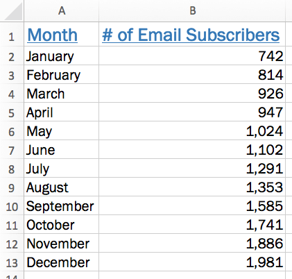
Sure, the numbers themselves show impressive growth, and she could simply spit out those digits during her presentation. But, she really wants to make an impact—so, she’s going to use an Excel chart to display the subscriber growth she’s worked so hard for.
How to build an Excel chart: A step-by-step Excel chart tutorial
1. Get your data ready
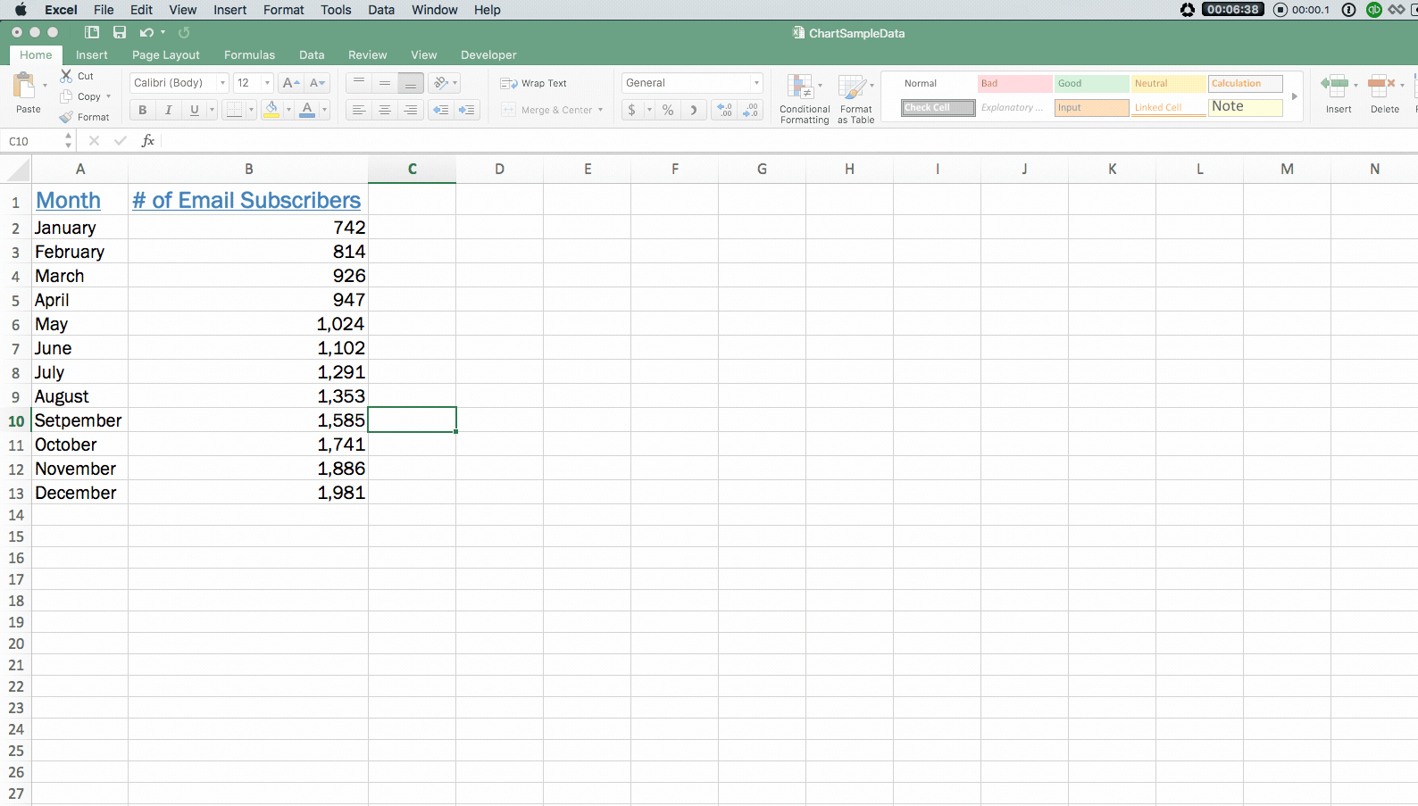
Before she dives right in with creating her chart, Lucy should take some time to scroll through her data and fix any errors that she spots—whether it’s a digit that looks off, a month spelled incorrectly, or something else.
Remember, the charts you build within Excel are going to pull directly from your data set. So, whatever errors you have there will also appear in your chart. Taking even just a little bit of time to check over your data could prevent you from having to go back and make changes after you see something off in your chart.
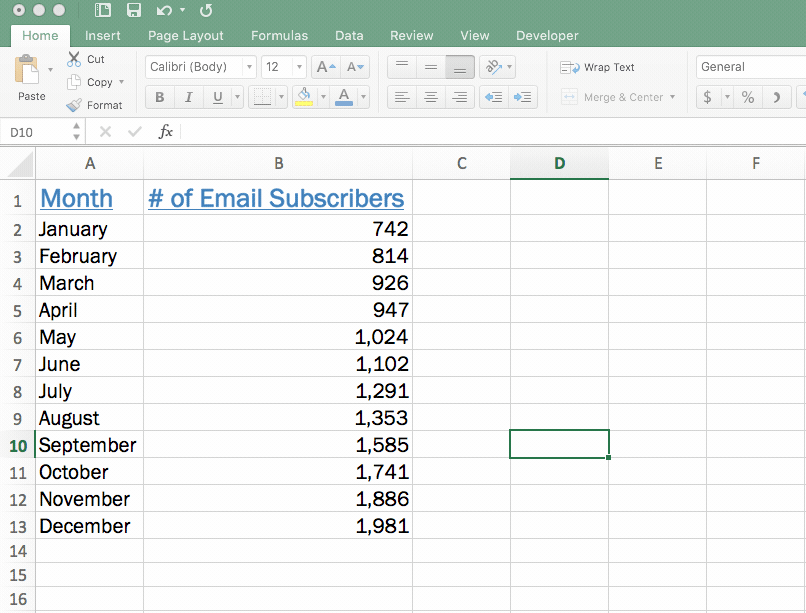
You should also ensure that you have descriptive column headers for your data. In this case, it’s pretty straightforward: Lucy has a column header for the month and a column header for the number of email subscribers.
TIP: Checking over data is pretty simple when you have a really small data set like Lucy, but it can become a little more cumbersome when you have hundreds or thousands of rows of data.
If you spot an issue, use Excel’s “find and replace” feature to correct all instances of that error. Go to the edit menu at the top of the page, and then type in the mistake you want to find and what it should be replaced with.
For example, if Lucy realized she spelled “September” as “Setpember” she could use this feature to replace all instances where it’s spelled incorrectly.
2. Insert chart and select chart type
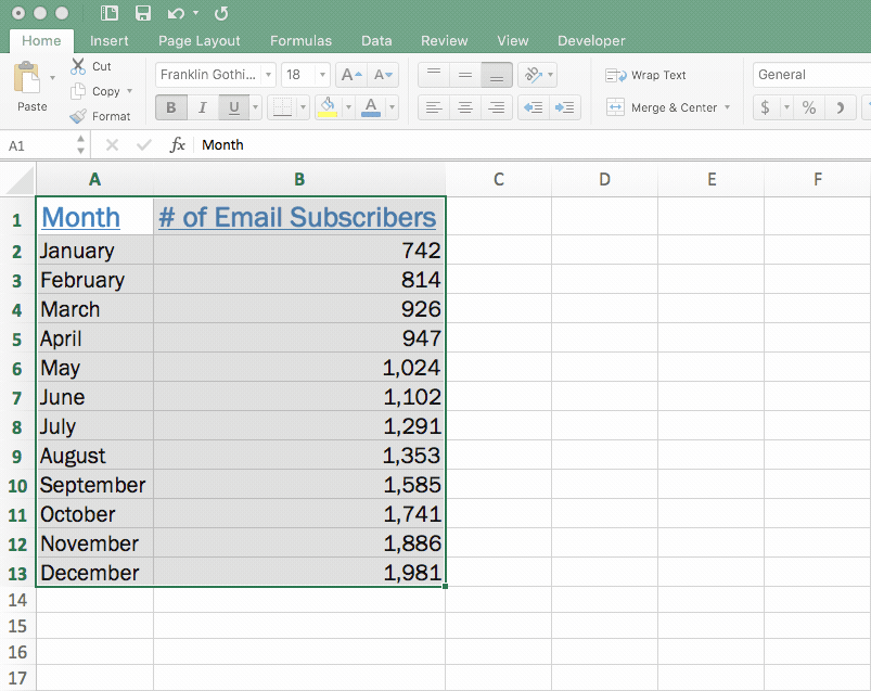
With her data cleaned up, Lucy is ready to insert her chart into her spreadsheet. To do so, she’ll highlight all of the data (including column headers!) she wants included in her chart.
Once her data is highlighted, she’ll head to the “Insert” menu in the ribbon and select what type of chart she wants to use to display her data.
Excel offers tons of different types of charts to choose from, including:
- Line
- Column
- Bar
- Pie
- Scatter plot
- Numerous other more advanced charts
If you’re unsure what type of chart to use, you can click the “Recommended Charts” button to see options that Excel suggests based on what appears in your data. This isn’t foolproof, but it can certainly help to give you some direction.
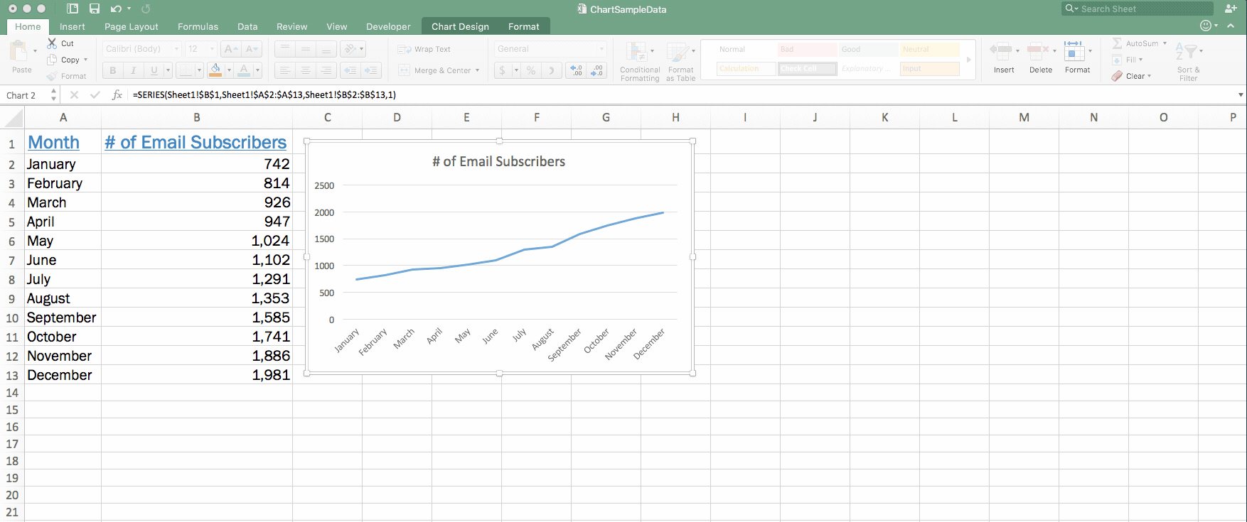
In this case, because Lucy wants to display a trend in her data over time, she knows that a line chart is probably her best bet. So, she selects a line chart from those options.
After doing so, her chart instantly appears within the same tab of her Excel workbook. That’s it—she’s just created her chart. Pretty easy, right?

3. Double-check your chart
Now with her chart is created, it's a good time for Lucy to take another quick peek and make sure nothing is unexpected or looks out of place.
In this case, since we’re working with such a small data set, it’s not a huge issue. But, when you’re working with a much larger set of data, mistakes can slip past much easier.
If you see a huge spike that you weren’t expecting or anything else that makes you hesitant, it’s best to return to your original data set to confirm there aren’t any errors that you didn’t catch the first time.
4. Customize your chart
At this point, the chart is created—and, you can stop here if you’re happy with it.
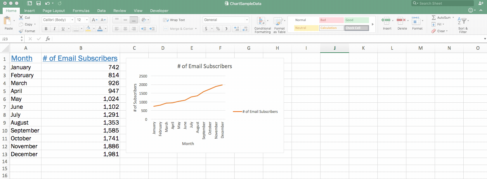
But, since Lucy works in marketing, she wants to make some changes to the colors to match her company’s branding, as well as add axis titles and a legend to make her point explicitly clear.
Let’s start by changing the colors. Here’s the important thing to remember about customizing a chart within Excel: You should click directly on the portion of the chart that you want to edit. So, if Lucy wants to change the line from orange to blue, she should click directly on the line—so that those formatting dots appear all around it.
When she’s clicked on the item that she wants to change, she’ll right-click on the line and select “Format Data Series.”
A quick note: The exact language here can vary depending on what portion of the chart you’re clicked into (for example, if you’re changing the white space around the chart, it’ll say “Format Chart Area”). In short, just look for the “Format” option.
After selecting “Format Data Series,” Lucy clicks the paint can for the color and then selects orange. Her line then changes from blue to orange.
 Next, Lucy wants to add axis labels so that there’s no doubt about the information that’s being displayed.
To do so, she clicks within her chart and then visits the “Chart Design” tab in the ribbon (you must be clicked in your chart for this “Chart Design” tab to appear!). Within that menu, she’ll click “Add Chart Element” and select “Axis Titles”.
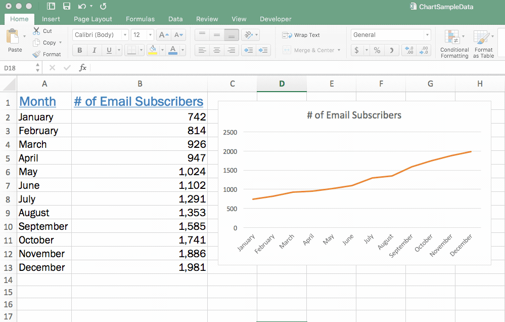
She’ll insert each axis title—the horizontal and the vertical—separately and enter the appropriate name for each. After doing so, they’ll appear on her chart.
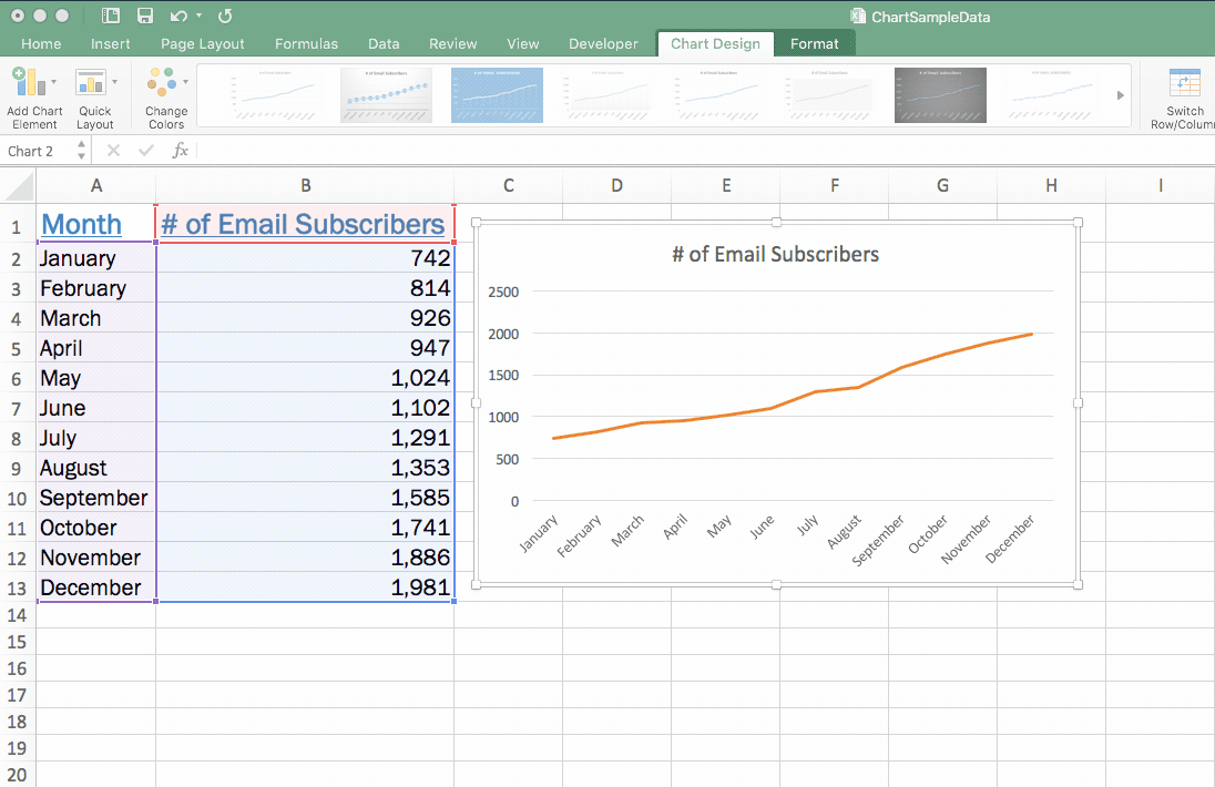
Finally, Lucy wants to add a legend. It’s not really necessary on a data set like this (since there’s only one line displaying data). But, for clarity’s sake, we’ll go through the steps to add one.
Again, Lucy will click within the chart, head to the “Chart Design” tab, click the “Add Chart Element” button, and select “Legend.”
She’ll need to select where she’d like it to appear on her chart. This is all up to personal preference, so Lucy selects the right side of her chart.
When she does so, her new legend appears.
But, wait… what if you regret your chart choice?
Sometimes it can be hard to visualize what your data will look like in chart form until you’ve actually created the chart.
So, what happens if Lucy had created this line chart—but, after seeing it, she thinks that a bar chart would be better? Does she have to start all over again from scratch?
Absolutely not! Excel makes it easy to swap out the type of chart you’re using—even after it’s created.
To do so, click within the chart, go to the “Chart Design” tab, find the “Change Chart Type” button, and select the type of chart you want to swap to.
Take note that after doing so, you might have to reformat some of the colors selected (since Lucy chose to have lines displayed in orange when editing her line graph, that’s what’s showing up even in the column graph).
But, otherwise, swapping out your chart type is as easy as that.
Ready to build your own charts?
Charts are a great way to visualize your data and present it in a way that’s far more digestible than endless rows of digits. And, the best part? Excel charts really aren’t challenging to create.
Follow this step-by-step guide, and you’ll end up with a chart that summarizes your data in a way that’s painless to analyze.
Ready to try some advanced techniques? Check out this advanced Excel charts tutorial.