
We use Excel to organize and manage all types of data. Excel also has great built-in functionalities for breaking that data down into graphical representations, which are easier to interpret and analyze.
You can make a graph in Excel for simple, advanced, and complex data. In this tutorial, we’ll walk you through how to make a graph in Excel.
Graph vs. chart
What is a graph, and what is a chart? Are they the same? In the strictest definition, a chart is any visual representation between two or more categories or variables. For example, a retailer may create a chart showing both peanut butter sales and sliced bread sales, both on the same axis but each in a different color.
This chart is not meant to show a direct impact of one item on the other, and removing peanut butter sales from the chart will not impact what was reported about paintbrush sales.
On the other hand, a graph specifically shows how one number affects or changes another. So we might plot the same two items (peanut butter and sliced bread sales), but on separate axes, to determine the relationship between the two.
That graph may be designed to show that as an independent variable, an increase in peanut butter sales will result in an increase in bread sales also.
So the term chart is broader than graph. Graphs can be considered a subset, or type, of chart. That’s the technical explanation. In practice, though, people tend to use both terms interchangeably. Excel tends to use the word “chart” to cover the various graphical representations of numbers, so we’ll mostly use that word here.
Download your free practice file!
Use this free Excel file to practice along with the tutorial.
Types of charts
We’ll explore some of the more commonly-used chart options and when to use them. If you’re just getting started on Excel charts, one of these three will usually do. If you’re looking for more advanced charts, you can check out our advanced charts resource, but the basic steps to make any graph will essentially be the same.
Bar and column graphs
We use both bar and column graphs to visually compare values across categories. The bars in bar charts are displayed horizontally, while in column charts, they are vertical.
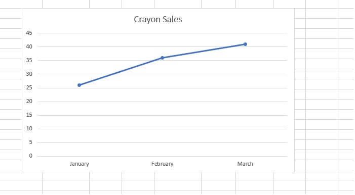
Line graphs
When we have data that shows trends or changes over a period of time, line graphs are usually a great choice.
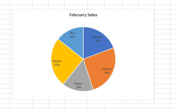
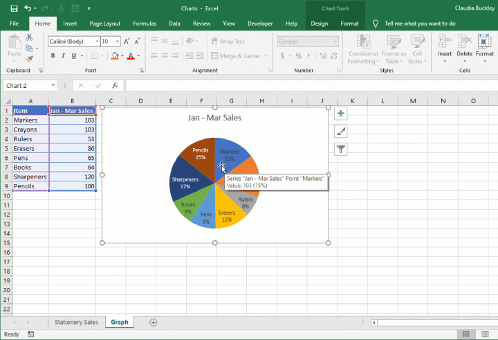
Pie charts
While not technically considered graphs, pie charts are so popular that it seems appropriate to include them here. They are used for showing how different elements contribute to a whole at a specific point in time.
 The type of graph you select has a lot to do with your data type, but it also depends on what you’re trying to highlight at that specific moment.
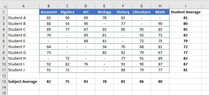
For instance, the data below can either be used to highlight each subject’s average score, to compare students’ performance, or to determine the proportion of students who chose to take each subject.
How to make a graph in Excel
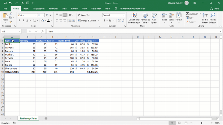
Step 1 - Enter data into Excel
Data entry will probably be the most labor-intensive part of your graph creation. The most important task at this stage will be to check the validity and accuracy of your data.
Data may also have to be extracted and summarized into categories so that items that are the same are presented as one datapoint. You should also create data headings, as they will be used to automatically generate labels on your chart.
Step 2 - Decide what story you want to tell
This may seem like a given, but as we’ve seen in the example above, doing this step will directly affect the type of chart you choose.
Is your story about changes over time, about proportions of a whole, or a comparison of two or more variables? Is your audience familiar with the subject you are reporting on? How well will they be able to read and understand the message you are trying to convey with your chart without relying on your words?
Step 3 - Highlight your data and 'Insert' your desired chart
When selecting the cells to be used as source data, there may be times when your data is non-contiguous. Remember, Excel puts (or tries to put) everything that is highlighted as your data source on your chart. So select only what you need by holding down the Control key between selections.
Choose a chart from the Insert tab. Excel can take some of the guesswork out of choosing the right graph with its Recommended Charts option. Excel plots graphs that might be appropriate for your dataset by looking at your data selection.
You can preview what your data would look like by clicking on each recommended option. It’s a good starting point if you’re not sure what type of chart options will work best with your data.
 A shortcut for the ‘Recommended Charts’ option is to press Alt + F1, with the only difference being that Excel will automatically create the chart and place it on the worksheet.
Make the chart your own
As you can see, a chart can be created in three steps. But it’s likely that you’d like to customize your graph by adding one or more of the following elements:
- Data labels (the value of each item)
- A chart title (the name of the chart)
- Axis titles (the names shown on each axis)
- A legend (what is represented by each color)
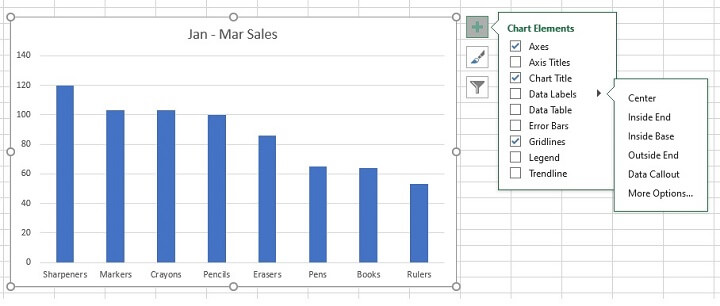
These can all be added by selecting the graph, then clicking on the green plus (+) symbol at the upper right corner for the Chart Elements shortcut. All the elements available for your chart type will be shown, with an expanding arrow to the right of each one, offering additional options.
For example, the Data Labels chart element can be customized to specify where the values are shown (e.g., inside or outside the data series). Selecting More options will display a panel to the right of the screen.
Resize graph
Click on the chart and drag any of the eight handlebars to resize the entire chart. The four corner handles will expand the chart proportionally, while the middle, left, and right handles will only make the image wider or narrower without changing the height. The middle, top, and bottom handles will only make the image taller or shorter without changing the width.
To resize only the plot area, select an inner area of the graph, such as the gridlines, and an inner outline will appear. Drag the handlebars in the way described above, and the plot area of the graph will become larger or smaller.
Change chart location
Select the chart and close to one of the edges, drag the chart to another location on the same worksheet.
To move the chart to another worksheet, select the chart and go to the Design tab. Click Move Chart and select either New Sheet (to place the chart on a sheet by itself), or Object in to select an existing sheet from the dropdown list.
Change chart type
If you’re not satisfied with the chart type you selected, there is no need to start over. Just click the chart, go to the Design tab and click Change Chart Type. From there you can select any of the available chart types.
Switch the data on each axis
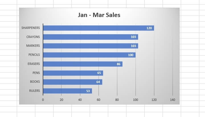
There are times when the same data can be viewed differently, even though the same chart type is used. Here’s an example:
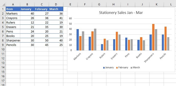 In the above graph, we are viewing stationery sales where each item is viewed as a 3-month cluster. Let’s switch the data on the X-axis by going to the Design tab and clicking on the Switch Row/Column command.
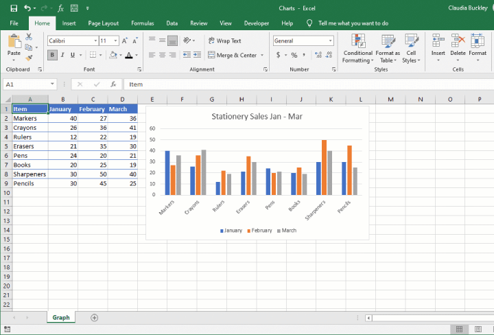 We are now seeing the same data, but we are now viewing each month as a cluster of eight items because the X-axis has now been switched to display the months instead of the items.
Adjust X or Y-axis values
If you right-click on the values of either axis and select the Format Axis… command from the context menu, a panel will appear to the right of your screen. From the Axis Options fields, you can choose the minimum and maximum values of that axis and the intervals for each unit, if a numeric axis was selected.
If the numbers on your Y-axis should be some other format (such as currency, percentage, or date) then expand the Number menu to select the number category. The numbers on the axis will be updated. Of course, this can also be done by just changing the number formats in the source data.
Adjust legend and axis labels
To increase the font size of your legend or axis labels, right-click the element you want to adjust and select Font from the context menu. From the Font dialog box, increase the font size as desired. As you can see, other font changes can also be made here.
Control the display of data on your chart
You can control the content displayed on your chart simply by selecting only what you want to report on from your source data before you even create the chart. Press the Ctrl key between selections to select non-contiguous cells.
However, if the chart is already created, go to the Design tab, click Select Data and uncheck any category labels which you want to exclude from your graph.
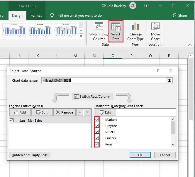 As a shortcut, you can just click the chart and select the Chart Filters icon to the right of the chart (it looks like a funnel). From here you can deselect any category you do not want to be shown on the chart. Click Apply, and it will be removed from the chart.
Note that if you created a Pie Chart and deselected one or more of the categories from your chart display, Excel recalculates the percentages since the slices in a pie chart will always add up to 100%.
 To change the order in which the categories appear, you can either sort the source data or choose Select Data from the Design tab and use the up/down arrows to reorder the data on your graph.
Using chart tools
Cosmetic changes to an Excel graph can be made in multiple ways. The quickest way is usually to right-click on the element being changed and select a different font, color, text size, etc., as desired. Alternatively, the Format tab allows you to make more advanced changes to a single element at a time.
However, if you want to change an entire theme or color scheme, these methods would be too time consuming. You’d probably be better off choosing one of the pre-built Chart Styles from the Design tab. Options such as dark themes, shadows, and textures are available and can give your chart a modern and sophisticated look.
Summary and overall recommendations
That wasn’t so scary, was it? Maybe the biggest takeaway is this. Your chart should be your voice. It should tell the story you want with very little need for additional explanations. Create and design a chart that doesn't draw attention to the chart, but to the message.
Now you’re ready to go conquer the world with charts of your own. Learn a bit more about the basics of charts with our free Excel in an Hour course. Learn a lot more with our comprehensive Basic and Advanced course!