A line graph has a horizontal and a vertical axis and uses one or more lines to show where two values intersect.
Line graphs are some of the most common types of charts used to display continuous data. Since values are distributed evenly on both axes, they’re great for showing trends over time and are useful for predicting future values based on historical data.
Excel extends its analytical capabilities beyond spreadsheets by having a built-in chart maker. With very little effort, you can make a variety of customizable charts, including line graphs, in Excel. The right kind of chart can bring large amounts of numeric data to life by summarizing them in a way that’s meaningful and memorable.
With that in mind, let’s focus on one specific type of chart offered by Excel — line graphs. Here’s how to make a line graph in Excel.
Download your free line graph practice file!
Use this free Excel line graph file to practice along with the tutorial.
Differences between scatter charts and line graphs
Before we really get into it, let’s make sure we are all on the same page. Scatter charts and line graphs are not the same! They may look very similar, especially when a scatter chart is displayed with connecting lines. However, the way each of these charts plots data along the X and Y axes is very different.
A scatter chart always has numerical data on both axes, with the objective of determining a relationship between the two variables. The chart plots the intersection of x and y numerical values into single data points.
 On a line graph, the numerical value is always placed on the Y (vertical) axis, while the categories (e.g., days, months, years) are placed on the X (horizontal) axis.
How to make a single line graph in Excel
Making a line graph in Excel starts with the basic steps of making any other chart. Here’s how to make a line graph where each category has only one numeric value:
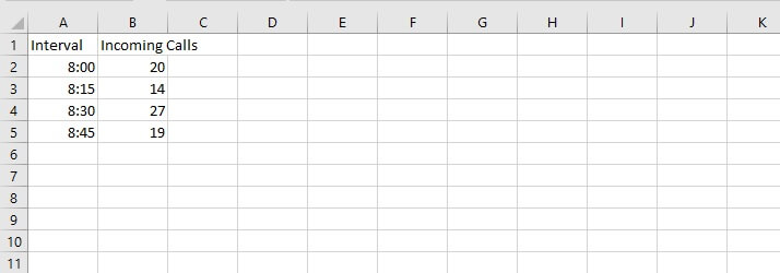
Step 1 - Enter and format source data
A single line graph means that only one independent variable is being measured or tracked across multiple time intervals.
Whether data is entered in row or column format, the time intervals (days/months/years, etc.) should be listed first. This will appear on the X-axis of the graph. The variable being measured (for example - items sold, daily rainfall, average income, etc.) should be listed next. This will be plotted against the Y-axis.

Step 2 - Ensure that a line graph is the right chart for your data type
Remember that line graphs are especially useful for showing trends over time. Psychologically, we tend to associate linear images with time. So if you try to depict employees’ sales figures for one moment in time using a single-line graph where employees’ names are the X-axis values, the line will be plotted. But your audience will most likely be confused because their eyes are expecting the graph to tell a different kind of story.
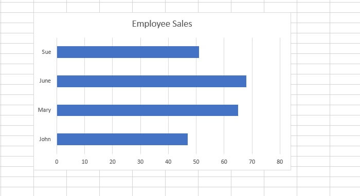
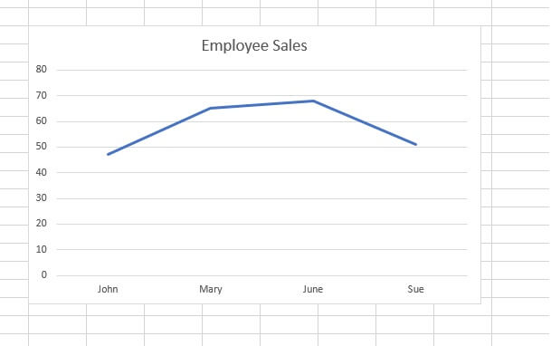 For example, the above chart is a poor choice to depict this type of data. A bar or column graph would have been better suited here.
Step 3 - Highlight data and 'Insert' your desired chart
If the two columns being used as your source data are non-contiguous, select only what you need by holding down the Control key between selections.
Choose a chart from the Insert tab. Excel takes some of the guesswork out of choosing the right graph with its Recommended Charts option. Excel determines this by looking at your data selection and the type of chart that will most likely produce the best results.
Hovering over each icon gives a preview of what your chart would look like with each recommended option. It’s a good starting point if you’re not sure what type of chart options will work best with your data.
There are a few options for single line graphs, including 2-D Line, 2-D Line with markers, and 3-D Line. 2-D and 3-D area charts are also considered types of line charts, where the area below the line is shaded to highlight the volume of change over time.
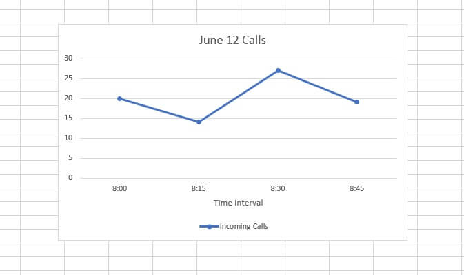
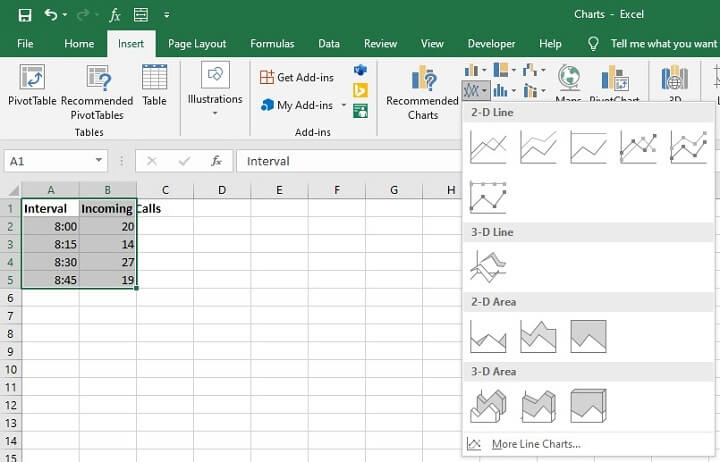 In the example below, we selected the 2-D Line with markers.
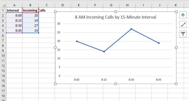 Congratulations! You just created a single line graph.
How to make a multiple line graph in Excel
The main difference between a single and a multiple line graph in Excel is that the source data for multiple line graphs is made up of several variables, and several data points for each variable.
As with single line graphs, the first column or row should be made up of the time intervals. Each subsequent column or row should represent the independent variables being measured, with their cells containing the respective values.
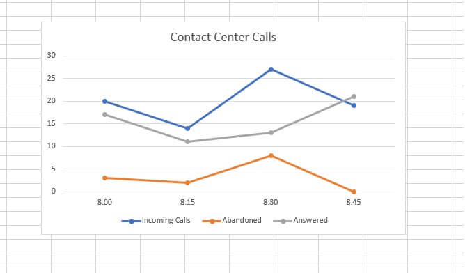
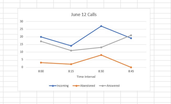
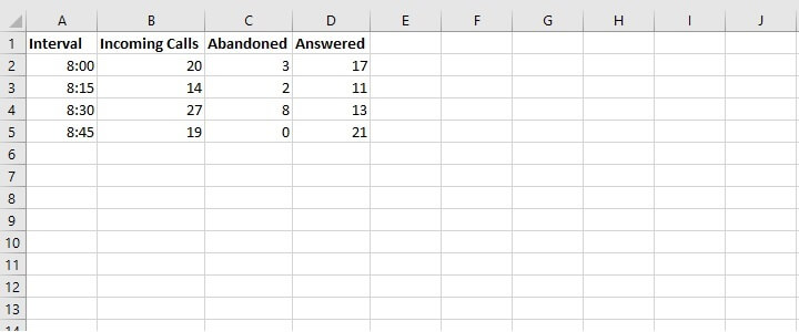 Time intervals will appear on the X-axis and the numerical measurements on the Y-axis. Each independent variable will be shown as a line in its own color on the graph. It makes sense for a legend to be created to identify which variable is represented by each color.
 Now that you know how to make a line graph in Excel, let’s make sure you understand what everything means.
Download your free line graph practice file!
Use this free Excel line graph file to practice along with the tutorial.
How to read a line graph
On a line graph, the axes typically (though not always) intersect at the zero point, called the origin. When line graphs show trends, the X-axis is the timeline while the Y-axis depicts the quantity of the variable being measured.
At each time marker, the plotline has a corresponding Y-axis value which shows the value of that variable at that point in time.
 When a line graph represents more than one variable, a separate plotline is used for each variable, each in a different color. This is often used as a way to compare variables against each other.
Change chart style and layout
If you’re satisfied with the style and layout of the line graph you created, great! If not, there are a couple of ways to change chart style. In general, chart elements can be added or removed from the Design or Format tabs on the Excel ribbon. These tabs only appear when a chart is selected. For this reason, they are called contextual tabs.
Elements and layout
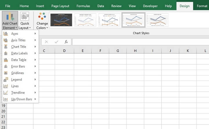
From the Design tab, you can add or remove specific elements like a legend, axis titles, data labels, etc., by using the Add Chart Element menu item.
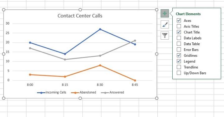
 Alternatively, chart elements can be quickly added or removed by clicking on the green plus sign (+) next to the chart.
Color and style
To change the chart’s color scheme, go to the Design tab and choose one of the Excel-designed themes and styles from the Chart Styles command group. Hovering over each one will give a preview of what your chart will look like if you select that option.
 If you use the Format tab instead, you’ll be able to make manual changes to the style and color of your chart without following an Excel-designed theme.
 To restore your chart to its original theme, go to the ‘Format’ contextual tab > ‘Current Selection’ command group > ‘Reset to Match Style’ menu option.
Change chart type
If, after creating your chart, you find that you’d rather use a different chart type, there is no need to start over from Step 1. Simply select the chart image and click the Change Chart Type icon from the Design tab, then select your new chart type.
 In general, chart editing options can be found by going to the Format menu and making a selection from the Current Selection dropdown. This will highlight that aspect of the chart and open a corresponding panel to the right of your screen, where both basic and advanced editing options are available.
When to use a scatter or line graph
As a general rule, use a line graph if your data has text values along the X-axis. These text values can be evenly-spaced time labels like days, months, or years.
If both sets of data contain numeric values, a scatter chart is probably better. In reality, it is possible to plot a line graph when there are two sets of numeric data, where each category will be shown as a different line color.
However, one challenge with doing this is that if both sets of values are quite different, it will be difficult to see changes to the numbers on the smaller scale.
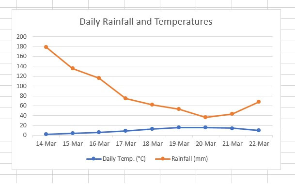
For example, the following dataset compares daily temperature and daily rainfall in millimeters.
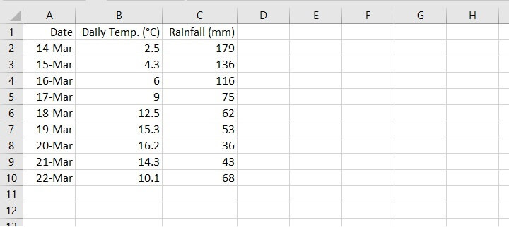 Using a line graph for the above data will result in a Y-axis scale where the numbers are so far apart that it is difficult to see the changes and fluctuations to the numbers which carry a smaller value.
 A scatter graph would be a better way of representing a relationship between these two sets of numbers.
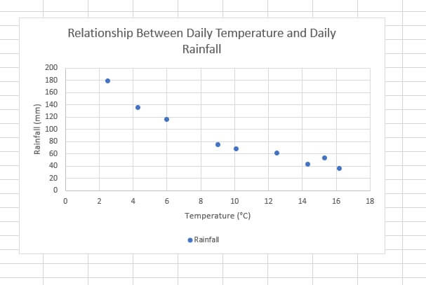 The purpose of your graph will also dictate the best chart choice. For scatter graphs, think correlation. For line graphs, think timeline.
Experimenting with different types of source data will get you comfortable with line charts in no time. Download the practice file and let us know what you think of Excel’s line graphs!
Learn more
Learn more about line charts and other types of Excel charts in our Basic and Advanced Excel course. Or start with some basic charting knowledge by trying our free Excel in an Hour course. Want to become an Excel data visualization master? You’ll love our course on Excel data visualization, taught by Microsoft MVP Deb Ashby.
