
Nothing makes information stand out like a little bit of color. Excel has a tool that automatically helps you out with that — it’s called conditional formatting.
If you’re ready to take your data organization game to the next level, keep reading to learn how to use conditional formatting in Excel.
In this resource, we'll apply conditional formatting to a pivot table. Note that the steps to apply pivot table conditional formatting are the same as applying it to data in other formats, so the instructions below will still work for you for any data in your range or table.
What is conditional formatting?
Conditional formatting in Excel is a tool that applies formatting to your data depending on the conditional rules you lay out.
It can be used in a number of ways, including visualizing your data and checking for specific information. Additionally, it’s a great way to highlight top values or differences in your data.
Download your free Excel practice file!
Use this free conditional formatting Excel file to practice along with the tutorial.
When to use conditional formatting
You can use conditional formatting in Excel to visualize month-over-month marketing statistics, highlight link building opportunities by difficulty, or color-code content calendars. Conditional formatting can also tell you when inventory levels fall below a certain number, your top ten selling products for the month, which tasks in your tracking sheet are incomplete, and so much more.
Why use conditional formatting?
With conditional formatting, you have a variety of rules at your disposal to customize your data according to your needs. You can generate rules for text, values, and even dates.
Text Rules:
- Is a cell empty or not empty
- Does Text contain or not contain something
- Does Text start with or end with something
- Is Text exactly equal to something
Date Rules:
- If a Date is
- If a Date is before
- If a Date is after something else
Value Rules:
- Is a Value greater than or equal to
- Is a Value less than or equal to
- Is a Value equal to or not equal to
- Does a Value fall between or not between other values
Now that you’ve been introduced to the conditions used at the core of conditional formatting, let’s talk about how you can apply them to your data.
How to use conditional formatting
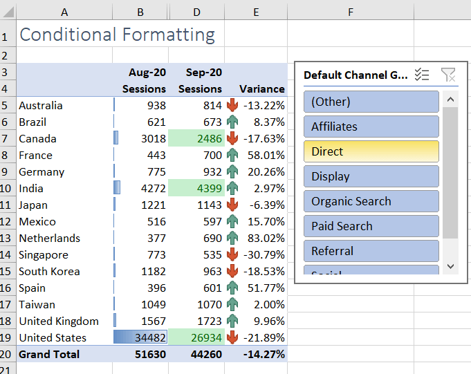
Let’s apply conditional formatting to this pivot table of traffic data from Google Analytics, where our eventual goal is to only look at the top 15 countries.
Conditional formatting’s various forms can help us highlight the most significant points in our pivot table, whether it’s top values or relative data point differences. Here are three versions of conditional formatting and how to apply them.
Icon sets
Instead of spending hours sifting through an endless array of values, if only there were an easy, visual way to help you break up your data in Excel. Lucky for you, we’ve got just the thing: icon sets!
Icon sets are exactly what you’re thinking — small images we can use to organize our data — and it’s super easy to use them in Excel with conditional formatting.
To start:
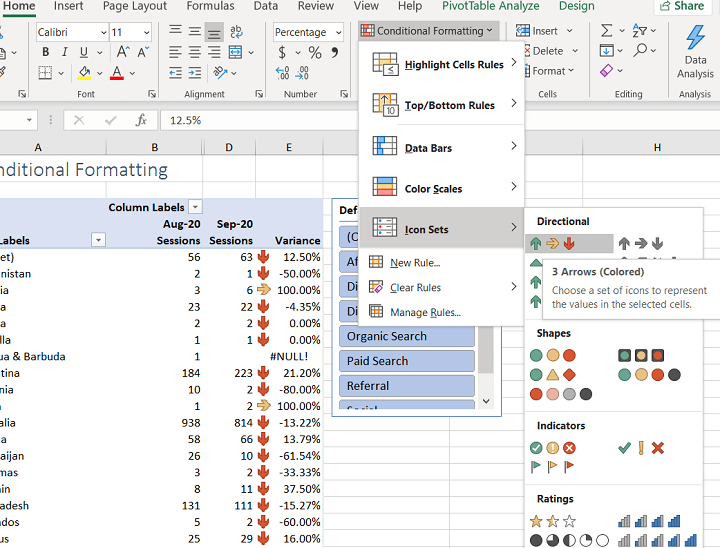
- Highlight the column you want to organize, then go to the Home tab.
- Click Conditional Formatting, then select Icon Set to choose from various shapes to help label your data.
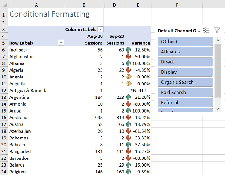
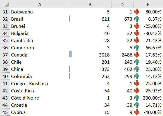
- For this example, let’s use the arrow icon set to show whether our highlighted data, the Variance column, has increased or decreased.
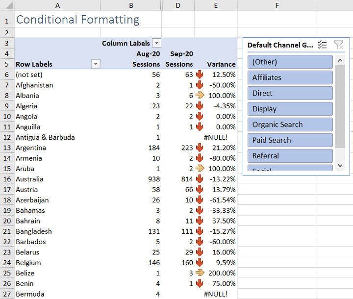
Now, you’ll see that the data has arrow icons accompanying their values in the cells. Looking at the data though, the arrows are not accurately showing increases and decreases in data as expected. We want our data to show positive percentages as increases and negative percentages as decreases.
This brings us to editing rules in conditional formatting, which is key to taming your data.
To change the rule:
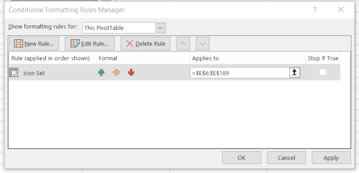
- Select your data again, then go back to Conditional Formatting.
- Select the bottom option, Manage Rules. You’ll be shown the rule you just implemented, which was applied with the default values set in Excel.
- Click on the rule, then select Edit Rule to change the values your rule will follow. You can change how your icons are displayed based on the values set here.
Download your free Excel practice file!
Use this free conditional formatting Excel file to practice along with the tutorial.
Let’s go back to our example, which calls for our icons to show Variance increases and decreases. To do this:
- Set the green arrow’s Value to 0.01 and Type to Number to show all increases.
- Then set the yellow arrow’s Value to 0 and Type to Number so that when the Variance is between 0.01 and 0, this means that there was no change.
- Red arrows will be shown when the Variance is below 0.
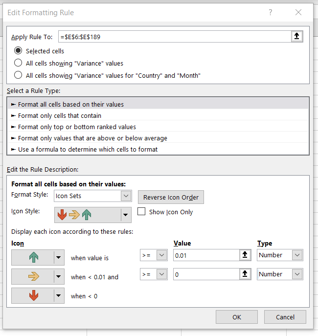
Once you’re done, click OK, and then you can click Apply before you exit this screen to put the rule in place.
Click OK once more to finalize your edits. With that, you’ll see that your wonderful set of arrows is accurately indicating all of the changes in your Variance data.
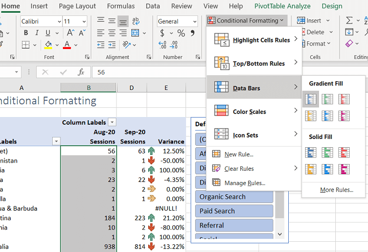
Data bars
Another way to display conditional formatting in your data is with data bars. If you highlight a column and apply data bars, you'll see that they appear in the column. Using this method, it’s easy to visualize your data relative to other values: the bigger the data bar, the bigger the value. You also have a choice between using a gradient or solid color bar in your visualization.
In our table, let’s apply data bars to the Aug-20 column. You can easily do this by going to Conditional Formatting, clicking Data Bars, then selecting any of the available bar fills.
Top/bottom rules
Top/bottom rules are another cool way to use conditional formatting. This allows you to organize your data based on the highest or lowest values in your data set. From there, you can further hone your data set by focusing on the values you care about most.
Let’s say you want to see the top three countries in the Sep-20 Sessions column displayed in green text with a green fill.
- Select Top/Bottom Rules, then click Top 10 Items.
- A window will pop up, where you can then indicate the number of cells that rank in the top. Change the number 10 to 3, then select Green Fill with Dark Green Text.
- Once you hit OK, your pivot table will now highlight those top three values in the color you chose.
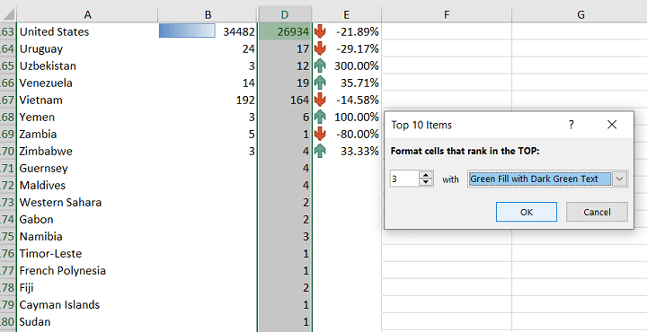
You can now see that the United States qualifies as one of the top three values.
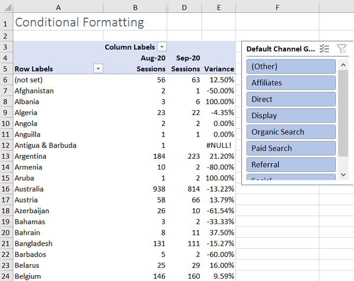
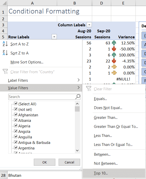
Since the list of countries is quite large, you can also use the Top Ten rules to make the pivot table smaller and more digestible. For this, navigate to the Row Labels header dropdown. Click Value Filters, then select Top 10 again. Edit the value 10 to however many items you want to display in the pivot table.
Here’s what the pivot table looks like when it’s condensed to the top 15 countries.
Notice in the image above the Row Labels and Column Labels header drop-downs are missing.
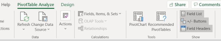
For a cleaner look to your pivot table, you can hide your row label and column labels. On the Pivot Table Analyze tab, just click Field Headers to make them disappear. To make them appear again, just click on the same button.
So there you have it: a pivot table showing data bars, the top three countries in green, and highlighted variance increases and decreases — all thanks to conditional formatting. And the nice thing about conditional formatting is that when your data changes, the rules you set in place adapt right with it too.
Level up your Excel skills
Conditional formatting does wonders in helping you to visualize your data, and its use cases are endless. To learn more about conditional formatting and other versatile Excel skills you can use to format and analyze your data, make sure to check out GoSkills and HubSpot’s free Excel for Marketers Crash Course.