
There’s more to a spreadsheet than just the numbers on the page. It is equally important to make your spreadsheets look professional, easy to read, and visually appealing to your viewers.
The same way a lawyer with a crooked tie and disorganized papers might raise an eyebrow in court, your Excel presentation won’t hit the right marks with your audience if it looks clumsy and bland, no matter how many hours of research goes into making it or how important the information contained within it is.
Whether you are creating a spreadsheet for personal use, to pass information to your team or share with your project manager, the secrets locked away in this post will be of immense use to you. Let’s take a look at the best Excel presentation tips to help you create standout spreadsheets.
Free Excel crash course
Learn Excel essentials fast with this FREE course. Get your certificate today!
Start free course1. Get a template online
If you are a busy person, and you cannot fit an Excel presentation design into your schedule, enter the ex machina: pre-made Excel templates. You can choose from an array of purpose-specific templates with beautiful designs, fonts, and colors. Simply enter your values to customize it, and you are ready to go.
Of course, using a template means you will not get better at designing things yourself. If getting things done is your priority instead of getting better at designing presentations, then, by all means, use a template and be done with it. On the other hand, if you want to know how to make your Excel presentation better on your own, then find someone to teach you or stick around until the end of this post.
Check out our 50 best Excel templates to make your life easier and our 33 Excel business templates for workplace productivity.
2. Name your worksheets correctly
Excel presentation is all about clarity. For this single reason, the importance of a correct and reliable project or worksheet name cannot be overemphasized. It could be a sentence, a phrase or just a word. Just make sure it is easy to understand by you or by anyone you will be sharing the file with.
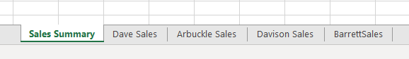
You also must make sure it is distinct from the names of other worksheets stored on your computer. After all, what is the use of all the tips you will learn here today if you will not be able to find the worksheet you applied them on?
3. Define your header/title
Your header and title can be anything but it needs to stand out. Your header must be able to speak to the reader and make the reader know at first glance what the header is.
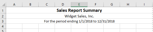
To do this, try a larger font for your header, underline and embolden it. You should center align it and use a different font color. It has to stand out but also blend with the template color scheme and overall aesthetic look. You can also use a different readable for your header. Just remember, we want to make it distinct, not isolated.
Step up your Excel game
Download our print-ready shortcut cheatsheet for Excel.
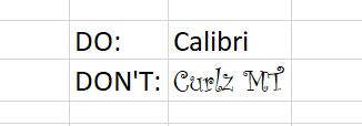
4. Dos and don'ts of fonts
Full transparency: Fonts make or break your spreadsheet. Always use a uniform font for your data, you can use the same font for your header or you can change that of the header. You can use three fonts in a single presentation and that is the recommended maximum, else you would be pushing it. In this case, less is infinitely better.
These are the guidelines to follow in selecting the right format for your font.
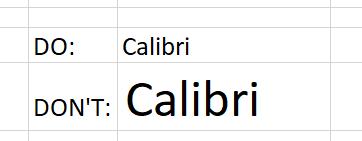
Font type
Here is a quick tip, fonts of the sans-serif group are the best for your Excel spreadsheet if readability is your goal. Calibri, Helvetica, Arial or Playfair are few examples. If used with the right alignment, spacing, and color, they can bring out the best in your Excel presentation.
Font size
This ultimately depends on your presentation but officially, font 12 is often advised with double spacing to improve readability. As stated earlier, the header font can be larger. The headers should be larger than sub-headers which in turn should be larger than data fonts.
Font color
There is such a thing as too much color. While this is often emphasized in fashion, it is equally true for designs like Excel presentations. You do not want to use more than 2 complementary colors, colors of the same shade, or 2 contrasting colors for your presentation.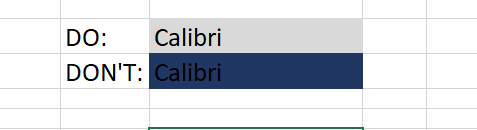
You want to create a sharp contrast between the text color and the background colors e.g. a light color text on a dark background and vice versa. This is where the "zebra stripes" rule comes in, which will be discussed later in the post.
Alignment
People don’t often use the alignment tool in Excel. If you want to make your presentation look beautiful and business-like, you will need to maximize the alignment feature.
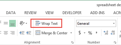 Headers should often have center alignment unless it is better at aside. The data should have an extreme right alignment for numbers or numerical data and a hard left alignment for texts. Center alignment is not advisable in the data input. To wrap your data or title around the cell, click on the cell then go to the Home toolbar, click on Alignment then select wrap text.
5. Create space for breathing room
When you see tightly packed, clumsy or wordy text or spreadsheet, your brain automatically gets tired of reading it before you even start. But when there is breathing space and the spreadsheet is divided up into categories, it becomes more pleasant to the eyes and ripe for interpretation by the brain.
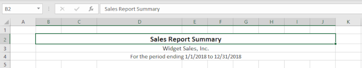
This brings us to the B2 rule. Try to start your presentation on column B, row 2. Leaving the A column and the first row blank. It works like magic. You should also make sure that the column and row dimensions are the same.
Additionally, don't autofit the height and width of your document. You need to have flexibility and creative control of your workspace. Instead, manually adjust the height and width so that they have just enough white space but not too much to give your presentation some breathing room and improve readability.
6. Add an image
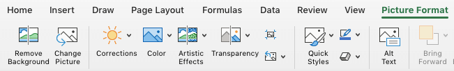
Whether it’s a photograph, an artistic sketch or your logo, images go a long way in making your spreadsheet better. Images make your presentation look official and possess the professional feel in many of the beautiful presentations you have seen. Pictures speak a thousand words. While Excel is not designed to accomplish the kind of presentation you can make in PowerPoint, a picture will help you to drive the point home and make your presentation memorable.
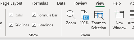
7. Go off the grid
Do you know that erasing all grid lines apart from those of your result will have people asking how you did it and if you used the same Excel software they use? Try it today. In your spreadsheet
-
Go to the View tab on the ribbon.
- Under the Show section, uncheck the box next to Gridlines.
8. Zebra stripes: Excel jungle law
Zebra stripes are alternating dark and light colors on rows lying on top of each other. This helps in a number of ways. First, it has this aesthetic feel that makes your work seem orderly, especially if you are displaying hundreds of rows of data. Second, it helps correlation and readability. A reader can track a row from the right-hand side to the far left and not lose track of what row his or her eyes are set upon.
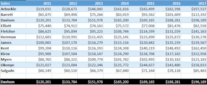
You can zebra stripe using many methods. When you create a table in Excel, by default this will be zebra striped (Tip- select your data and use the shortcut Ctrl + T on a PC or ^ + T on a Mac to quickly create a table). On the Design tab, under Table Styles, you can change the color and style of your zebra stripes.
It can also be done using a formula in conditional formatting if desired. Conditional formatting is done by highlighting values that satisfy certain requirements (e.g. all odd-numbered rows). It can be copied from cell to cell using the painter tool in the Home toolbar.
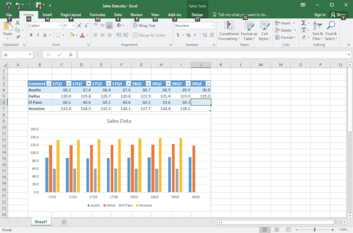
9. Use charts, tables, and graphs
Most presentations are incomplete without some form of visual representation. Whether table, graph or chart, you need to visually represent your raw data in mediums that would be understood in a single glance. Charts, graphs, and tables should not be underestimated, especially if you have cumbersome data spanning many columns and rows.
In the Excel ecosystem, the chart, graph, and table features are like symbiotic siblings. You need them to bring out the beauty in the brevity of your work.
10. Create cell styles
Excel has many preset cell styles but you can create your own custom styles that will be more customized, and easier to use and edit because you created it. This is actually an alternative to getting a template if graphics consistency is your goal. After creating a beautiful spreadsheet with the above information, you can save the style so that you can apply it to future presentations.
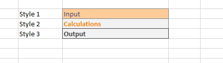
Now your presentation is perfect with the right feel and style. Simply highlight the cells with your design for saving, then go to the Home toolbar, click on "more" at the base of the style gallery, then select "new cell style". A style dialog box will open, name the style, edit its properties and save.
If it isn't broken and it works efficiently, why change it? You can, however, add a touch of variability by changing the color palette from time to time.
11. Show restraint
You have learned all of these tips and you are ready to start your presentation - be careful of overdoing it. Use color sparingly and don't combine too many tips at once. You need to tread the fine line between underwhelming and too much to find the "just enough" middle ground. Make sure your presentation is perfectly balanced, as all things should be.
Ultimately, the way your Excel presentation turns out depends on how well you communicate your data to your audience. Although, it does help to know the psychology of colors, good fonts. Browse beautiful spreadsheet presentations online to figure out what the "best" looks like. But at the end of the day, the ball is in your court and we hope that your dedication to practicing, sharpening and perfecting your presentation skills in Excel will be rewarded with cheers.
Ready to design your own Excel presentations?
If you would like to sum up the data on your Excel spreadsheet so that its insights are conveyed in a straight-forward manner, then follow this step-by-step guide. You’ll end up with a presentation that summarizes your data in a way that’s painless to analyze.
If you’re eager to brush up on your Excel skills, check out our Excel course and master the fundamentals to boost your productivity.
Free Excel crash course
Learn Excel essentials fast with this FREE course. Get your certificate today!
Start free course