
An image on a slide may speak a thousand words, but you do need text to explain the finer details. And that’s where choosing the best font for PowerPoint presentations becomes a critical exercise. In short, if you want to make a flawless PowerPoint presentation, you must pay attention to your fonts.
The interesting thing about fonts is that each has a personality. It’s like the three-piece suit that will be out of place at a barbeque but is perfect for an evening at the Savoy.
 How you pick and place the font in the context of the design can make or break your presentation. A well-placed font will help you to survive the day. When it comes to designing your slides, how your fonts are combined, placed, and scaled makes all the difference.
Want to learn more?
Take your Microsoft Office skills to the next level with our comprehensive (and free) ebook!
Why is choosing the right fonts so critical?
Slides aren’t like the pages of a book. They are billboards on the highway.
When you run through your slides, they will linger for just a few seconds. The words on the slides have to capture interest, send the right message, and support the visuals in those few seconds.
Fonts influence your audience by setting the tone and atmosphere of the presentation. The right choice of fonts or font pairings can make your text stand out by separating it from other elements around it. Typefaces are also brand symbols that help the audience relate to it through the presentation.
Before you get into the deep end, let’s learn the distinction between two major font types.
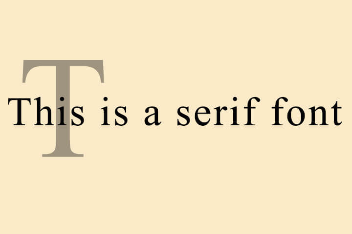
What are serif and sans serif fonts?
Times New Roman is the classic example of a serif font. The letters have tiny extensions that appear to connect them together in words as one letter leads to the next.
Newspapers and magazines use serif fonts for body text as they are easier to read. Serif fonts have distinct line heights that make them more legible in dense copy.
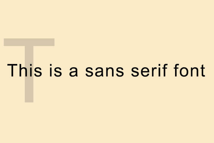
 Arial is the classic example of a sans serif font. The word “sans” means “without” to show the absence of the tiny extensions on the letters. Letters appear bigger and bolder and viewers can see them from a distance.
They lose this clarity if you pack them together in the body. That’s why designers recommend sans serif fonts for titles, headings, and captions in your slides.
The critical font pair: title vs body text
All Microsoft PowerPoint presentations by default start with two fonts — one font for the headings and one for the body text. This font pairing decides the entire look of the presentation. The theme plays an important role in the font choices and even blank presentations give you a theme to build upon.
The first question you may have to answer is how big your fonts should be? The simple answer is that it depends. Factors like screen size and room size dictate the limits of font size. Font sizes can hinge upon you emailing the presentation or delivering it live on stage or on a PC screen in a remote meeting.
Also, all fonts have an optimum size for legibility. Arial is clear at 12pts while Times New Roman is readable at 10pts.
Most presentation experts recommend these size ranges. The thumb rule — a larger font size with less text on screen is always good.
The default slide in PowerPoint starts with 60pts for section headers and 24pts for body font.
- Header Font: Between 26 and 42 point
- Body Font: Between 18 and 24 point
You can use the same font for both, but that can limit the visual impact of your slide.
Want to learn more?
Take your Microsoft Office skills to the next level with our comprehensive (and free) ebook!
10 tips for choosing the best font for PowerPoint presentations
Never sacrifice readability for style. With that motto in mind, follow these Microsoft PowerPoint tips to choose the best fonts for your business presentation or any other.
1. Choose two fonts
Three fonts can be a crowd. Choose two fonts wisely and use size, contrast, and color to combine them for visual interest. Font pairing is a critical part of PowerPoint presentations and you will have to spend a lot of time on this decision. The second font shouldn’t be too unlike or too similar to the primary typeface where you miss the distinction.
Tip: There are many font pairing tools available on the web. But play the TypeConnection typography game if you want to get better at it yourself.
2. Choose standard fonts
You want your presentation to look the same on all devices. Choose from standard fonts and you won’t have to rescue your slides from turning into a mishmash on another screen. You can be more imaginative if you are presenting to children or at Comic Con, but standard fonts are the safest bet always.
Tip: Here’s a complete list of fonts available on Windows 10.

3. Avoid script fonts and decorative text
Script fonts like Lucida Calligraphy or Gothic fonts like Century are always difficult to read. You can use them if the topic of the talk demands it.
4. Create visual interest with serif and sans serif fonts
As we emphasized earlier, serif and sans serif fonts have their own advantages and disadvantages. You can pair them and tap into their strengths.
5. Select color and create contrast
Go for font colors that are a part of your brand. Using color swatches and precise Hexadecimal or RGB values ensures colors stay consistent across slides.
Also, you might have to check your slide for accessibility for all as someone in the audience can be color blind and may not be able to decipher red or green.
Tip: There are many color palette generators available on the web for free. Try Coolors.
6. Have contrasting text and background colors
Fonts must stand out against the background. The higher the contrast between the two, the better the readability across the room will be. Use the color wheel to pick the background and the font colors. Opposite colors on the color wheel clash with each other and have the maximum contrast. For instance, orange on blue.
Always use the same background on each slide. Text against white backgrounds is not legible in a larger room. For the best results, opt for dark slides with light-colored text.
Tip: Go through a gallery of well-designed PowerPoint templates or use PowerPoint Designer as a shortcut to grasp the interplay of contrast.

7. Less is more with caps and italics
Don’t capitalize all the letters in the body text as it is difficult to read. Selectively use caps for acronyms and for emphasis. Similarly, choose italics sparingly for quotes or highlighting the names of books, authors, and journal titles, etc.
You can make a creative choice by using italic text sparingly for impact or you can also substitute them with subtle formatting to the standard fonts.
Tip: Caps and italics may be able to work with specific fonts, but you may need access to those fonts. You can use Picsart's text editor to play around with text that may suit your presentation better.
8. Limit the use of animated fonts
Animated fonts can be distracting. Avoid animating your text or use it only if it serves a functional purpose. Ask yourself if it adds clarity to your data or is just a cute effect.
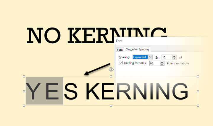
9. Keep an eye on font tracking and kerning
Learn these two typography terms and you will have an easier time placing your words on the slide. Kerning adjusts the spacing between two adjacent letters in a font. Tracking adjusts the space between all letters together. Both influence the readability of text.
For instance, you can avoid using narrow or condensed typefaces. Instead, pick a thicker font and tweak it with tracking and kerning within PowerPoint.
For more on changing the spaces between text, read this Microsoft support article.
Tip: Play the KernType typography game to get familiar with the basics of the two principles.
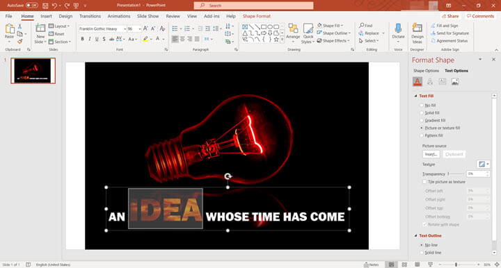
10. Make interesting shape effects
It doesn’t always have to be just about fonts and simple colors. The Shape Effects panel on PowerPoint gives you a lot of control over the finished appearance of text on the slide.
For instance, you can adjust the transparency of the letters. You can also “texturize” the words by using pictures to fill the words instead of a solid fill color.
- Select the word and right click.
- From the context menu, click on Format Text Effects.
- The Format Shape panel is displayed on the right.
- Select Text Options > Text Fill & Outline.
- Choose Picture or texture fill.
You can now use an image or any texture to decorate your words. Picture or texture fills are a creative way to use standard fonts but still make them stand apart on your slides. Of course, never overdo it.
Tip: Shape effects go well with thicker fonts.
15 of the most versatile fonts you can use in PowerPoint
These fonts (and a few more) are versatile because they are standard fonts and are available on both Windows and macOS. You don’t have to go after fancy typefaces just yet. Focus on your layout. Use the design pointers from the above list and give your slides an attractive makeover.
- Arial
- Calibri
- Cambria
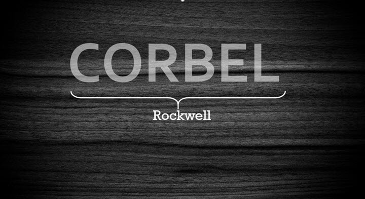
- Corbel
- Consolas
- Constantia
- Candara
- Franklin Gothic
- Garamond
- Gill Sans
- Helvetica
- Rockwell
- Times New Roman
- Verdana
- Palatino
Think of typography in PowerPoint as design
Practice with your eye. Play one font against the other for interesting unions. Typography isn’t just for selecting fonts and using them to occupy your slide with words. It is an essential design element in any place where visual communication matters. You can design your presentations faster once you work out how fonts work together and learn a bit about color theory.
Want to learn more about how good design comes together? Start with some of the basic and advanced PowerPoint techniques.