
A C chart is a control chart for monitoring the number of defects per sample. Control charts generally have three parts: sample averages, a centerline, and control limits.
The sample averages and the centerline represent the present behavior of the process. The control limits represent the range of sample averages that are predictable from that behavior.
C charts often accompany other tools for attribute data. For example, Pareto charts can help identify the most popular type of defects. Poka Yoke is a strategy that prevents defects.
Download your free C chart example file
Use this C chart file to practice along with the tutorial.
How to use a C chart
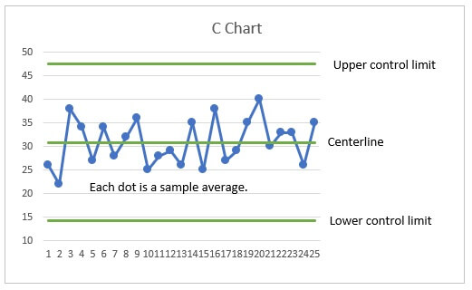
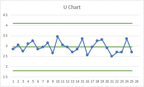
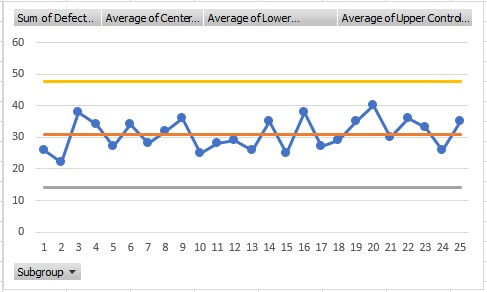
In the following example chart, the control limits and centerline are green. The blue dots and their connect line show the sample averages. A process is in-control when all of the points are within the control limits.
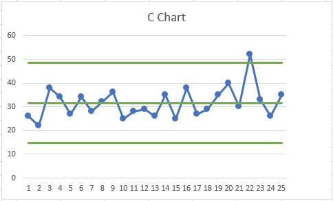
 A point outside the control limits alerts you that the process needs attention. Suppose that a process makes plastic parts and a defect is a rough spot. Every hour, you randomly inspect 20 parts. The following chart shows a high average number of defects in sample 22. You would investigate the cause and decide what to do about other parts from the same batch.
Comparing C charts, P charts, and U charts
The C chart is one of many control charts. Three common charts of the process average are C charts, P charts, and U charts. These charts all assess attribute data. Attribute data count characteristics, such as the number of defects or the number of defectives.
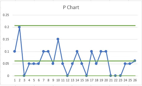
C chart vs P chart
To choose between a C chart and a P chart a useful guideline is to consider how to summarize the data. P charts are for attribute data that you summarize with a proportion. C charts are for attribute data that you summarize with a rate.
|
Proportion |
Rate |
|---|---|
|
Each measurement is one of two outcomes, such as defective/not defective. The summary is a proportion, such as a proportion defective of 0.003. |
Each measurement is a count, such as the number of bubbles on a painted panel. The summary is a rate, such as an average of 0.02 bubbles per panel. |
|
|
|
C chart vs U chart
U charts plot the average count per unit. C charts plot the average per sample. Because C charts plot the count per sample, they are typically used only when all of the samples contain the same number of units. In such cases, the U and C charts are interchangeable and you can use personal preference to select one.
|
|
|
Make a C chart in Excel
A C chart calculator needs to calculate the following:
- Sample averages
- Centerline
- Upper and lower control limits
While you can make a C chart in Excel in many ways, one fast way is to make a line chart from a pivot table. The following are general steps:
- Record the process data.
- Calculate the average of the samples.
- Calculate the control limits.
- Make a pivot table.
- Insert a line chart.
You can follow along with this C Chart Excel example file.
Download your free C chart example file
Use this C chart file to practice along with the tutorial.
1. Record the process data
Prepare five columns in Excel:
- Attribute data
- Subgroup identifiers
- Average of the samples
- Lower Control Limit (LCL)
- Upper Control Limit (UCL)
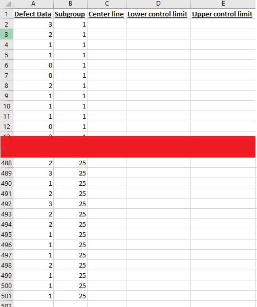
The first two columns contain data on your process. In the first column, record the count from each unit. In the next column, record subgroup identifiers.
2. Calculate the average of the data
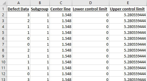
The average of a set of data is sometimes represented by the y bar symbol (ȳ), but in a C chart, use C with a line over it (C̅). The C chart formula for C̅ is the average count per sample. For example, if you have counts from 500 units from 25 samples and a header in your first column, then the formula is:
=SUM(A$2:A$501)/25Include the dollar signs ($) so that when you paste the formula down the column, the references to the data are unchanged.
3. Calculate the control limits
Control limits are typically three standard deviations to either side of the center line. Because C charts are for attributes data, there is no reason for the lower control limit to go below 0. In Excel, you can make your formula use the MAX function to account for this boundary. Assuming that your data begin in row 2 and that your centerline values are in column C, the formula is:
=MAX(0, C2 - 3*SQRT(C2))Because there is no boundary for the UCL, use a simpler formula:
=C2 + 3*SQRT(C2)Paste these formulas next to the data.
4. Make a pivot table
- Select a single cell in the data table.
- On the ribbon, select the Insert tab.
- Press Pivot Table.
- Click OK to add the pivot table to a new worksheet.
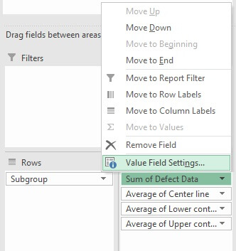
- In the Pivot Table Fields pane, select all five columns.
- Arrange the columns so that the subgroup identifiers are in the Rows box and the other columns are in the Values box.
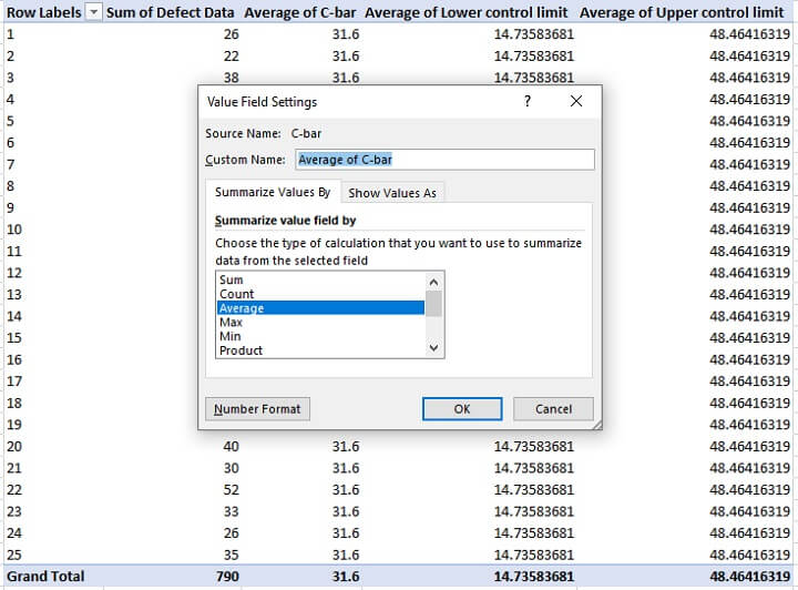
- In the Values box, use the following steps for the three columns for the centerline and the control limits.
- Open the context menu.
- Select Value Field Settings.
- In Summarize Value Field By choose Average.
5. Insert a line chart
- Select a cell in your pivot table.
- On the ribbon, select the Insert tab.
- Click the button to insert a line plot.
- Double-click the line for the subgroup averages.
- In the Format Data Series pane, click the paint bucket.
- Click Marker.
- In Marker Options, select Built-in. Make changes to the shape, size, and color of the markers.
- Delete the legend from the chart.
The C chart Excel makes will have different colors for the center line, UCL, LCL, and line that connects the sample averages. You can edit these series in a similar fashion to adding the markers.
Ready for more
Control charts are wonderful tools for making sure that the behavior of your processes is predictable.
When you have an in-control process, you can make use of your ideas to improve the process knowing that changes that you see are the result of your improvement efforts.
Whether you’re just beginning your journey with quality or you’re preparing for your black belt certification, GoSkills has the training you need to take the next step. Be sure to check out the Statistical Process Control course to learn about this and other types of control charts.