
Power BI is here and provides us with an easy way to create stunning, interactive reports.
In this article, we will start by explaining what Power BI is and why it is so useful. We will then see how to create a Power BI Pie chart.
If you’re a beginner to Power BI and want to see how it can help you create awesome reports quickly and easily - read on.
Download your practice file
Follow along with the steps in the article by downloading this practice file
What is Power BI?
Power BI is a business analytics service that enables you to get data from almost anywhere, transform it, model it and then create visually stunning and interactive reports.
These reports can then easily be shared with others. The methods available to you for sharing depend on the version of Power BI that you have.
To get started you first of all need to download Power BI desktop for free on your Windows device.
There are paid versions which provide more security and sharing options for businesses. The free version is an all-in-one powerful business intelligence tool and will be used in this article.
The big benefits of using Power BI are that:
- It enables you to work with huge volumes of data and the calculation time is fast.
- You have access to the powerful DAX language for creating measures.
- You can easily create charts and other visualizations on a dashboard that can interact with each other.
Our sample data model
Before we can create a Pie chart, we, first of all, need some data.
For the purposes of this article, the data has already been imported, relationships built and the measures have been created.
We will be using the simple data model below.
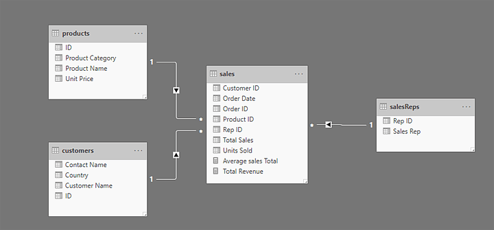
This model consists of a fact table containing sales data and three dimension tables (Products, Customers and Sales Reps).
The sales fact table has two measures which we can use in our visuals; Total Revenue (a sum of the Total Sales field) and Average Sales Total (an average of the Total Sales field).
Download the file used in this tutorial to practice and follow along:
Download your practice file
Follow along with the steps in the article by downloading this practice file
Create a Power BI Pie chart
Creating a Power BI Pie chart can be done in just a few clicks of a button. But then there are some extra steps we can take to get more value from it.
The purpose of a Pie chart is to illustrate the contribution of different values to a total.
For example, to see the total sales split by product category. You can then see the percentage contribution of each product category to the total revenue.
The Pie chart is not the only chart type that can produce this visual. We could opt for a Donut chart, or maybe a Column chart instead.
It is important to be able to create different chart types, as you may be asked by someone to display data in a specific way.
Check out this quick video on how to create a Power BI Pie chart:
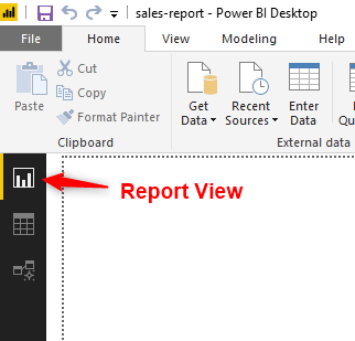
1. Navigate to Report View
You need to be in report view to create your visualizations.
If you are not there already, you need to navigate to this view by clicking the Report button along the left side of the window.
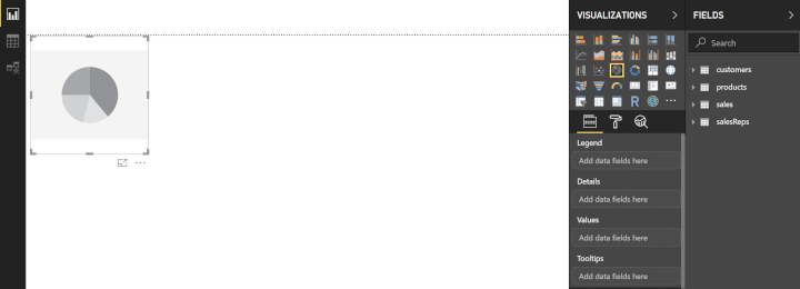
 After navigating to this view, it is a good habit to click somewhere within the white area. This ensures that no existing visualizations are selected when we go to create our new one.
2. Add the Pie chart to the report
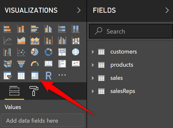
Click the Pie chart button in the Visualizations area.
A Pie chart is added to the report page. More options have also appeared in the Visualizations pane. We will be interacting with these next to specify what data should be displayed and how.
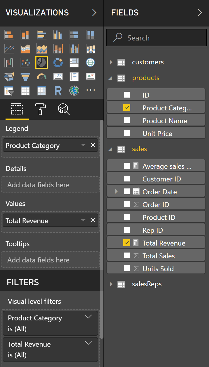
Click the arrow to the left of the Products and Sales tables to expand the list of fields.
Using fields in Power BI visualizations is similar to how you work with PivotTables in Excel.
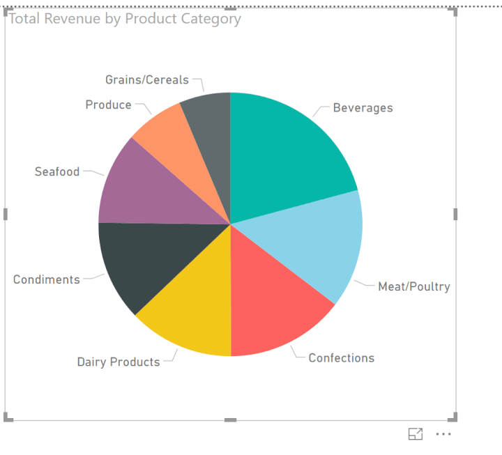
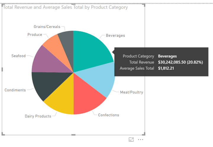
Drag the Product Category field from the Products table into the Legend area, and the Total Revenue measure from the Sales table into the Values area.
 The following Pie chart is created.
 You can resize the chart using the handles around the edge of the visual. You can also move the chart on the page.
3. Basic formatting
There are plenty of formatting options that can be applied to a Pie chart to improve it.
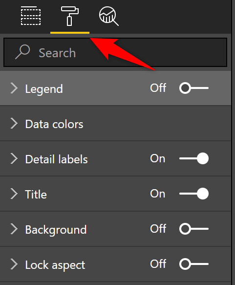
Click the Format button to access all the formatting options for the selected visualization.
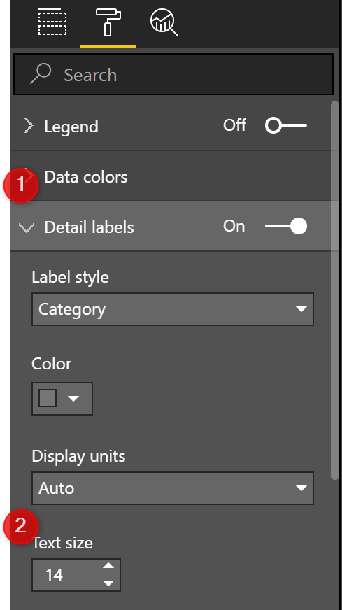
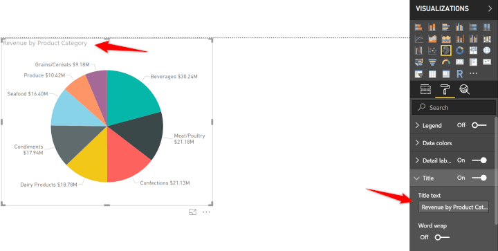
 Examples of some useful changes could be to increase the text size of the data labels (Detail Labels section) and chart title (Title section).
 There are tons of options and it is really a case of looking around and seeing what is available, and what you like to use.
You can see some more examples of formatting changes in the video at the end of this article.
4. Mouse over for more statistics
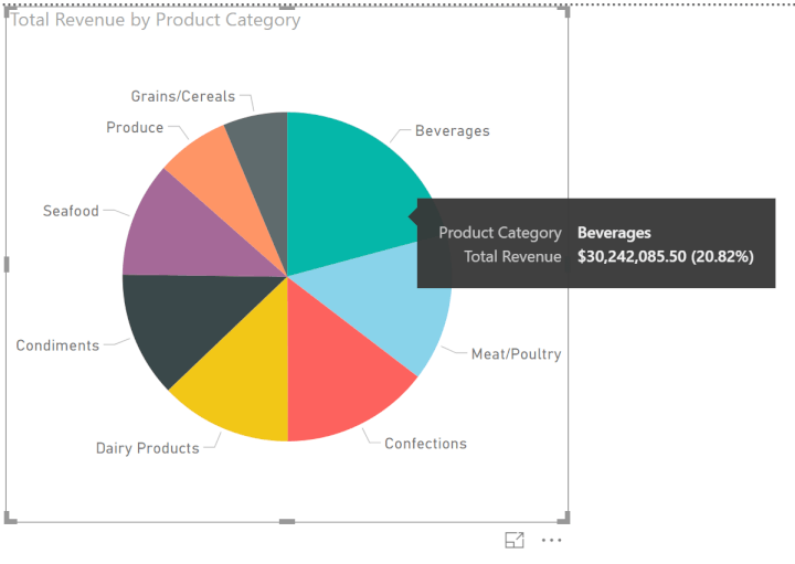
A cool effect with Power BI Pie charts is that when you mouse over the different segments, a tooltip with statistics is shown.
 You can add more information to these tooltips if you want by dragging fields into the Tooltips area.
If you have just been making some formatting changes, you will need to click the Fields button first to switch back to field options.
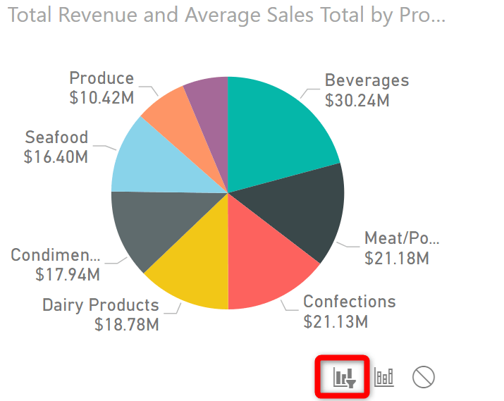
Click and drag the Average Sales Total measure into the Tooltips area.
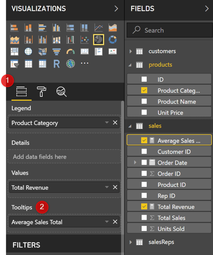 This information is then displayed in addition to Total revenue in the tooltip.
 You could go on to add further information to tooltips if required.
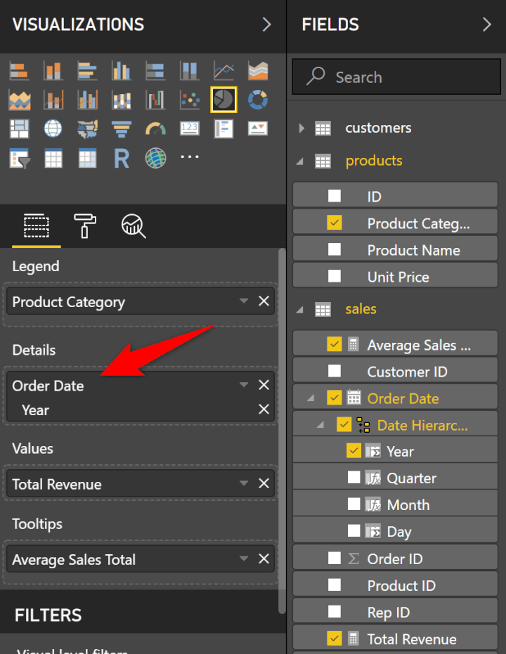
5. Adding to the Details area
By adding fields into the Details area of a Pie chart we can create an even further breakdown of our data
Click and drag the Years field into the Details are of the visualization.
 This can be a cool feature and show some great insights into our data.
In this example though, it also highlights some limitations with Pie charts. This visual is showing too much data and it is difficult to see what we want.
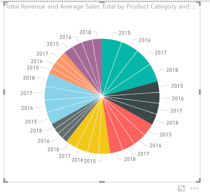 If we were to keep this visual, we would look to turn the Legend back on as it was lost when the Details area was used.
We will remove the Years field from the details area.
The chart title is becoming confusing. Let’s change this in the Format options for the chart.
 In an example such as this. A better idea may be to create a second visualization and have them interact with each other.
6. Interactive visualizations
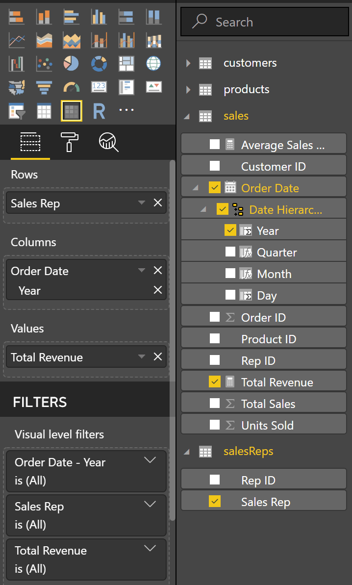
Let’s add another visualization to the report - the Matrix. This visualization is similar to a PivotTable.
1. Click in the white space of the report page to deselect the Pie chart.
2. Click the Matrix button in the Visualizations pane.
 3. Expand the salesReps table and drag the Sales Rep field to the Rows area of the Matrix.
4. Expand the Sales table and drag the Total Revenue field to the Values area, and the Year field into the Columns area of the Matrix.
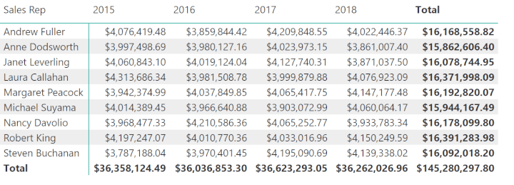
 The Matrix will look like below. This is a nice visual of each sales rep performance over the years.
 The really cool thing now, is that the Pie chart visualization will interact with the Matrix and vice versa.
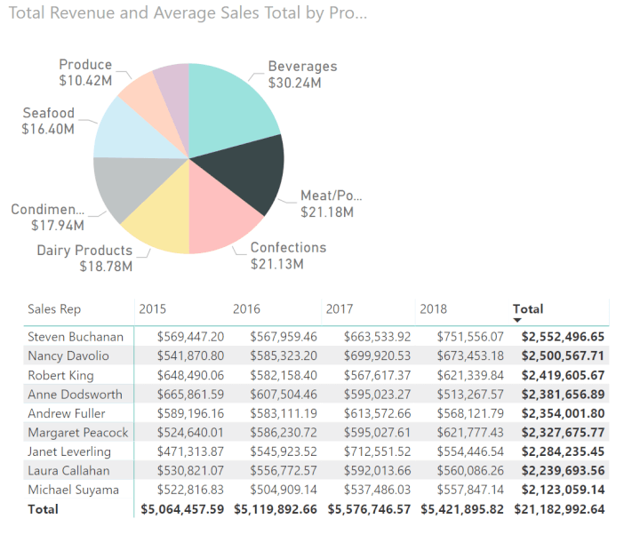
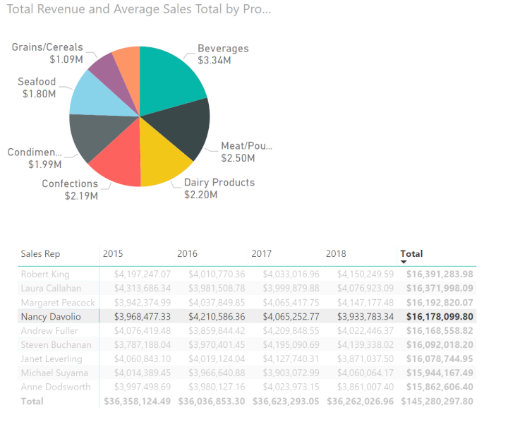
Click a product category segment in the Pie chart and see how it filters the Matrix.
In the image below, the Meat/Poultry data point has been selected in the Pie chart. The Matrix now only shows the values for that product category.
 And if you click a value in the Matrix, it will visualize that selection in the Pie chart.
In the image below, the total value for Nancy Davolio has been selected.
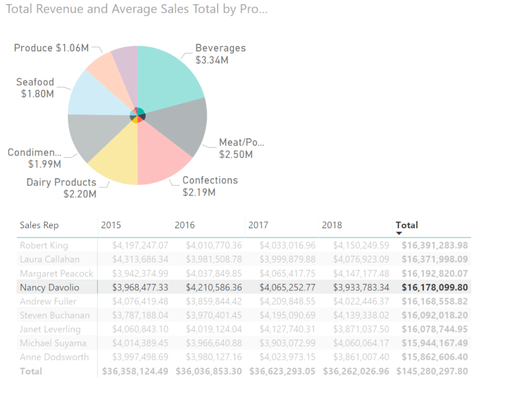 With the data in use here, the visual on the Pie chart is not very useful. It is so small, we cannot read much into it. But this could be a really effective visualization.
However, the filter from the Pie chart to the Matrix is great.
To clean a filter, click somewhere in the empty space of the visualization that you clicked on.
These interactions can be edited so that the report works as we desire.
We would like to keep the filter from the Pie chart to the matrix, but remove the one to the Pie chart.
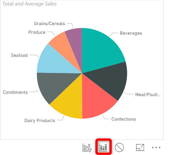
Select the matrix visualization. Then click on the Format tab and the Edit Interactions button.
This will display the interaction buttons for the other visualizations on the report page.
Now if we wanted to disable all interactions to the Pie chart from the matrix we would click the no impact icon.
 Click on the Highlight button to disable the visual interaction to the Pie chart.
 Although we do not want the Highlight interaction, having the matrix filter the Pie chart would be great.
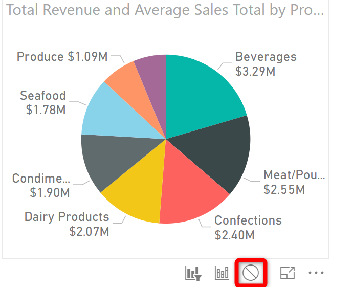
With the matrix selected, click the Filter button for the Pie chart to toggle the filter functionality on.
 Below is an image of the Pie chart being filtering to show Nancy Davolio’s sales only.
 The interactions between the Pie chart to the matrix remain the same.
Conclusion
This article has given you a good insight into the incredible visualization features available in Power BI.
Power BI Pie charts offer much more than standard Pie charts available in Excel.
The rich data offered by tooltips and the way that all the visualizations can interact with each other offers greater depth to your dashboard reports.
And the amazing thing is how quick and simple they are to use.
Want to learn more about Power BI?
If you are looking to sharpen your data analysis and reporting skills, then check out our comprehensive Power BI course delivered by Microsoft MVP Ken Puls. And while you're at it, brush up on your data analysis skills with our range of Excel courses, including Power Query and Power Pivot.