
If you’re like most people, you’re probably somewhat intimidated by Excel.
But, here’s an important truth: Excel is an incredibly helpful tool—particularly when it comes to taking raw data and transforming it into useful and impactful information. And you don’t need to be a numbers whiz to use it.
In this step-by-step tutorial, we’re breaking down exactly how to create an Excel dashboard (with no stress or headaches required).
What is an Excel Dashboard?
First, let’s start with the basics. The simplest way to think of a dashboard is as a visual representation of data. Raw data can be hard to look at. Sure, the need-to-know digits are there. But, all of those rows and columns are often impossible to process and understand.
This is where dashboards come into play. They turn data into information (yes, those are two different things!) by creating different charts, tables, and other visual elements that give you a high-level overview of that data.
A dashboard simplifies that otherwise complex data you have in your spreadsheet and transforms it into something visual that's easy to understand and, thus, utilize.
Needless to say, dashboards have a wide array of uses—from budgeting or project management to marketing or sales reporting.
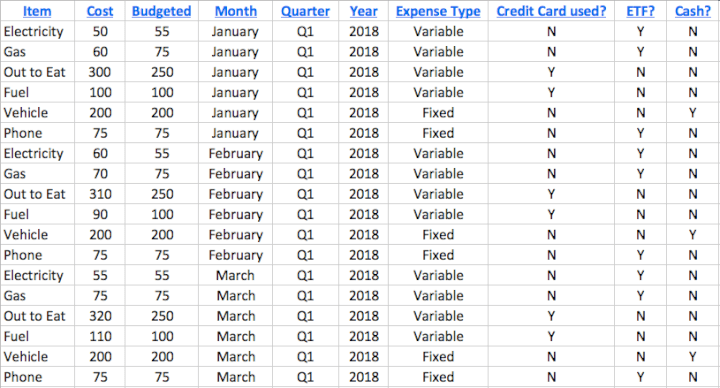
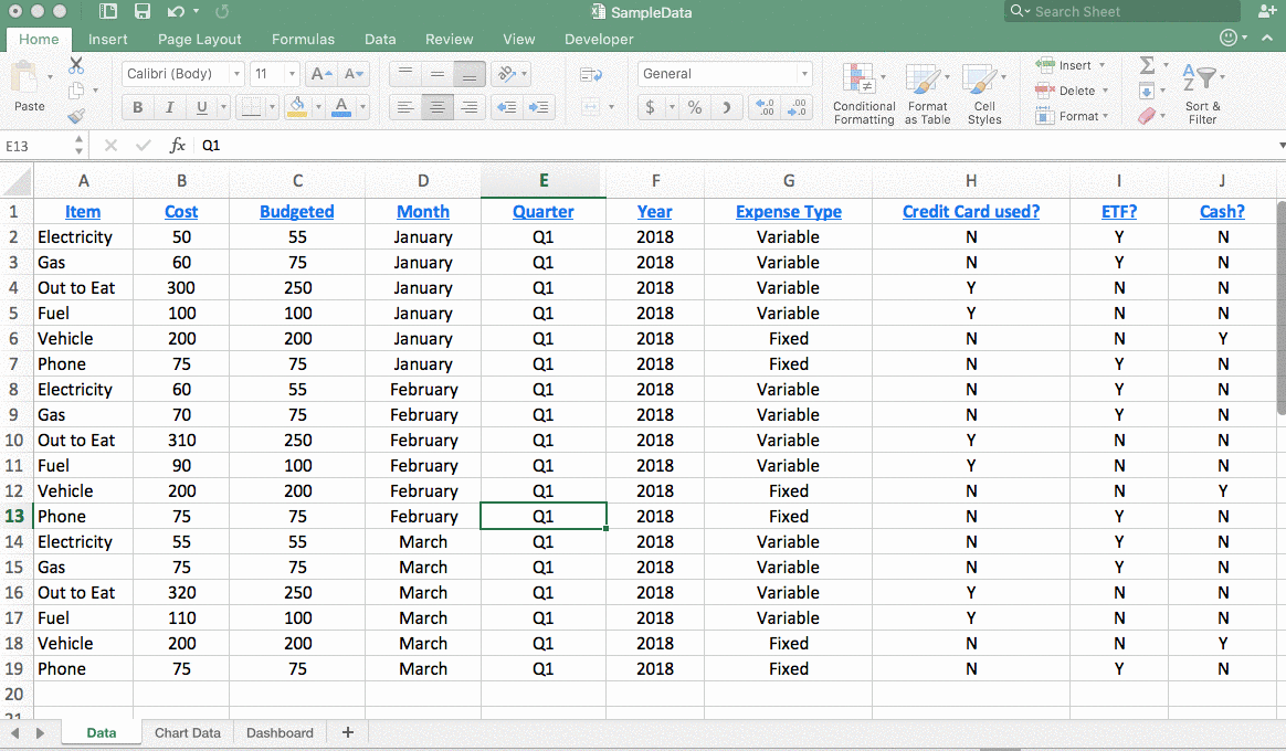
For a simple example, I used a dashboard to transform this spreadsheet of first-quarter expenses:
 into this quick pie chart that shares a breakdown of where money was spent during January:
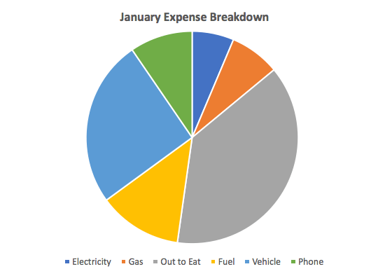 This example is relatively straightforward. But Excel has tons of capabilities to create as complex of a dashboard as you require.
Before building the Dashboard: what you should know
Data visualization sounds like a real party, doesn’t it? We can tell that you’re ready and raring to get started building your own dashboards.
However, before doing so, it’s essential that you lay the appropriate groundwork for dashboard design first. Here are a few things you’ll want to do before getting started:
1. Import your data into Excel
In order to create a dashboard, your data first needs to exist in Excel. If it’s already there, great—there’s nothing more you need to do with this step.
If your data source isn't in Excel, you’ll need to import it into an Excel workbook, preferably into an Excel table. The major advantage of using official Excel tables for your source data is that it'll make it far easier to output a dynamic chart.
There are numerous ways to do this with ranging complexities—depending on where your data exists currently. So, your best bet is to research how to import your specific data format.
2. Clean your data
When working with data within Excel, it’s important that each piece of information lives within its own cell.
If your existing spreadsheet is a bit of a jumbled mess, take some time to clean it up and ensure that things are organized into their appropriate rows and columns. It’s also wise to briefly analyze your data and make sure that no glaring typos or errors jump out at you.
Now is also an excellent time to search for any duplicate information that needs to be deleted, because each row of data needs to be unique in order to utilize the dashboard feature—otherwise you’ll be double counting.
Want a quick way to search for duplicates? Highlight your entire dataset and then click the “Remove Duplicates” button.
TIP: It’s best to keep your original dataset somewhere else. That way, if you make an error, you’ll be able to retrieve the data that you started with.
Want to learn more?
Take your Excel skills to the next level with our comprehensive (and free) ebook!
3. Set up your workbook
To create a dashboard, you’re going to need three separate sheets (or tabs) within your Excel workbook.
Name your first tab (the one that has all of your raw data on it) with something you’ll readily recognize—such as “Data” or “Raw Data.”
Then, create a second tab labeled “Chart Data.” That tab is where you’ll store only the data that needs to be fed into different charts for the dashboard. Finally, create a tab labeled “Dashboard” where your various charts will appear.
You can leave those last two tabs totally blank for now! The important part is just to get your workbook set up and ready to work with.
4. Understand your requirements
When you start familiarizing yourself with dashboards in Excel, you’ll quickly realize that there are tons of options. Admittedly, that can be overwhelming—which is why it’s important to get clear on the why of your dashboard first.
What’s your goal with this dashboard? Do you need to track progress? Analyze a budget? Identify trends?
By considering that first and foremost—as well as things like who you’ll need to share this with and what format it will need to be in—you’ll be empowered to design a dashboard that fits your needs.
How to create an Excel Dashboard
1. Figure out which charts best represent your data
You know how we just said you’ll be faced with tons of options to represent your data? We weren’t kidding—there are bar charts, column charts, pie charts, line charts, scatter plots, waterfall charts, and so many more.
However, not all of them will be the best fit for the data that you want to represent. For example, a line chart is excellent for analyzing trends while a pie chart is effective for looking at a snapshot in time.
Not sure which chart is the best choice for you? Your best bet is to play around. Create a few different charts, look at the results, and see which ones make the most sense for displaying your data in an easily digestible manner.
With so many options, we couldn’t possibly dive into every chart type in detail here. So, instead, we’re going to dip our toes into the dashboard waters by focusing on the step-by-step process for creating one specific type of chart: a column chart.
Learn more: Excel Charts—The Ultimate Guide
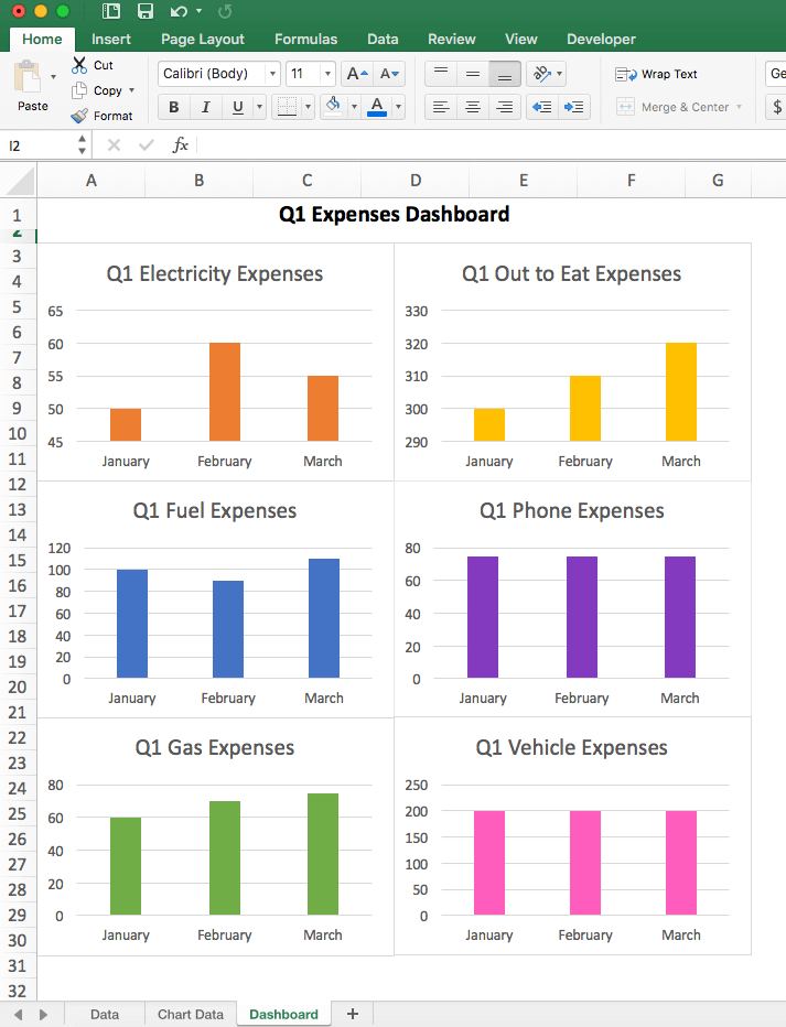
We’ll stick with the same budget data set that we used above. Our goal is to create column charts that will display how much we spend on each individual budget line item per month in the first quarter. This means that we’ll end up with separate charts for electricity, gas, phone, etc.
Ready? Let’s get started.
2. Filter your data
When creating a chart, you’re not going to need to use all of your data at once—you’ll need to filter through it to focus on only the pieces you need at that given time.
The easiest way to do this is by using the “Filter” option within Excel. For example, we want to filter by item type and only see numbers related to our electricity expenses.
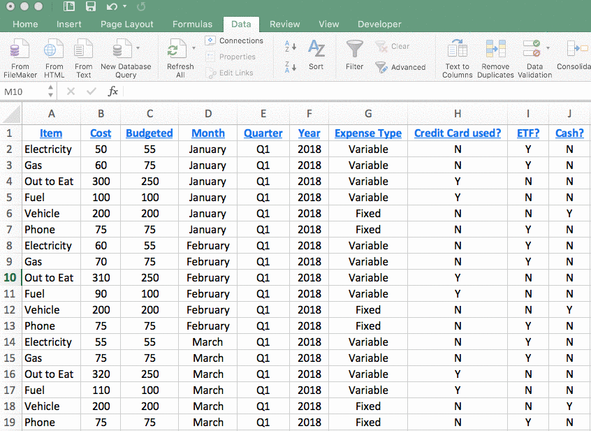
To do that, we’ll highlight the entire data set, click the “Data” ribbon in the toolbar, and then click the “Filter” button. When doing so, you’ll see that little arrows appear next to your column headers. If you click one of those arrows, you’ll be presented with a drop-down menu that you can use to filter your data.
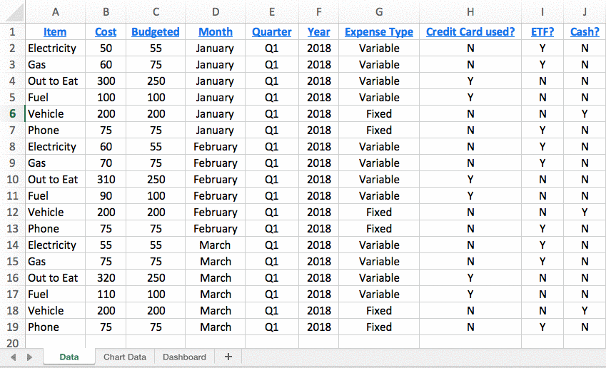
 When you’ve filtered down to only the data that you want, highlight all of the cells of data, hit “copy,” and then paste only those rows into your “Chart Data” tab of your workbook. That’s the tab that you’ll pull data from when building your charts.
Why can’t you just select data from your regular “Data” tab? Well, put simply, because even though you’ve filtered the data, those other irrelevant rows are still included there (albeit hidden)—meaning they’ll throw things off in your chart.
3. Build your chart
Now that you have only the data that you need, you’re ready to begin building your chart.
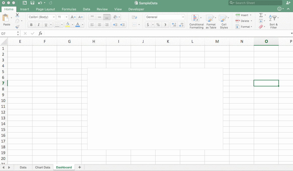
Click on the “Dashboard” tab of your worksheet, click the “Insert” button in the toolbar, and then select the type of chart you want from the menu. In this case, we’re going to use a clustered column chart.
When you insert the chart, you’ll see a blank box. Don’t worry—you haven’t screwed anything up. We’ll cover how to get your data to appear there in the next step.
 TIP: Still aren’t sure which chart option is the best fit for your data? Highlight all of your rows of data in your “Chart Data” tab and then click “Recommended Charts” within the “Insert” ribbon. Excel will suggest some charts for you to use.
4. Select your data
Now that you have that blank box inserted in your “Dashboard” tab of your workbook, it’s time to pull some data in.
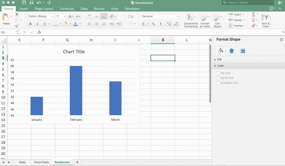
To do so, right-click on that box and then choose “Select Data.” After that, navigate over to your “Chart Data” tab (where your filtered data is living) and highlight all of the data that you want to display—minus the column headers. In this case, we’re selecting the “Item” and “Cost” data, since the purpose of my chart is to show how much we spend on electricity each month.
That data that you just selected is for the vertical axis. But, you still need to select your data for the horizontal axis of your chart.
To do that, click the button within the “Horizontal Axis” field of the “Select Data” popup and then highlight the information you need for the horizontal axis—in this case, the months.
After doing so, hit your “Enter” key, click “OK,” and then head over to your “Dashboard” tab to ensure that your chart populated with that data.
5. Double-check your data
At this point, it’s wise to take a quick look at your chart and make sure that nothing looks off. Mistakes can happen. So, it’s worth it to take the time to ensure that your chart is pulling in your data correctly.
Does something look off?
Do some troubleshooting to figure out where you went wrong.
6. Polish your chart
Here’s the fun part—when you get to put the finishing touches on your chart.
From changing the colors to match your brand to adding labels, titles, units, or any other information that is required, you can polish up your chart by double-clicking on the chart area and then using the options in the toolbar (there are buttons up there for everything from “Add Chart Element” to “Change Colors) to make your changes.
7. Repeat the process for other data
A true Excel dashboard includes several different charts and gauges to display data. So, to complete our dashboard in this example scenario, we’ll go back and repeat all of those steps for our other budget line items—such as phone, vehicle, gas, etc.
One important thing to note: You don’t want to delete any data in your “Chart Data” tab—since the data there, is what’s feeding your charts.
So, when going through the process of making your other charts, make sure to paste the new data sets below each other, rather than deleting and replacing them within that tab:
After we’ve done that? We’ll end up with a tab that shows how much we spend on each item each month.
See, that wasn’t so bad, was it?
Ready to get rolling with Excel Dashboards?
We’ve covered a lot about Excel dashboards here, and we’re hopeful that you have some newfound confidence to leverage Excel so that you can visualize and use that data of yours.
We promise—it’s not as overwhelming or complicated as you’re likely making it out to be.
If you’re eager to learn even more and become a true Excel dashboard master (we know you are), check out our course all about Excel dashboards to roll up your sleeves and discover more about how you can use Excel dashboards to your advantage.
Also, check out our post about the differences between big data and business intelligence and the tools used in these fields.