
You've probably heard of Excel being utilized in a myraid of ways, but the thread that ties them all together? Data. Excel helps you record, organize and keep track of quantitative data in ways that no manual system can. If you’re not using Excel to analyze important information, then you're definitely missing out.
Download your free practice file
Use this free Excel file to practice along with the tutorial.
What is data analysis?
Data analysis is taking raw data and turning it into information that’s useful for decision-making. It establishes relationships or patterns between different sets of data so that you’re in a better position to respond to current and future situations of that nature.
Of course, Microsoft Excel isn’t the only tool available for data analysis at work, but it is one of the favorites for a couple of reasons:
- Popularity - Since the Microsoft Office suite is standard in most business software, Excel is likely already loaded on your machine and the machines of folks with whom you will be sharing documents.
- Familiarity - Microsoft applications are familiar to most people, so Excel’s commands and keyboard shortcuts are similar to those used in many other applications, making the interface largely intuitive.
- Versatility - Excel is a great way to venture into data analysis in baby steps, from simple data collection to formula creation, to integration with Power BI.
Below is your guide to all things data analysis in Excel. In this guide, we cover:
- Sorting data
- Filtering
- Conditional Formatting
- Charts
- Pivot Tables
- Functions for Data Analysis
- What-If Analysis
- How to Use Solver
- Excel Data Analysis ToolPak
Where is data analysis in Excel?
The most obvious place to look for data analysis tools in Excel is on the Data tab.
The Data tab on the Excel ribbon is the home of commands which can transform your data from simple numbers into meaningful answers. From here you’ll be able to import, sort, extract, convert, and otherwise massage simple and complex data in various ways. Let’s start with the simplest form of data analysis: sorting.
Sorting in Excel
Sorting data is the first step to getting things organized. Excel allows you to sort by numbers, text, date, or even color. You can also sort in whatever order is useful - for example, from oldest to newest or vice versa, by column or row, and you can even do multi-level sorting. The primary purpose of sorting is to get your data ready for even more in-depth analysis, but sorting will usually do the trick if you just want to arrange things in a logical order.
To sort a data range:
- Highlight the range to be sorted.
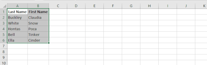
- Go to Data > Sort.
- If your highlighted range includes data headings, tick “My data has headers”.
- Select the column you want to sort by.
- Select additional sorting columns if necessary.
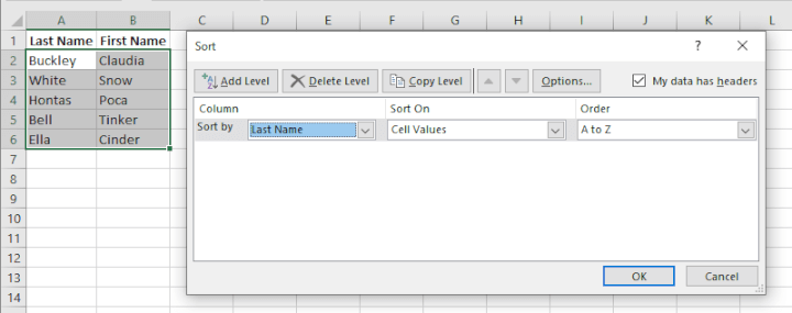
5. Click OK.
Filtering
Learning how to filter in Excel is another useful analysis tool. It’s not just a way of temporarily hiding data that you don't want to see. With advanced filtering techniques, you can extract exactly what you want from a larger dataset and place it in a new location, allowing you to work with only data that’s relevant for a particular purpose.
Excel allows you to choose from simple auto-filters to more advanced filters, as well as the (fairly new) FILTER function. Here’s a quick overview:
Auto-filters
Auto filtering is quick and easy:
- Click any cell within the dataset that you want to create a filter for. (If there are blank rows within the dataset, highlight the entire range.)
- Click the “Filter” icon on the Sort & Filter command group. Excel will then display a filter arrow in the first row of the dataset. If that isn’t where you wanted your filter to be, highlight the row you want to treat as the header, then click the “Filter” icon.
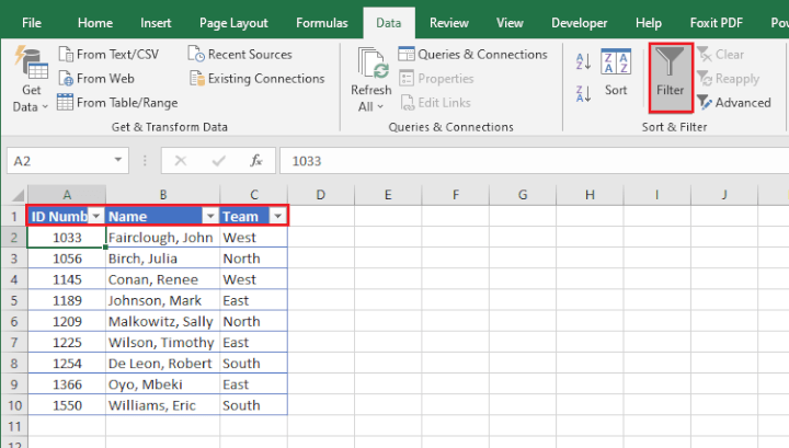
- Each header row now has a dropdown menu that includes a list of unique values you can use to filter your data.
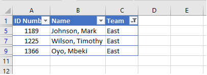
- Tick a box from the filter dropdown and only rows in that category will be displayed. The other rows are temporarily hidden, as shown by the blue row numbers to the left. Rows that have been filtered out can easily be redisplayed by re-selecting all the values in the filter dropdown, or just by deselecting the Filter icon from the ribbon.
Advanced Filters
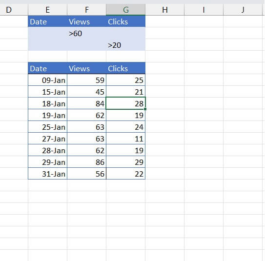
Excel’s Advanced Filter feature has a functionality that allows you to display data that satisfies either ANY of several criteria. This isn’t possible with a simple auto-filter, which allows filtering using OR logic for a maximum of two criteria, and only for values in the same column.
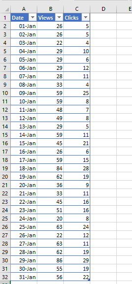
To illustrate: the dataset below shows the number of views and clicks on a website by date. If we wanted to isolate dates that had more than 60 views or which had more than 20 clicks, we can see that some dates had one but not the other (for example, January 19, 27, and 28 each had more than 60 views but fewer than 20 clicks. On January 9 there were more than 20 clicks but fewer than 60 views).
If we try to use an auto-filter, applying the filter to one column would result in excluding data that we want to see in another column.
Excel’s Advanced Filter functionality fixes this situation by offering the option of filtering with multiple criteria using AND logic, OR logic, and wildcard characters.
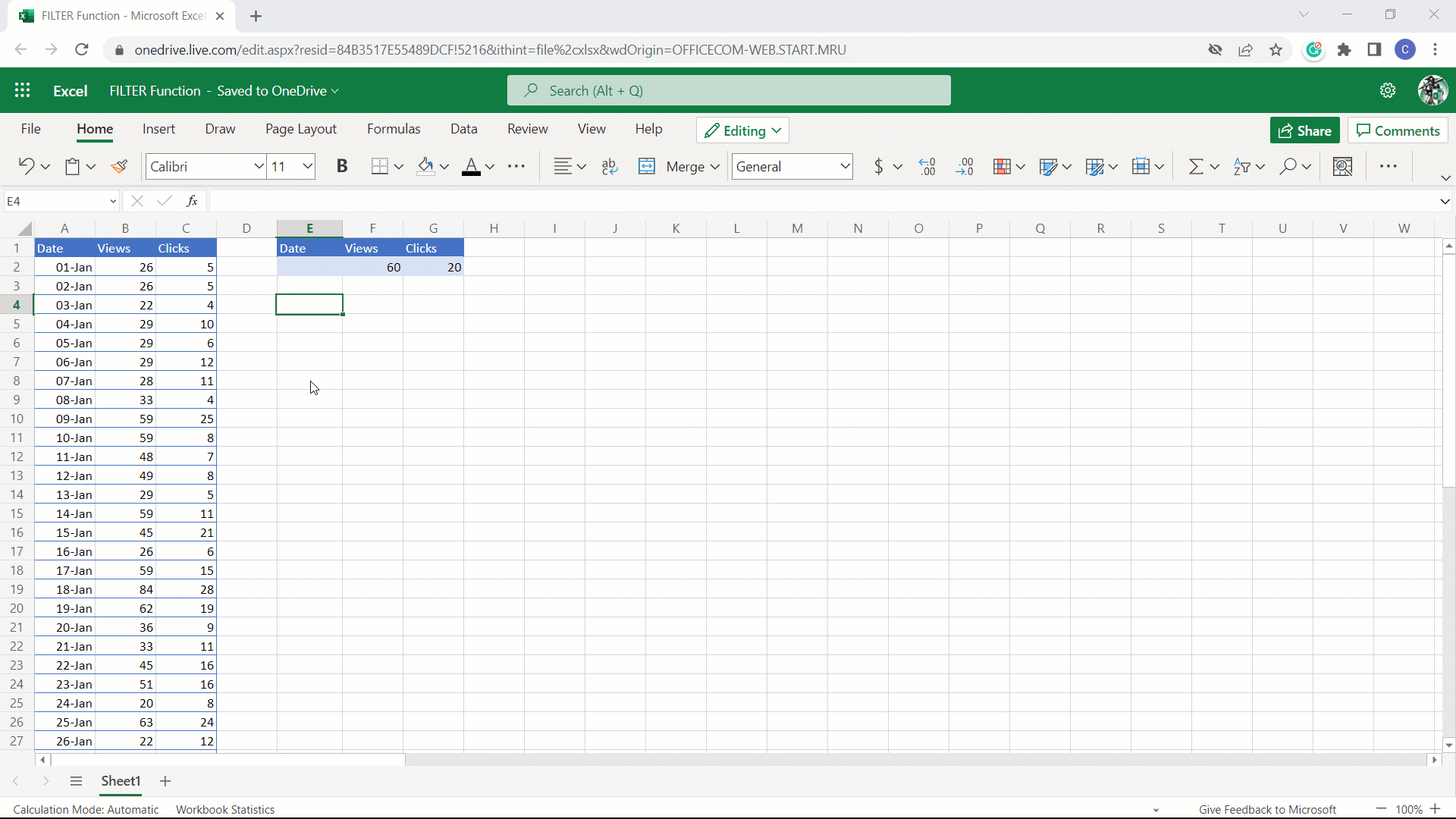
FILTER Function
Excel 365 now has a way to filter data dynamically using a function. The FILTER function carries the syntax
=FILTER(array, include, [if_empty])- array is the array or range to be filtered
- include is the range to be evaluated for criteria
- if_empty is the value to return if the filter formula returns no values
The include argument allows filtering using Boolean logic (e.g. =, >, <), and its ability to dynamically filter means that when the source data changes, the filtered display is automatically updated.
Conditional Formatting
When conditional formatting is applied to your data, similarities and differences in data elements stand out in color, making it easier to spot patterns, trends, and anomalies at a glance.
Excel’s conditional formatting tool provides the ability to add color, style, icons, or data bars to cells that satisfy a certain condition or set of conditions. These conditions may refer to the value, rank, or content of the cells.
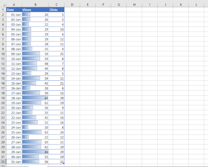
Being able to compare data visually makes analysis easier. The versatility of Excel’s conditional formatting tool even allows formatting based on a formula.
Charts
Charts are another effective way to tell a story with pictures. They summarize data in a way that makes data sets easier to understand and interpret. Excel is popular for its ability to organize and calculate numbers.
Excel charts are excellent for helping to analyze that data by drawing attention to one or a few aspects of a report. With Excel charts, we can filter out the extra “noise” from the story we are trying to tell at the moment and instead, zero in on the essential pieces of data.
By going to the Insert tab and choosing from the Charts command group, you can select from pie, line, column, or bar charts, which are made quite easily. The steps to create these basic charts are:
- Select the data range.
- Click Insert > (choose desired chart type from icons).
- Customize inserted chart as needed.
But these aren’t the only charts we have as data analysis resources. There are more advanced charts used for special types of data analysis, including:
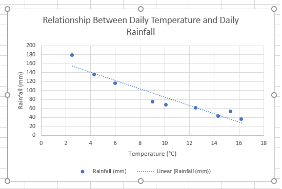
- Scatter graphs (to observe relationships between variables)
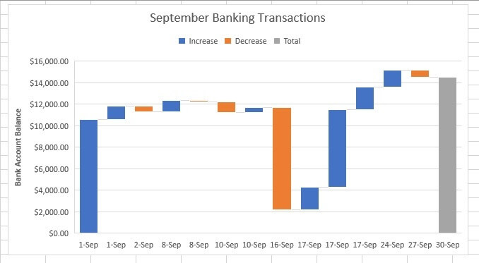
- Waterfall charts (to show the effect of positive or negative values on an initial value)
- Histograms (to show the distribution of data grouped into bins)

You can also use Excel to custom-build specialty charts like:
- Stock charts
- Radar charts
- Gantt charts for project management
The rule of thumb for charts is - the simpler, the better. A good chart answers questions - it doesn’t create more questions. Think about your story and your audience when deciding what chart to use.
Pivot Tables
Pivot tables summarize large amounts of data by allowing you to choose the fields or categories you consider important. Being able to manipulate the focus and basis of the summary is, of course, how they got their name- you have the flexibility of pivoting very quickly to change what section of the table will be the focal point for your analysis.
You can choose to summarize not only by using the standard SUM, COUNT, AVERAGE, MIN, and MAX functions, but also PRODUCT, Variance, Standard Deviation, and others.
For example, we can use the following data set as the source for a pivot table:
To make a pivot table for the above:
- Go to any cell within the table.
- Go to the Insert tab and select Pivot Table.
- Select the source data and the location to place the Pivot Table.
- Use the panel on the right to create fields for your table and the way you would like the data to be summarized.
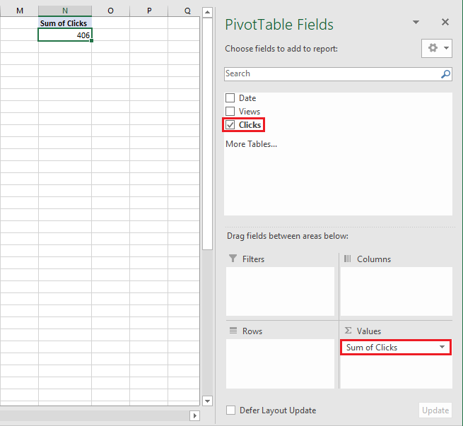
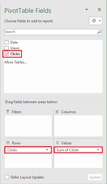
Let’s focus on the number of clicks, for example. We would tick the “Clicks” checkbox to include that field in the Pivot Table.
Meanwhile, Excel totals the number of clicks by automatically placing the Sum of Clicks in the Σ Values section in the lower right of the PivotTable Fields panel and showing that total as a value on the worksheet, under the heading “Sum of Clicks”.
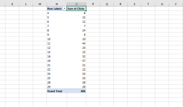
What if we wanted to know how many clicks we’re getting per day? We can drag the “Clicks” field to the Rows area, which creates a table in the worksheet which carries a row for each number of clicks.
The Sum of Clicks column is probably not as helpful now, so how can we change what is reported in that column?
Click on the Σ Values area of the PivotTable Fields, then choose Value Field Settings from the context menu.
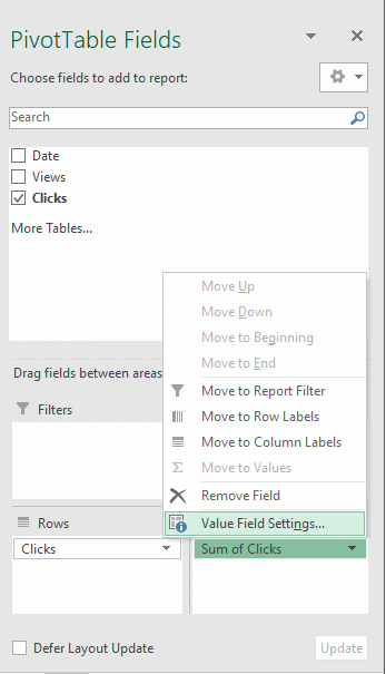
Now we can change the way the values in the field are summarized. For instance, we can get Excel to do a count to figure out how many days we got “n” number of clicks. Select “Count” and click OK.
We can also customize a column name just by clicking on the cell and overwriting the current name.
And why not go one step further? We can sort this Pivot Table from most to fewest number of daily clicks to better analyze and understand how engaged visitors to our website are.
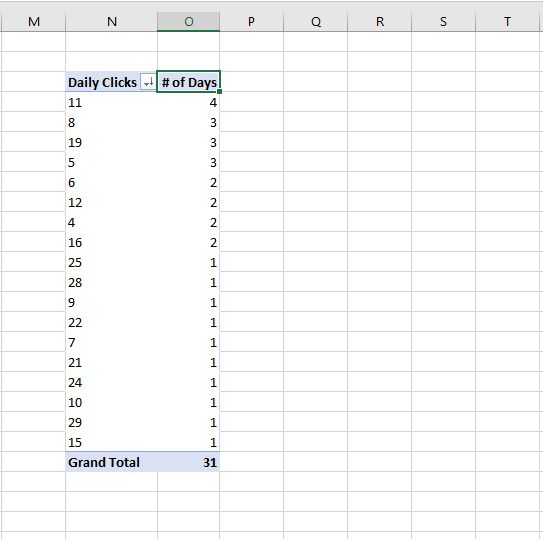
So there were four days where we got 11 clicks, three days where we got 8 clicks, and so on. Of course, we can add even more fields, including dates and/or visits, choose how we want to view the events that month, and determine their relationship to each other.
PivotTables are seen as being for more advanced Excel users, but they can also help replace analytical Excel functions without the extended time needed to learn syntax and arguments, even for more basic situations like the one above. Dive into solutions to more complex problems by checking out advanced pivot tables.
Functions for Data Analysis
Functions are, arguably, what Excel is best known for. With hundreds of functions to choose from, it might seem overwhelming to get started. Fortunately, they’re grouped by type in the Function Library on the Formulas tab of the Excel ribbon.
Several functions used for data analysis can be found among the "Logical" and "Lookup & Reference" groups.
IF functions
Take, for example, the logical IF function. With this function, we can get Excel to display one value or another, or to perform one calculation on another depending on the outcome of a logical test.
For instance,
=IF(C7/B7>25%,“Yes”, “No”)is a formula that tests whether dividing the value in C7 by the value in B7 results in a value greater than 25%. If it is, the word “Yes” is displayed in the current cell. If it isn’t, the word “No” is displayed.
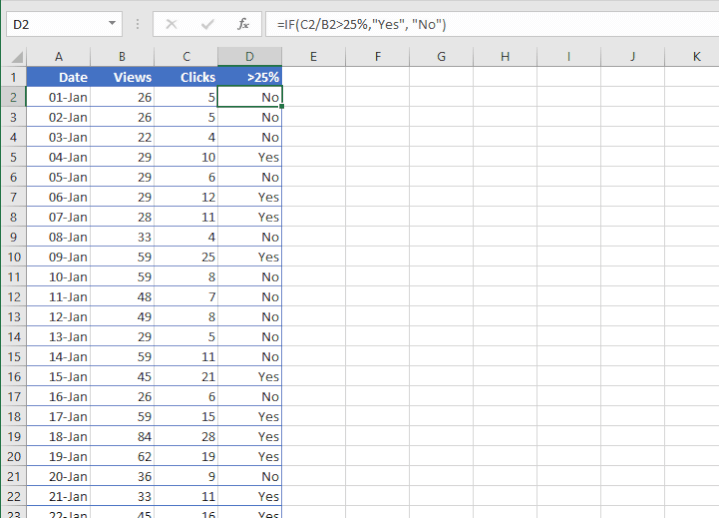
From here, we can layer our analysis with filtering or sorting techniques to concentrate on the areas we consider important at the moment.
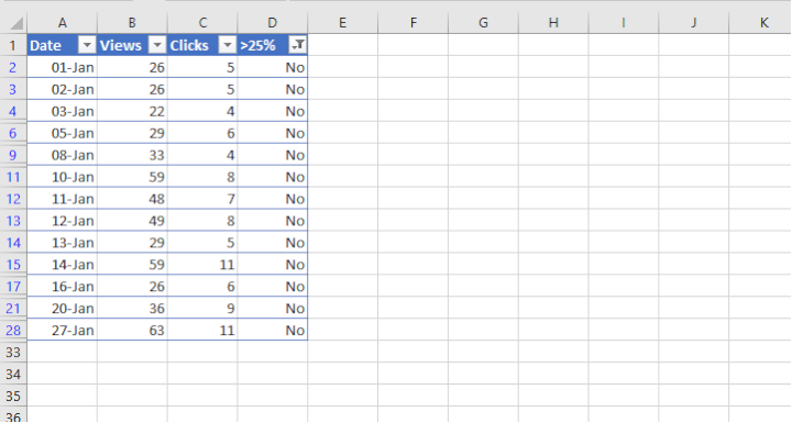
We’ve applied a filter to view the “No” values in column D, and we can see that most dates where the engagement was below 25% were in the first two weeks of January.
Other members of the IF function family include SUMIF, SUMIFS, COUNTIF, and COUNTIFS, which perform the specific actions suggested by their names if the logical test is true.
Our roundup of IF functions (plus downloadable cheatsheet): Mastering Excel: A Beginner’s Guide to 10 IF Functions
LOOKUP functions
Excel’s LOOKUP functions are indispensable for data analysts in virtually every industry. They are typically used to look up and extract specific pieces of information from a larger dataset.
- One of the most commonly used lookup functions is VLOOKUP. VLOOKUP looks in the first column of an array, or dataset, for a specific value and returns a single value from the same row in which the lookup value was found.
The syntax of VLOOKUP is
=VLOOKUP(lookup value, table array, column index number, range lookup)
The final argument allows you to specify that only an exact match to the lookup_value will be accepted.
- The HLOOKUP function works similarly to VLOOKUP, but it performs a horizontal, instead of a vertical, search for the lookup_value.
- The game-changing XLOOKUP function can look horizontally or vertically and eliminates some of the limitations of VLOOKUP and HLOOKUP. For example, it:
- defaults to an exact match. VLOOKUP and HLOOKUP default to an approximate match, which we don’t like too much.
- can return a value to the left or right of the lookup_value.
- can return more than one value from an array.
- can return the next larger or next smaller approximate value if an exact match isn’t found.
The syntax of XLOOKUP is
=XLOOKUP(lookup_value, lookup_array, return_array, [if_not_found], [match_mode], [search_mode])XLOOKUP was rolled out in Microsoft Excel 365 and isn’t on older versions. LOOKUP functions in Excel are found among the Lookup & Reference group of the Function Library.
Check out this popular read (comes with downloadable cheatsheet): Top 12 Excel Lookup Functions
What-if analysis
If your analysis has you trying to predict the outcome of different actions or scenarios, you’ll want to get familiar with the three What-If Analysis menu options:
- Scenario Manager
- Goal Seek
- Data Table
These are all sensitivity analysis tools that test how an outcome is affected by changing the model's variable(s).
Goal Seek assumes that you know the outcome you want, and by adjusting a single variable at a time, shows the impact on that outcome or goal.
Scenario Manager, on the other hand, allows the creation of an unlimited number of possible scenarios by allowing you to change up to 32 variables at a time. Each scenario can be saved and later edited and/or presented as needed.
With Data Tables, you can make side-by-side comparisons that are easier to read than scenarios in the Scenario Manager. Data Tables allow the adjustment of up to two variables within a dataset, but each variable may have an unlimited number of possible values.
Solver
Solver is another tool used for What-if analysis in Excel. It’s available as an add-in and appears on the Data tab once activated.
Like Goal Seek, Solver seeks to achieve a numeric objective by changing variables. However, it is undoubtedly superior to Goal Seek because you can specify up to 200 variable cells to arrive at an optimal value for the objective cell. A handy feature of Solver is the “Constraints” parameter, where you can create rules for what is and is not allowed when solving for the optimal value.
Download your free practice file
Use this free Excel file to practice along with the tutorial.
Data Analysis ToolPak
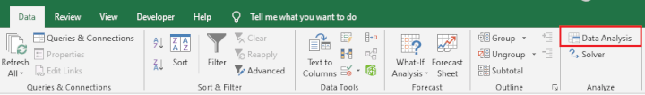
The Data Analysis command is in the Data Analysis group of commands on your PC or next to the Analysis Tools command on a Mac.
The purpose of the Data Analysis Toolpak is to provide a one-stop-shop for complex data analysis, especially those with a statistical, financial, or engineering angle. The ToolPak offers a choice of 19 tools to analyze or summarize quantitative data. Since the Excel functions for data analysis are built-in on the back-end of Excel, you only need to enter the data in the relevant input fields and Excel does the calculations for you.
Even if you know the detailed steps for these functions, it’s obviously a time-saver. All you need to do is determine the appropriate function for your data, select the tool from Excel’s ToolPak, and Excel guides you to what it needs. The results will be displayed in an output table. Some tools generate both charts and output tables.
Since the Data Analysis ToolPak is an add-in, you may not see it on the ribbon. To load it, do the following:
How to load the Analysis ToolPak add-in (Windows)
- Go to the File tab on the ribbon and click Options,
- Click the Add-Ins category on the left. (If you are using Excel 2007, click the Microsoft Office Button, then click Excel Options.)
- From the Manage dropdown list, select Excel Add-ins, then click Go.
- In the Add-Ins dialog box, tick the Analysis ToolPak check box, then click OK.
Notes:
- If Analysis ToolPak is not shown as one of the Add-Ins available, click the Browse command to find it.
- If you get notified that the Analysis ToolPak is not currently installed on your computer, click Yes to install it.
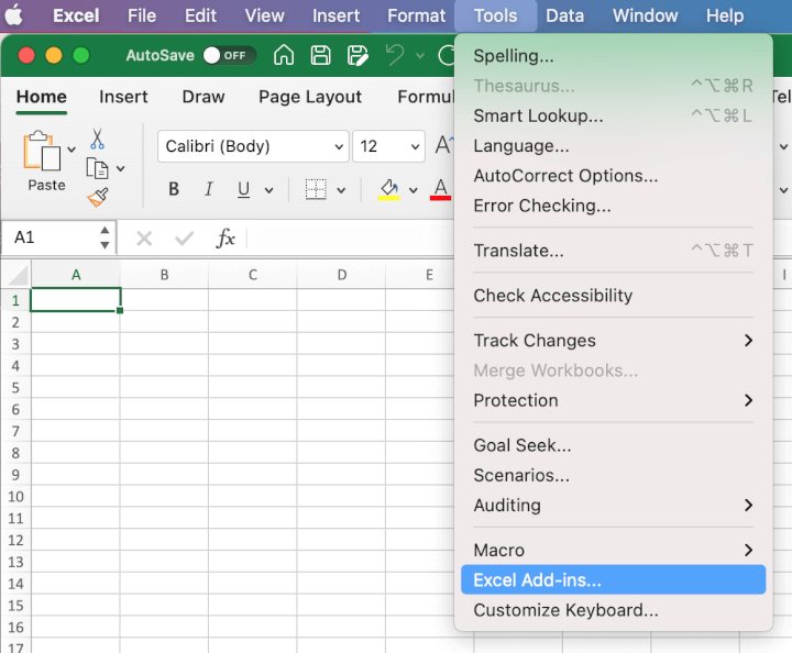
How to load the Analysis ToolPak add-in (Mac)
1. Click the Tools menu, then click Excel Add-ins.
2. Select the Analysis ToolPak checkbox in the Add-Ins Available box, then click OK.
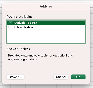
3. If Analysis ToolPak is not shown in the Add-Ins available box, click the Browse command to find it.
Note:
- If you get a prompt that says the Analysis ToolPak is not currently installed on your computer, click Yes to install it, quit Excel, and restart.
Once the Data Analysis ToolPak is activated, you will have access to 19 built-in advanced statistical and engineering functions, including ANOVA, Linear Regression, and Moving Averages, to name a few.
Summary
And that's what's in the Excel toolbox for analyzing all kinds of data. Ready to step up your Excel game? Hopefully, we’ve managed to convince you that it’s doable and, more importantly, that getting those Excel skills is easier than you think.